A brand color system turns an approved palette into repeatable use by assigning functional roles, defining hierarchy and approved variants, setting usage and pairing rules, documenting medium-appropriate values, and validating the system in real applications. Color proportions remain context-dependent: the system is governed by roles and conditions, not by one universal ratio.
From approved palette to repeatable brand color system
Build the system in dependency order so each later decision remains traceable to an earlier role or rule; repeatability comes from those governed relationships rather than from swatches or codes alone.
1Start with the approved palette. Keep the chosen colors and values as the input; this stage organizes them rather than selecting new hues.
2Assign functional roles. Define which colors lead, support, create selective emphasis, or provide neutral and supporting functions.
3Set hierarchy and controlled variants. Establish relative prominence, then add only tints, shades, or variants that remain tied to a parent role and a defined use.
4Write usage conditions. State allowed, conditional, and restricted uses, including pairing, coexistence, substitution, and context-sensitive proportions.
5Document the system. Record stable names, medium-appropriate color values, roles, approved variants, and the rules needed for repeatable application.
6Validate in context. Check role clarity, permitted combinations, legibility, accessibility requirements, and whether another person can apply the rules without guesswork.
Core decision rule: change visible color allocation when the medium or communication need changes, but keep the documented role hierarchy and use conditions intact.
Table of Contents⌄
How a Brand Color System Extends a Chosen Palette
A color palette identifies the chosen palette through its swatches and color values, while a brand color system adds rules that define how those colors function.
The same palette can therefore exist as a set of approved colors without specifying which colors should lead, support, or provide emphasis.
Within Brand Identity Design, the system extends the palette by assigning functional structure rather than changing the approved colors.
A brand color system adds color roles, hierarchy, variants, and usage rules that govern permitted use and support repeatable application.
The process of choosing brand colors is an upstream task; this stage organizes the colors after the palette has been approved.
Color codes identify specific color values, but they do not by themselves define a color's role, relative prominence, or permitted use.
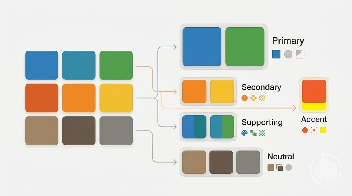
The image contrasts color identification with functional organization by showing the same approved colors before and after roles and hierarchy are assigned.
The contrast block separates the attributes that identify the chosen palette from the attributes that govern how its colors are used:
Approved palette
Swatches, color values, and color codes identify the approved colors.
The colors can exist without defined functional roles or hierarchy.
Brand color system
Color roles and hierarchy define functional purpose and relative prominence.
Approved variants and usage rules define permitted use and support repeatable application.
Assign Functional Roles to the Brand Colors
Color role assignment converts approved colors into functional roles by defining the job each color should perform rather than selecting new hues.
Assign each color according to how it should lead, support, emphasise, or provide a neutral foundation within the approved palette.
A primary color, secondary colors, an accent color, and neutral or supporting colors can describe these functions, but the categories should reflect the brand's actual application needs rather than a fixed formula.
A color role should be defined by its function, intended prominence, permitted use, and interaction with other roles.
For example, an approved color with no defined purpose can be assigned an accent role for selective emphasis, while another can serve as a supporting color with lower relative prominence.
The number and naming of roles can change with the brand's needs, so primary, secondary, accent, neutral, and supporting labels are flexible categories rather than a universal role structure.
The diagram maps the existing approved colors to functional jobs, showing the same colors before and after role assignment so relative prominence and permitted use are easier to distinguish.
Use these criteria together to prevent different color roles from competing for the same job:
Function: define what the color is expected to do, such as carry the primary brand-identifying role, provide secondary support, create selective emphasis, or provide a neutral or supporting function.
Prominence: establish whether the role should receive greater, lower, or selective visual emphasis relative to the other approved colors.
Context: specify the applications or situations in which the color has permitted use instead of treating approval as permission to use it everywhere.
Interaction: define how the role works with the rest of the hierarchy so supporting colors reinforce rather than compete with roles intended to carry greater prominence.
Define the Primary Color Role
The primary color role is the color, or tightly controlled set of colors, that carries the principal brand-identifying function within the color system.
A primary color represents system priority and anchors high-priority brand use, with permitted use defined by the contexts in which that identifying function is needed.
“Primary” therefore describes the color's principal role in the hierarchy, not a universal requirement for one color to occupy the most surface area in every composition.
The primary color may receive greater prominence where brand identification is the priority while supporting colors remain subordinate, but its prominence can change with the purpose and composition of an application.
For example, using the primary color as the principal identifier keeps its role explicit, whereas applying it indiscriminately to every element can erase the distinction between primary and supporting roles.
Clear permitted use maintains the primary color's system priority without imposing a fixed percentage or requiring every brand to have exactly one primary color.
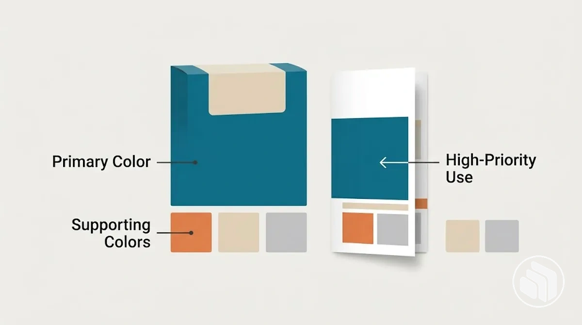
The annotated example shows the primary color in a high-priority identifying use while supporting colors remain visually subordinate, making the role hierarchy clear without assigning a fixed proportion.
Define Secondary Color Roles
Secondary color roles give secondary colors a supporting function that extends the brand color system without replacing the primary color.
They sit at lower relative prominence in the hierarchy and provide complementary support where additional visual distinction or emphasis is needed.
A secondary color may be a distinct hue or a related variant, so “secondary” describes its functional role rather than a required method for generating the color.
Compatibility with the primary color means the secondary role should broaden usable expression while keeping the primary role identifiable as the higher-priority brand signal.
For example, a secondary color can distinguish a section or provide a complementary background while the primary color retains the principal emphasis.
This adds flexibility without giving secondary colors equal dominance or displacing the primary role.
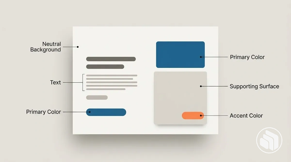
The annotated example shows secondary colors providing background or secondary emphasis while preserving the primary color's priority in the visible hierarchy.
Define Accent Color Roles
The accent color role gives an accent color a focused emphasis function within the brand color hierarchy.
Limited use allows the accent color to draw attention to selected elements while the primary and supporting colors continue to carry the broader composition.
Accent suitability therefore depends on function and context rather than a fixed percentage or whether a palette color is otherwise unused.
The frequency of accent use should remain selective enough for the emphasis to stay distinct, while contrast with surrounding colors should make the intended point of attention visually distinguishable.
For example, an accent color can highlight a small priority element while the primary and supporting roles remain visible across the rest of the composition.
Restrict accent use when repeated emphasis would make too many elements compete for attention, keeping its use sparse and intentional.
Define Neutral and Supporting Color Roles
Neutral and supporting colors handle practical functions such as backgrounds, text, surfaces, and separation so branded colors can remain visually distinctive.
These non-dominant roles provide visual balance and create usable space around primary and accent colors without competing with them.
The exact neutral colors depend on the application and the required surface, text, and contrast relationships, so a neutral set is not limited to black, white, and grey.
For example, a subdued neutral background can provide space for text and supporting surfaces while allowing the primary and accent colors to retain their brand-signalling roles.
Neutral and supporting roles organize these practical treatments, while legibility and contrast still require verification in the specific use context rather than being guaranteed by the color role itself.
Build the Color Hierarchy and Supporting Range
Build order
Rank the established roles. Set relative role priority and permitted use so higher-priority roles can lead where their function requires it and lower-priority roles remain subordinate.
Treat dominance as functional, not formulaic. Prominence can change across media and compositions, so the hierarchy should describe which roles lead, support, or provide selective emphasis rather than prescribe one fixed percentage.
Expand only for a defined need. Add approved tints, shades, or other variants for specific backgrounds, surfaces, reproduction conditions, or other use cases while keeping each variant connected to its parent role. The size and composition of the approved range can differ by application need without changing that parent relationship.
Control substitution and traceability. State which role each variant belongs to, when it may substitute for another approved value, and the conditions that keep the expanded range inside the documented system.
Set Relative Dominance Between Color Roles
Set relative dominance by deciding the visual priority each established color role should carry, while allowing the visible expression of that priority to change with the medium and composition.
Priority signals
Salience, frequency, emphasis, and communication priority together describe how strongly a role is perceived.
Surface area
Area is not a reliable proxy for hierarchy by itself; a color can attract strong attention through contrast or placement while appearing infrequently.
Context
The visible share of a role may change between media and compositions while its documented function and relative priority remain the same.
Accent example
An accent role can have high salience and low frequency, drawing attention at a few priority points without displacing roles that carry broader visual priority.
Add Approved Tints, Shades, and Variants
Approved color variants extend an existing base color only when a tint, shade, or other variant serves a defined functional purpose.
Each variant belongs to an approved range tied to its parent role rather than becoming a new role by default.
For example, a lighter variant may support a background treatment while a darker variant may support emphasis, with both remaining traceable to the same base color.
Naming and restriction keep that parent relationship explicit: each approved variant should identify its base color and intended function, then remain restricted to the contexts for which it was approved.
The number and type of variants can differ according to application needs, but every variant remains subordinate to the parent role.
Variants are approved only when they solve a defined use need:
Functional purpose: assign the variant to a specific use such as a background, surface, or controlled emphasis treatment.
Naming: identify the variant consistently so its relationship to the base color remains clear.
Traceability: keep every tint, shade, or variant connected to the parent role within the approved range.
Restriction: limit the variant to its approved context instead of allowing unrestricted substitution across the system.
Set Usage Rules for Each Color Role
Color usage rules convert each established color role into operating conditions that specify allowed use, conditional use, and restricted use.
Define each usage rule around an application condition so a user can determine where the role is permitted, where its use depends on surrounding colors or purpose, and where it should be restricted.
Include pairing and coexistence conditions when combining roles changes their intended hierarchy or causes roles to compete for the same visual function.
Consistency means applying each color role under its defined conditions rather than using the same color everywhere.
Allowed use identifies applications that match the role's established function, while restricted use identifies applications that conflict with that function or hierarchy.
Pairing rules should state which roles may appear together and what relationship they should preserve; coexistence rules should identify when several roles can share a composition without competing for the same visual priority.
For example, an accent role can be permitted for selective emphasis but restricted when repeated emphasis causes several elements to compete for attention.
Each rule should be specific enough that a user can test an application against the stated condition.
The table converts the established roles into testable operating rules by separating allowed use from restricted use and stating the reason for each condition.
Color Role
Allowed Use
Restricted Use
Reason
Primary
Applications where the principal brand-identifying function should carry visual priority.
Use that causes another color to compete for the same principal function or applies the primary color indiscriminately to unrelated elements.
Preserves the primary role as the principal brand signal rather than a general-purpose color.
Secondary
Supporting applications such as complementary backgrounds, section differentiation, or secondary emphasis where the primary role remains identifiable.
Use that displaces or competes with the primary role for principal visual priority.
Extends the system while preserving the intended hierarchy between primary and supporting roles.
Accent
Selective emphasis where a limited point of attention is needed within the established hierarchy.
Repeated or broad emphasis that causes multiple elements to compete for attention.
Maintains the accent role's attention value through selective rather than pervasive use.
Neutral and Supporting
Backgrounds, text treatments, surfaces, separation, and other support functions defined for the application.
Use that makes supporting colors compete with branded roles or assumes a pairing is suitable without checking the specific application condition.
Provides practical support and visual balance while keeping branded roles distinctive.
Set Relative Color Proportions by Context
Relative color proportions should adapt to the communication context while preserving the established role hierarchy.
Allocate more or less area to a dominant color, supporting color, accent color, or neutral color according to the layout, content density, medium, and communication need rather than treating one proportion as correct for every composition.
No universal percentage allocation applies to every brand color system. Choose relative proportions from the layout, content density, medium, communication purpose, and the hierarchy the roles are meant to preserve.
Changing a role's relative share does not by itself change that role's underlying function.
A large branded field may allocate more visible area to the dominant color while supporting and accent roles occupy smaller areas, whereas a text-heavy layout may allocate more area to a neutral color so content has sufficient visual space while the established color roles remain intact.
Document Color Names, Codes, Roles, and Usage Rules
Brand color documentation should give every approved color a stable color name, color code or value, assigned role, approved variants, and core usage rules so another person can identify and apply it without relying on memory or visual guesswork.
A color record should use consistent naming that distinguishes approved colors clearly rather than depending on decorative names alone.
A documented color becomes reproducible within the system when its identifier is mapped to its role and operating rules, not merely to a swatch.
Color value formats should match the intended medium rather than treating one format as sufficient for every application. For digital use, record the defined RGB or HEX value used by the interface workflow; for print, record the production colour specification required by the workflow, such as CMYK values or a spot-colour reference when those systems are used.
A HEX value can identify a digital color value, but it does not by itself guarantee equivalent reproduction in print or every output condition; the documented production specification remains part of the color record.
Role and variant information should remain attached to the appropriate value specification so the intended function remains recoverable when the color is applied.
Broader identity-system governance belongs in brand guidelines; this record remains limited to documenting the brand color system.
The documentation example consolidates the minimum identifiers and operating rules into one repeatable reference, so each entry connects a stable identifier and value with its role, approved variants, and usage constraints.
Color Name
Code or Value
Role
Approved Variants
Usage Notes
Brand Blue
Approved digital value
Primary
Approved lighter and darker variants
Use where the principal brand-identifying role is required; apply variants only for their documented conditions.
Support Blue
Approved medium-specific value
Secondary
Approved supporting variants
Use for supporting applications where the primary role remains identifiable.
Accent Orange
Approved medium-specific value
Accent
Approved accent variants, if defined
Use selectively for documented emphasis conditions rather than broad application.
Neutral Light
Approved medium-specific value
Neutral
Approved neutral variants
Use for documented background, surface, text, or separation functions as applicable.
Validate the System for Clear, Accessible, Repeatable Use
Brand color system validation checks whether its roles, pairings, variants, identifiers, and rules can be understood and applied clearly and repeatedly under the relevant use conditions.
A ready system has observable role clarity, defined permitted combinations, controlled variants, documented values, and rules another person can follow without relying on the original designer's memory.
Legibility and accessibility still require verification in the context where particular color combinations and content are used.
The following checks evaluate each requirement by its observed state and identify whether it passes or needs adjustment before repeatable use.
Role clarity: Check whether every approved color has one documented role or an explicitly documented combination of roles. Pass when another person can identify the intended function from the record; adjust ambiguous or conflicting role assignments before implementation.
Permitted combinations: Check whether pairings and coexistence rules state which color roles may appear together and which relationships are restricted. Pass when a user can determine permitted combinations from the documented rules; adjust missing or contradictory pairing conditions before reuse.
Variant control: Check whether every approved variant remains traceable to its parent color, functional purpose, and restriction. Pass when a user can distinguish an approved variant from an independent role and identify its permitted context; adjust untraceable or unrestricted variants before application.
Documented values: Check whether each color record contains a stable identifier and the color value required for its intended medium. Pass when another person can locate the documented values needed for that application without estimating from a swatch; adjust missing or medium-inappropriate specifications before reproduction.
Legibility and accessibility: Check actual foreground and background combinations under the relevant content and use conditions rather than assuming that assigned roles make a pairing accessible. Pass only when the applicable accessibility and legibility requirements for that context have been verified; adjust combinations that do not meet those requirements.
Repeatability: Give the documented system to someone other than the original designer and check whether that person can select the intended roles, permitted variants, combinations, and values for the tested application. Pass when the documented rules are sufficient to reproduce the intended role relationships without undocumented guesswork; adjust the documentation or rules where interpretation is still required.
A failed validation check identifies the part of the color system that needs adjustment rather than proving that the entire system is unusable; revise the affected role, pairing, variant, identifier, value, or rule and verify it again under the relevant condition.
Once local color-system validation is complete, maintaining brand consistency across different channels becomes a broader implementation concern.
Check Contrast and Legibility Across Approved Color Pairings
An approved color pairing should be evaluated with its foreground, background, content type, and intended use context rather than judged from the colors in isolation.
Contrast and legibility can support approval for one application while requiring restriction or adjustment for another, so visual impression alone is not sufficient evidence of accessibility.
The checklist separates text, important graphical content, and decorative use so each pairing is checked against the criterion that applies to its actual function.
Text use: Check the actual foreground text and background pairing at the intended text size, weight, and use context. Approve the pairing for that text use only when the applicable contrast and legibility criterion has been verified; otherwise restrict or adjust the foreground, background, or text treatment.
Important graphical content: Check whether foreground and background colors allow essential graphical information or interface elements to remain distinguishable in their intended context. Approve the pairing only when the applicable criterion has been verified for that use; otherwise adjust or restrict the combination.
Decorative use: Evaluate a decorative pairing according to its visual function rather than applying a text criterion to an area that contains no text or essential graphical information. Restrict the same pairing if it is later used for content whose legibility or applicable accessibility requirement has not been verified.
Context change: Recheck an approved pairing when the foreground, background, text treatment, content type, or use context changes. A pairing may be acceptable for a large decorative field yet unsuitable for small text, because suitability in the decorative context does not establish suitability for the text application.
Check That Roles and Hierarchy Stay Distinct
Verify role distinctness by comparing each applied color with its documented role and expected position in the role hierarchy.
Primary, secondary, accent, neutral, and approved variant roles remain distinct when their observed use matches their intended function and relative priority; a deviation requires correction when the application contradicts the documented role rules.
The checklist tests implementation for dominance drift, role confusion, uncontrolled substitution, and variant creep without redefining the roles themselves.
Dominance: Compare the intended role with the observed role of each applied color. If a secondary or accent color repeatedly carries the visual priority documented for the primary role, the observed hierarchy deviates from the intended hierarchy; correct the application where that dominance contradicts the documented role relationship.
Role confusion: Check whether primary, secondary, accent, and neutral colors remain distinguishable by their observed functions in the composition. If two roles repeatedly perform the same function without that overlap being documented, treat the ambiguity as role confusion and return the application to the documented role rules.
Substitution: Check whether one applied color substitutes for another role only under an approved use condition. If a secondary, accent, or neutral color replaces another role outside its documented permission, restrict the substitution or restore the color assigned to that function.
Variant creep: Compare each approved variant with its parent color and expected role. If a variant is repeatedly applied with an independent function or hierarchy position that is not documented for its parent role, the variant has begun to behave like a separate role; restrict that use or return the variant to its approved function.
Contrasting application: An accent color may remain distinct when it provides selective emphasis, but if its observed dominance repeatedly displaces the expected primary role, the implementation no longer matches the intended hierarchy. Likewise, a variant that begins substituting across unrelated functions needs correction when those substitutions fall outside its documented role conditions.
Common Brand Color System Mistakes
Brand color system mistakes usually become visible when unclear roles, uncontrolled expansion, vague usage rules, incomplete documentation, or unverified pairings make the system harder to apply repeatably.
Role overlap can blur the intended hierarchy, while uncontrolled variants and arbitrary proportions can allow individual compositions to drift from the documented system.
Incomplete documentation can leave users guessing about approved values or conditions, and weak pairings can create legibility problems in the contexts where those colors are applied.
The comparison below links each failure to its consequence, recognition cue, and corrective direction.
Treating a palette as a complete system
Consequence
The mistake leaves approved colors without operational roles or usage rules, which can lead to inconsistent implementation.
Recognition cue
Users can identify the available colors but cannot determine which should act as primary, secondary, accent, or neutral in a given application.
Correction
Assign explicit roles, hierarchy, permitted uses, and restrictions to the approved colors.
Allowing role overlap
Consequence
Undocumented role overlap weakens role separation when multiple colors begin performing the same function or competing for the same hierarchy position.
Recognition cue
An applied secondary or accent color repeatedly behaves like the primary role without an approved condition for that change.
Correction
Return each color to its documented function or explicitly resolve the conflicting role assignment.
Allowing uncontrolled variants
Consequence
Uncontrolled variants can expand the system until lighter, darker, or altered values are treated as independent choices rather than approved extensions of a parent color.
Recognition cue
Variant creep: users introduce or substitute variants that have no documented parent role, functional purpose, or restriction.
Correction
Retain only approved variants and document their relationship to the base color and permitted use.
Using arbitrary proportions
Consequence
Arbitrary proportions can weaken the intended hierarchy when color allocation follows an unsupported fixed ratio or changes without reference to the communication context.
Recognition cue
A dominant, supporting, accent, or neutral role occupies more or less visual area simply to satisfy a formula rather than the composition's functional need.
Correction
Adjust relative proportions according to context while preserving the established role hierarchy.
Leaving documentation incomplete
Consequence
Incomplete documentation reduces repeatability when a color record omits its stable name, appropriate value, role, approved variants, or usage rules.
Recognition cue
Another user must estimate a color from a swatch, infer its role, or guess which variant is permitted.
Correction
Complete the missing identifier, medium-appropriate value, role, variant, and usage information needed for the intended application.
Approving weak pairings without verification
Consequence
Weak pairings can undermine legibility or suitability when foreground and background colors are approved from visual impression alone rather than checked for their actual content and use context.
Recognition cue
A pairing is treated as broadly approved even though its text, graphical, or decorative use has not been evaluated under the relevant condition.
Correction
Verify the specific pairing for its intended use and restrict or adjust it where the applicable contrast or legibility requirement is not met.
Correction should return each failure to the relevant role, usage rule, documentation requirement, or verification condition instead of adding more colors to compensate for unclear implementation.
A workable brand color system is defined by clear roles and repeatable rules, not by the number of colors it contains.