
How to Choose Brand Colors for Brand Identity Design
Choose brand colors by defining the brand attribute the identity should communicate, then testing candidate hues against audience, cultural and category context, their relationships with supporting colors, real application needs, and accessibility. A color is suitable only when its intended meaning and practical use remain defensible in the contexts where the identity will appear; personal preference or a generic color-psychology association is not enough.
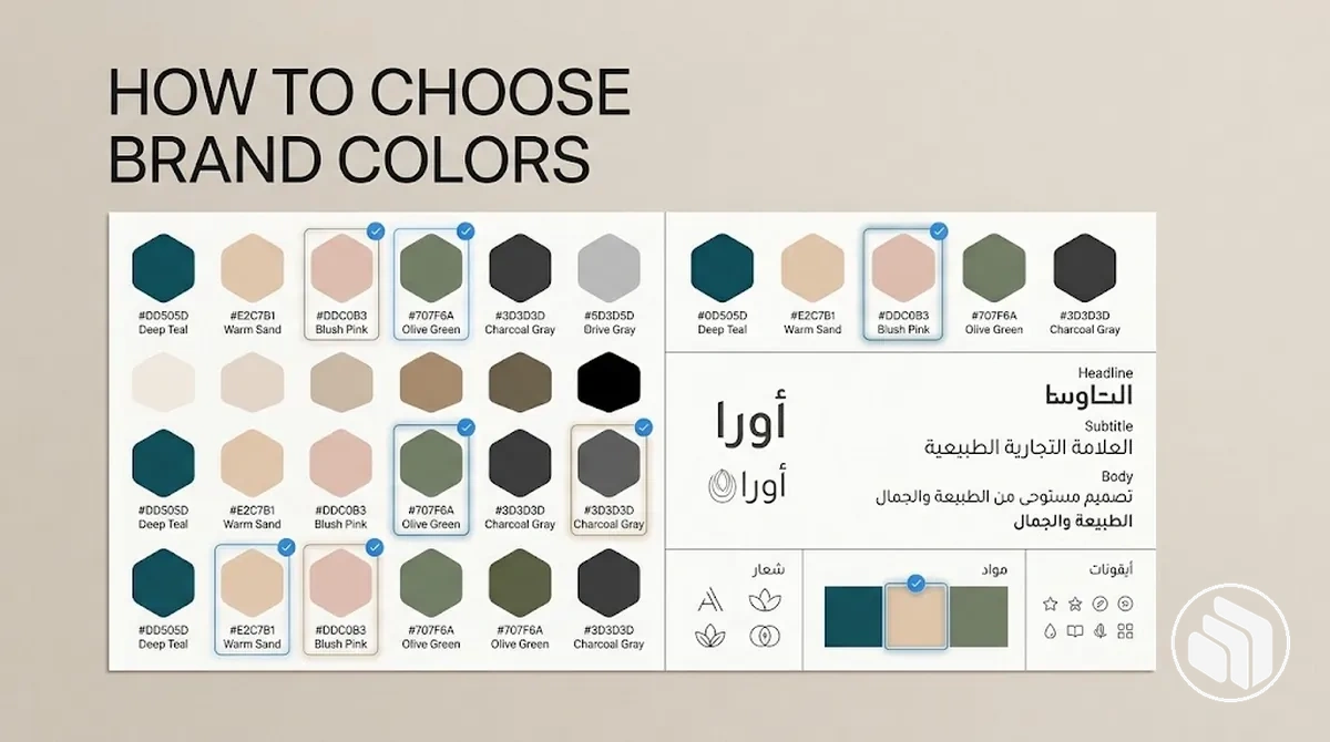
Candidate decision check
Test a brand color before you finalise it
Use these five gates for one candidate color or palette. A candidate should stay in evaluation while any required gate remains unresolved.
Decision rule: keep or adjust the candidate according to the first unresolved gate; do not compensate for a failed context or accessibility condition merely because the hue is visually appealing.
The process moves from selection criteria to a core color, then to supporting-color relationships, palette breadth, and final accessibility testing.
Table of Contents
Set Brand Color Selection Criteria Before Comparing Options
Define brand color selection criteria before visual preference or side-by-side comparison drives the decision.
Evaluate each candidate color against brand goals, brand personality, intended audience perception, and the conditions in which the color must work.

Two kinds of fit to test
Strategic fit
- Brand goals and brand personality: support the intended identity and perception rather than personal taste alone.
- Audience perception: consider how the intended audience may interpret the color in its social and usage context.
- Category and cultural context: check whether category expectations or cultural associations change meaning or suitability.
- Distinctiveness: compare common category cues and relevant competitors when differentiation matters.
Practical fit
- Application needs: keep the color usable across the digital, print, light, dark, or other applications the identity requires.
- Existing visual assets: test it with retained typography, imagery, graphics, and other identity elements.
- Accessibility: verify intended color combinations against the relevant contrast requirement for the specific text, interface, or communication use.
A candidate can fit the intended personality yet still fail in use: context may redirect its meaning, similarity to category conventions may reduce distinctiveness, and application constraints or contrast may make the color impractical.
Color selection is one decision within the broader brand identity design process, rather than a substitute for that wider sequence.
For example, two visually appealing candidate colors may both fit the intended brand personality, yet one may conflict with existing assets or provide less usable contrast in required applications.
The selection criteria therefore provide the basis for choosing a core color under the brand's actual conditions, not a universal formula for every brand.
Choose a Core Brand Color Using Meaning and Context
Choose a core brand color by starting with an intended brand attribute, identifying plausible color associations, and then testing each candidate hue against audience context, cultural context, category context, and application constraints.
Select the candidate whose intended meaning remains suitable under those conditions rather than choosing from a generic color-psychology association alone.
- Define the intended brand attribute: State the quality the identity should communicate, such as calm, energy, trust, or luxury, so the core brand color has a clear selection purpose.
- Identify plausible color associations: Find candidate hues commonly associated with the intended attribute, but treat each color association as a hypothesis rather than a fixed meaning.
- Test contextual fit: Compare each candidate hue with the intended audience context, cultural context, and category context; retain candidates whose likely interpretation supports the intended attribute under those conditions.
- Test application constraints: Apply each remaining candidate to relevant backgrounds, media, and identity materials to identify practical conditions that could weaken usability or alter its visual effect.
- Select the strongest candidate: Choose the core brand color whose intended meaning and contextual fit remain defensible after these checks, then carry it forward for testing with supporting colors.
Key distinction
Association-led shortcut
Treats a cue such as blue = trust or red = energy as the final decision rule.
Context-led choice
Uses the association as a starting hypothesis, then checks audience, culture, category, imagery, surrounding colors, and real applications before selection.
The same hue can support different interpretations when category cues, imagery, value, saturation, or surrounding colors change.

For example, a deep blue candidate may support a calm, restrained identity when paired with understated imagery, yet feel more energetic when surrounded by brighter colors and dynamic graphics.
If calm is the intended brand attribute, the candidate core brand color is justified only when the relevant context and application preserve that direction; it can then proceed to supporting-color tests rather than being treated as permanently correct.
Interpret Color Psychology in the Brand Context
Color psychology describes commonly reported associations between colors and perception, but a color association is context-dependent rather than a fixed emotional effect.
In branding, color meaning can therefore inform how a candidate hue is evaluated without functioning as a universal dictionary of responses.
What can change the interpretation
- Shade and saturation
- They can change the perceived intensity and character of the same hue family.
- Surrounding colors
- Neighbouring colors can make the hue feel more restrained, energetic, soft, or forceful.
- Audience and culture
- Associations can differ across groups and cultural contexts.
- Category and imagery
- Category cues and imagery can reinforce, weaken, or redirect the intended association.
The useful branding implication is to treat the association as evidence to question or narrow a candidate color, then evaluate whether the interpretation remains appropriate in the intended context.
The example below keeps the color family related while changing contextual cues so the variation in interpretation is visible rather than inferred from hue alone.

A color association can support candidate evaluation, but color choice alone does not guarantee an emotional or behavioural response.
Color psychology is therefore an interpretive aid for brand fit, not a substitute for the separate harmony or accessibility checks required before a color system is finalized.
Build Candidate Brand Color Combinations with Color Harmony
Color harmony organizes relationships between a core color and candidate supporting colors to create brand color combinations with different degrees of cohesion and contrast.
Harmony alone does not determine palette suitability because value, saturation, neutral colors, proportion, application context, and accessibility can change how a theoretical relationship works in practice.
The comparison below shows how analogous, complementary, split-complementary, and triadic relationships position colors around a color wheel, the visual tension or cohesion they may create, and the conditions in which each relationship can be useful.
These are candidate relationships rather than rankings or guarantees of brand fit.
| Harmony Relationship | Color Relationship | Typical Visual Effect | Use Condition |
|---|---|---|---|
| Analogous | Colors positioned next to or near one another on the color wheel | May create a visually cohesive, closely related combination | Useful when the identity needs close hue relationships and enough variation can be created through value, saturation, or proportion |
| Complementary | Colors positioned opposite one another on the color wheel | Can create pronounced color contrast and visual tension | Useful when clear color separation is appropriate and the contrast can be controlled through value, saturation, neutrals, or proportion |
| Split-complementary | A core color paired with the two colors adjacent to its complement | Can retain noticeable contrast while distributing it across two supporting hues | Useful when contrast is wanted with more supporting-color flexibility than a direct complementary pair |
| Triadic | Three colors spaced approximately evenly around the color wheel | Can create varied color contrast while maintaining a structured relationship | Useful when several distinct hues are needed and their value, saturation, and proportion can be controlled for the intended application |
Theoretical color harmony describes hue relationships, but practical combinations can change substantially when value and saturation are adjusted.
Neutral colors can create visual separation or reduce competition among stronger hues, while proportion determines which colors dominate and which remain supporting accents.
For example, a complementary pair used at similar saturation and proportion may feel more visually forceful than the same pair with one hue muted and used in a smaller proportion.
The diagram maps the geometric relationships among the four harmony types, while the table and prose describe their conditional brand-use implications.
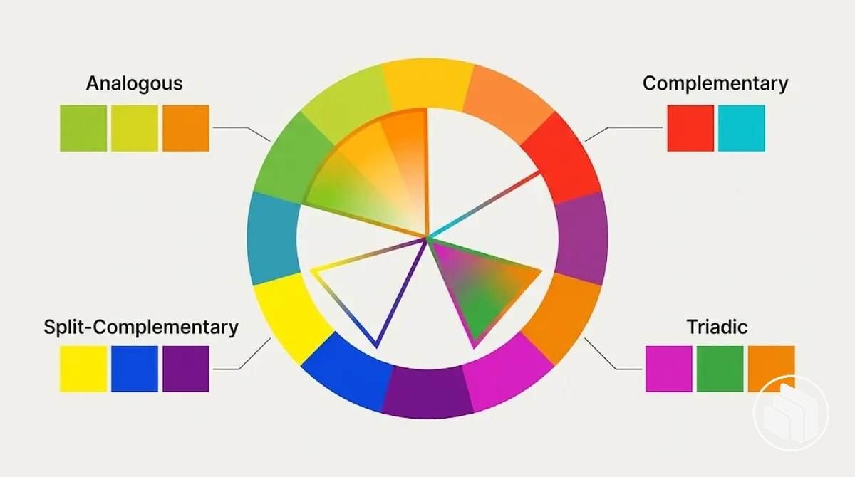
For a candidate palette, a core color can therefore remain dominant while supporting colors are adjusted in value, saturation, neutrality, or proportion until the combination suits the intended application.
At this stage, the goal is to identify compatible candidate combinations rather than assign permanent primary, secondary, or accent roles.
Formal roles and usage rules belong to the later step to build a brand color system.
Decide How Many Brand Colors You Need
There is no single correct number of brand colors.
Palette size should reflect the functional roles the colors need to cover and the complexity of their applications, rather than a fixed three-color, five-color, or other universal formula.
Evaluate the number of brand colors by function: the criteria below show conditions that can support a smaller palette or justify additional supporting colors without treating a particular color count as mandatory.
The aim is to cover necessary roles across communication contexts while keeping the palette practical for consistent use.
- Identity complexity: A focused identity with few visual requirements can support a smaller set of core colors, while an identity that must express more distinct visual states or applications can justify a broader palette.
- Communication contexts: Fewer contexts can reduce the need for color variation, while multiple digital, print, environmental, or campaign contexts can justify additional supporting colors when they perform distinct functions.
- Primary and supporting emphasis: If a small set of core colors provides sufficient hierarchy, additional hues may add unnecessary complexity; more supporting colors can be justified when distinct levels of emphasis are genuinely required.
- Neutral coverage: Neutral colors can provide backgrounds, text support, and visual separation without requiring every function to be handled by another expressive hue.
- Accent needs: A dedicated accent can be useful when specific elements need distinct emphasis, while multiple accents are justified only when separate communication functions require them.
- Accessibility: Palette breadth may need to accommodate color combinations with suitable contrast for their intended applications, but adding colors does not by itself make a palette more accessible.
- Consistent use: A smaller palette can be easier to apply consistently when requirements are simple, while a broader palette adds complexity and therefore needs clear enough distinctions for people to use its colors consistently.
The comparison graphic illustrates palette breadth through functional role coverage, showing a compact set and a broader set in comparable brand-use contexts rather than prescribing a universal number of colors.
Core, neutral, and accent roles are visual cues for why additional colors may be needed, not a pass-or-fail formula.
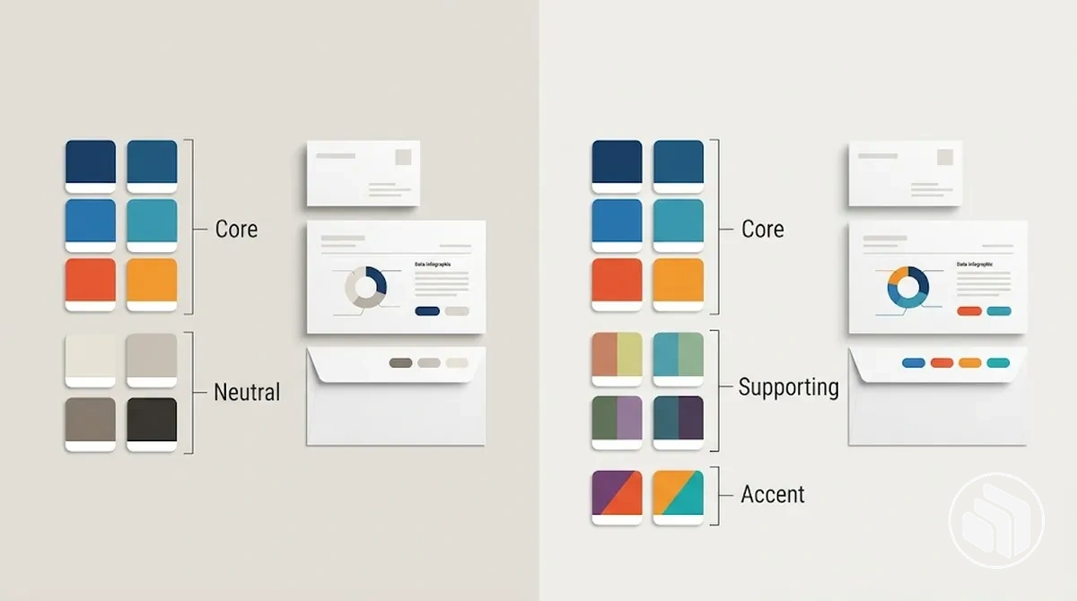
For example, a simple identity may work with a small set of core colors and neutral colors when those choices cover its communication contexts, while a broader identity may require supporting colors for additional applications or accent needs.
Test Brand Color Contrast and Accessibility Before Finalizing
Test brand color contrast and accessibility in representative foreground and background combinations and interface uses before finalizing the palette.
Colors that look distinct as isolated swatches can provide insufficient contrast or become difficult to read or distinguish when applied to text, backgrounds, controls, and interface states.
The verification checklist tests how selected colors behave in actual combinations rather than judging isolated swatches by eye.
It covers readability and distinguishability as well as situations where color-only signals could otherwise carry essential information.
WCAG 2.2 AA contrast values to verify
- Normal text
- Minimum contrast: 4.5:1 between text and its background.
- Large text
- Minimum contrast: 3:1. WCAG defines large text as at least 18 pt regular or 14 pt bold.
- Required non-text contrast
- Minimum contrast: 3:1 for visual information needed to identify relevant UI components, states, or graphical objects against adjacent colors.
- Color as information
- Do not use color as the only visual means of conveying a state, instruction, warning, or distinction.
- Check text against its background: Test each intended foreground text color with the backgrounds on which it will appear, and verify the pairing against the applicable accessibility criterion for the text size and use case.
- Check relevant non-text elements: Test controls, icons, boundaries, focus indicators, and other non-text elements where visual contrast is needed to identify an interface component or its state.
- Check color-only signals: Where color communicates a state, warning, selection, or other information, provide a non-color cue such as a label, icon, pattern, or other distinguishable indicator so meaning does not depend on color alone.
- Check light and dark contexts: Test each required color pairing in its intended light context and dark context because changing the background can change usable contrast and readability.
- Check representative applications and states: Apply the palette to realistic text, navigation, controls, messages, and other required states so contrast and accessibility are evaluated under the conditions in which people will use them.
- Adjust and retest: If a pairing does not satisfy the relevant condition, change its value, background, or functional role and test the revised combination again rather than preserving an unusable pairing solely for brand consistency.
Usability can change with color value and background as well as with text size, element type, and whether the application uses a light or dark context.
Non-color cues also matter when an interface state or message would otherwise rely on color alone for distinguishability.
Apply the criterion to the actual use case: normal text, large text, and required non-text contrast have different thresholds, so test the exact foreground/background or adjacent colors used in each state rather than judging isolated swatches by eye.
The image applies the same selected colors to representative uses, showing where a foreground/background pairing or color-only signal needs adjustment.

For example, if a supporting color produces difficult-to-read text on a light background, its value can be adjusted or its role changed while the broader palette character remains intact; the revised pairing should then be retested for that use case.
Successful testing validates the selected palette for its intended applications before its color roles, specifications, and operational rules are formalized in brand guidelines.