
How to Build a Brand Typography System
A brand typography system turns selected typefaces into repeatable rules for font roles, hierarchy, type scale, spacing and usage. Build it by assigning each recurring text function to an approved role, defining relative relationships instead of isolated values, documenting permitted treatments and exceptions, and testing those relationships in representative layouts; exact sizes and spacing can adapt to the format as long as the roles and hierarchy remain clear.
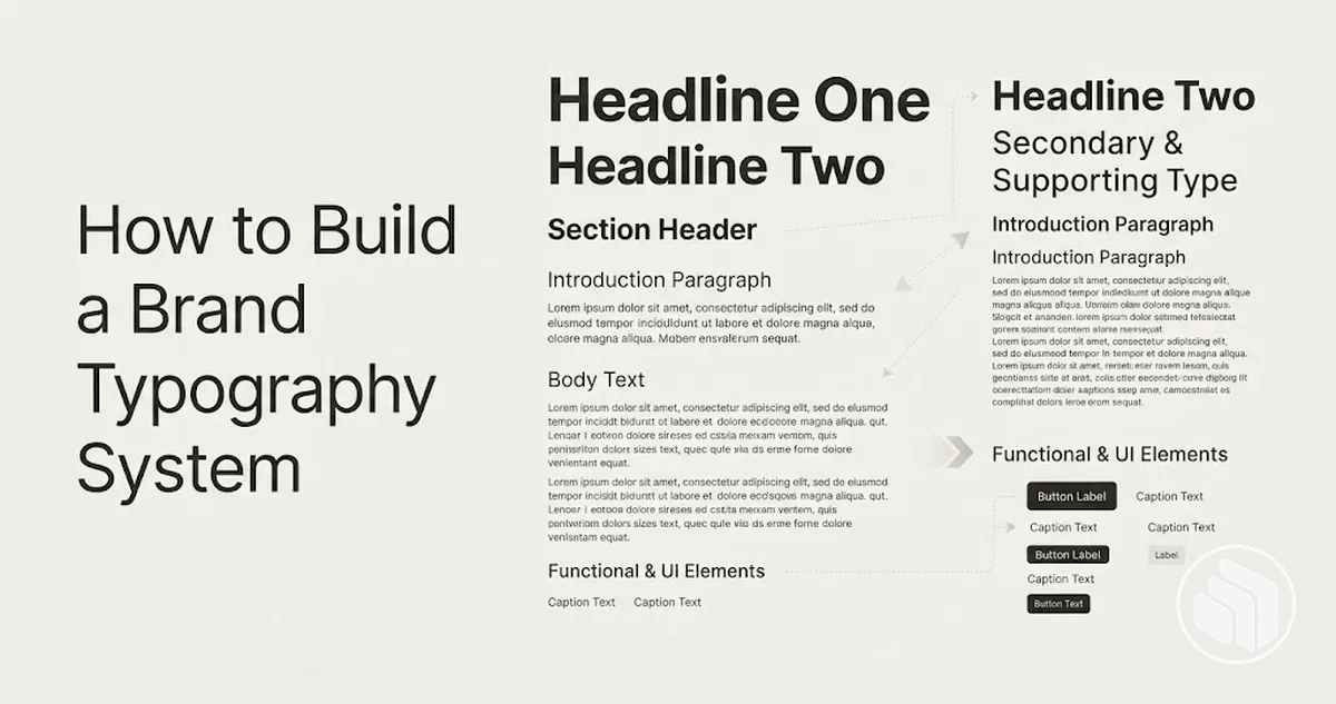
Brand typography system blueprint
Use this sequence after choosing the brand typefaces. Each stage defines an output that constrains the next stage, so typography decisions remain repeatable instead of becoming layout-by-layout exceptions.
-
Assign font rolesSelected typefaces → primary, secondary or accent responsibilities tied to recurring content functions. These are responsibilities, not a required font count.
-
Build hierarchyInformation priority → heading, body and supporting levels distinguished through coordinated size, weight, style and spacing.
-
Set scale and spacingBase size + relative scale + role-based line height and vertical spacing → repeatable relationships rather than isolated numbers.
-
Define usage rulesApproved weights, styles, casing, alignment and exception conditions → clear standard states and controlled departures.
-
Test and adaptRepresentative compact and content-heavy layouts → verify hierarchy, readability and role consistency, then adapt exact values to real format constraints.
-
Troubleshoot and normaliseObserved symptom → verify the underlying role, hierarchy, scale, spacing or exception → correct the smallest confirmed cause and retest.
Decision rule: preserve the relationships first. Change individual values when content density, available space, viewing conditions or font metrics make the current values impractical.
Typeface selection is a prior decision: this process starts after the brand fonts are chosen. The system is reusable when the same recurring content function receives the same approved role and treatment in comparable conditions, with documented exceptions when a format genuinely requires one.
Table of Contents
Establish Clear Roles for Each Brand Font
Each selected font needs a defined responsibility before hierarchy and scale can be applied consistently.
A brand font role states what the font is responsible for, the usage context it serves, and where exceptions to that responsibility are allowed.
Role ownership begins with the typefaces already selected, not with adding fonts to fill a predetermined set of categories.
One typeface can serve multiple roles when changes in weight, size, or treatment provide the distinctions the system needs, while a secondary font or accent font is useful only when it has a distinct recurring content function.
Typeface selection is a prior decision; this planning step begins after choosing brand fonts.
The example below labels responsibilities rather than recommending a particular number or combination of typefaces.
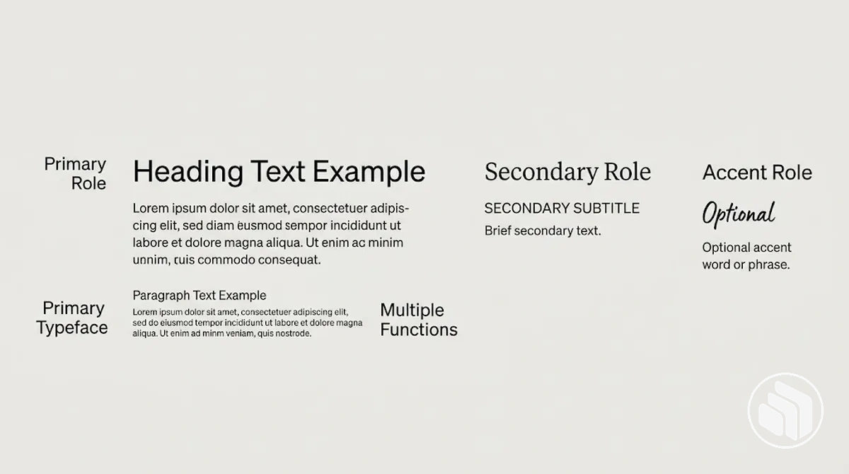
The role categories below separate responsibilities rather than font-selection preferences.
A distinct role has a clearly stated communication function that recurs in the usage context; a redundant role duplicates a responsibility that another typeface already serves.
- Primary font: assign the primary role to the typeface that serves the recurring core text responsibility in the defined usage context.
- Secondary font: assign a secondary role only when the typeface supports a distinct, recurring communication function that the primary role does not cover.
- Accent font: reserve an accent role for a narrow, controlled function when that function recurs; otherwise, the additional role is redundant.
- Role exception: record an exception when a medium or format calls for a different treatment, while keeping responsibility for that usage context explicit.
Clear role ownership reduces arbitrary switching between typefaces in otherwise similar layouts and gives the later hierarchy a stable set of responsibilities to work with.
For example, if two selected fonts can both serve the same recurring content function without a stated distinction, similar layouts can assign that content differently; defining which font owns the role, and when an exception applies, makes the responsibility explicit and supports consistency.
Define Primary, Secondary, and Accent Font Responsibilities
Primary, secondary, and accent font labels describe different responsibilities, not a mandatory font count.
A primary font may carry the most prominent and frequent communication, while secondary and accent roles exist only when they add a distinct function.
A system may have fewer than three distinct typefaces even when it contains multiple text roles, because one typeface can serve more than one responsibility.
A secondary font is justified when functional contrast supports a recurring role, while an accent font is justified when limited emphasis has a distinct, controlled purpose.
The diagram distinguishes these responsibility classes by relative prominence and frequency of use rather than presenting them as a fixed formula.
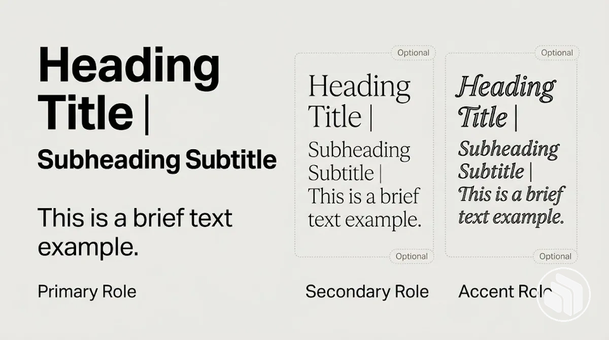
- Primary font: carries the core communication responsibility with the greatest prominence or frequency in the system. Its constraint is role clarity: frequent use remains tied to its defined function rather than extending to every treatment.
- Secondary font: supports a recurring function where functional contrast serves a distinct supporting role. It may be omitted when that contrast does not add a separate responsibility.
- Accent font: is reserved for limited-use emphasis with a specific controlled purpose. The accent role may be omitted when it adds no distinct function beyond responsibilities already covered by the primary or secondary role.
Assign Each Font to Specific Content Functions
Map every recurring content function to an approved font role and permitted treatment so the same type of content is not formatted differently from one layout to another.
Display text, headings, body copy, labels, captions, and utility text can share a typeface when their approved treatments make their functions clear.
Assign high-priority reading functions according to the emphasis and readability they require, while supporting functions can use less prominent treatments within an approved font role.
Body copy should prioritise readability, with line length and spacing handled as part of its permitted treatment, while display text and headings can use stronger prominence and contrast.
Labels, captions, and utility text support the main content and should remain identifiable without requiring a different typeface for each function.
The example maps these recurring content functions to approved roles within one coherent layout.
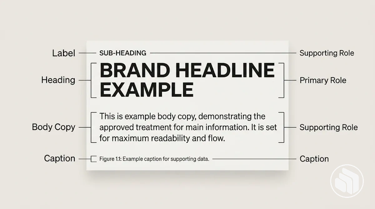
- Display text and headings: map these prominent content functions to the approved font role responsible for emphasis, using only the permitted treatment for that role.
- Body copy: assign body copy to the font role intended for sustained reading, with a treatment that supports readability through appropriate size, line length, and spacing for the layout.
- Labels: map recurring labels to an approved supporting font role and treatment that keeps short functional text distinct without assigning another typeface solely to that function.
- Captions: assign captions to a supporting font role with a treatment that distinguishes contextual text while keeping it subordinate to the content it describes.
- Utility text: map utility text to an approved font role and restrained treatment appropriate to its supporting function and frequency of use.
When one typeface serves several content functions, size, weight, or spacing can distinguish the permitted treatments without changing the underlying font role.
Keep the mapping explicit: each recurring content function uses an approved font role and treatment rather than triggering ad hoc font switching.
Build a Clear Typography Hierarchy
A typography hierarchy orders text by information priority, using visual differences to signal which content should receive attention first and which content supports it.
Typography hierarchy works when each heading level and body text treatment consistently reflects relative importance rather than relying on size alone.
Size, weight, style, and spacing contribute to contrast together, so a more prominent text role does not need to differ from the next level on every attribute.
Size can increase prominence, weight or style can strengthen distinction, and spacing can clarify relationships between a heading level and the content around it.
Coordinated contrast makes visual priority clearer than changing size while leaving other relevant relationships ambiguous.
The annotated example shows how information priority can be expressed through coordinated differences in prominence, weight, and spacing while retaining body text as a stable reading level.
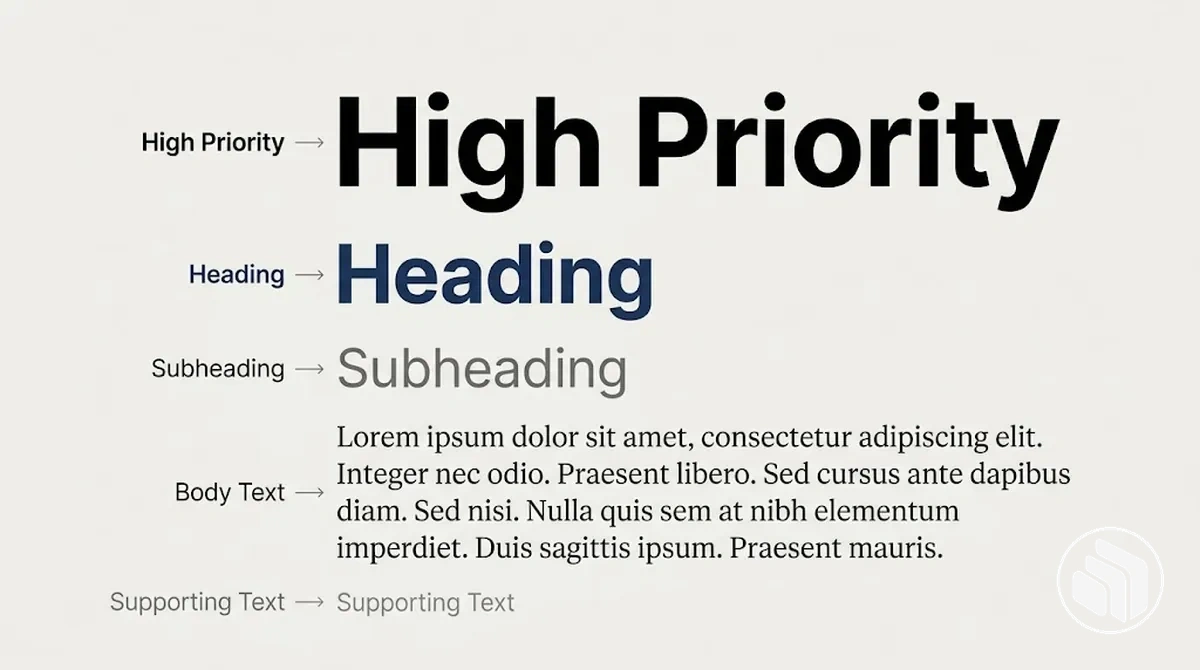
Verify the typography hierarchy by comparing adjacent levels: each should be distinguishable enough to communicate a change in information priority without making every difference extreme.
If two neighbouring levels look too similar, the visual cue between information groups becomes weaker; adjust the relevant size, weight, style, or spacing until the distinction supports meaning and scanability.
The ordered example below illustrates decreasing prominence and the relationship among levels rather than prescribing a mandatory naming system or fixed specification.
- Highest-priority text: signals the main information focus through the strongest appropriate prominence and clear separation from supporting content.
- Major heading level: identifies an important content division with enough contrast from both the highest-priority text and the level that follows.
- Supporting heading level: differentiates a subordinate information group while remaining visibly related to the major heading above it.
- Body text: carries sustained reading content with less prominence than headings while maintaining readability and a clear relationship to the heading it follows.
- Supporting text: handles secondary information with restrained prominence while remaining distinguishable and readable in its context.
Define Heading Levels by Importance
Each heading level should signal a distinct degree of semantic importance while remaining part of the same coordinated typography system.
Differentiate heading levels by relative prominence and by their relationship to adjacent levels, rather than assigning universal point sizes or ratios.
Size, weight, style, and spacing can work together to create the required contrast between adjacent levels, and the combination can vary with the layout and content.
The annotated example demonstrates relative separation between adjacent heading levels through coherent differences in prominence and spacing rather than treating any single visual attribute as the rule.
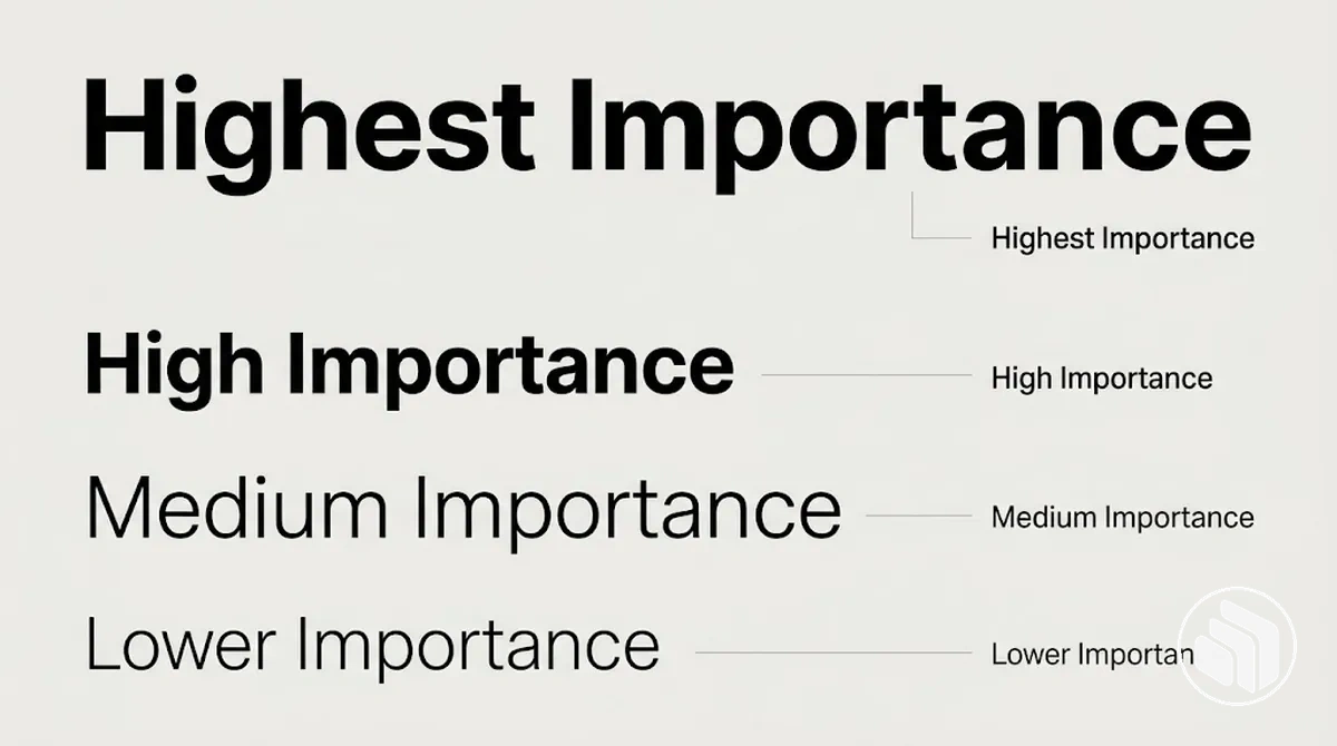
The criteria below verify relative distinctions rather than absolute sizes.
Apply them from semantic importance to visual execution so each heading level has a clear relationship to the levels around it.
- Semantic importance: assign greater prominence to a heading level when its content has greater structural importance within the current context, while keeping lower levels visibly subordinate.
- Adjacent-level separation: differentiate neighbouring levels with enough contrast in size, weight, style, spacing, or a coordinated combination of these attributes to make their distinct jobs apparent without excessive contrast.
- Consistency: use the same treatment for the same heading level in equivalent contexts so its relative importance remains consistent within the typography system.
- Practical fit: verify each treatment in its actual layout and adjust the combination of size, weight, style, or spacing when adjacent levels are insufficiently distinct or unnecessarily far apart.
Define Body, Label, Caption, and Utility Text Levels
Body text, label, caption, and utility text are supporting text levels with different reading tasks, so their treatments should reflect different requirements for readability, prominence, and density.
Body text serves extended reading, while labels, captions, and utility text support shorter, more specific reading tasks.
Body text requires a treatment that supports sustained readability, including appropriate size, weight, spacing, and line length for its reading context.
Short supporting text can use lower prominence or greater density when the reading task permits it, but visual subordination should not come at the expense of legibility.
The exact combination of size, weight, and spacing therefore depends on the content, layout, and expected reading conditions rather than one fixed specification.
The annotated example demonstrates these different reading tasks in one layout, allowing the relative prominence and legibility of body text, labels, captions, and utility text to be compared in context.
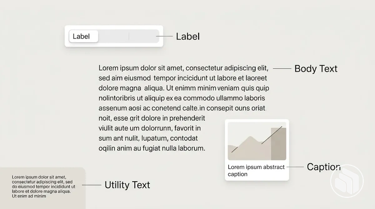
The categories differ because their reading tasks differ.
Match each treatment to the amount of reading, required prominence, content density, and conditions in which the text needs to remain legible.
- Body text: serves extended reading, so prioritise sustained readability with sufficient prominence and a size, weight, spacing, and line length appropriate to the content and layout.
- Label: identifies or categorises an element through a short reading task, so it can use restrained prominence and compact treatment when the label remains clearly legible in its context.
- Caption: supports nearby content with brief explanatory or identifying information, so keep its prominence subordinate to that content while maintaining enough spacing and legibility for comfortable reading.
- Utility text: supports short functional reading tasks, so its treatment can be compact and relatively low in prominence when its size, weight, and spacing still make the information legible under the expected reading conditions.
Set a Consistent Type Scale and Spacing System
A type scale controls the relative size relationships among text roles, while spacing coordinates line height, vertical rhythm, and separation between those roles.
Together, the type scale and spacing system make hierarchy repeatable without requiring every format to use identical numeric values.
Start from a base size appropriate to the reading context, then derive each text role through a relative size relationship rather than treating individual sizes as unrelated choices.
A scale ratio can provide mathematical consistency, but no single ratio is universally correct; its practical value depends on whether the resulting hierarchy remains clear for the content density and format.
Coordinate line height and spacing with those relative sizes so more prominent and supporting roles remain visually related.
When the format changes, preserve the intended relationships even if the individual values need adjustment.
- Relative size: relate each text role to the base size so changes in prominence follow a repeatable type scale instead of isolated size decisions.
- Spacing: coordinate line height and vertical spacing with each text role's reading task so separation supports readability as well as hierarchy.
- Practical usability: treat mathematical consistency as a starting relationship, then test whether content density, hierarchy, and format make the resulting scale and spacing usable in context.
Test the combined type scale and spacing system in representative layouts, checking whether text roles remain distinguishable and readable without excessive or insufficient separation.
If hierarchy or readability weakens in a different format, adjust the values while retaining the same relative logic.
Consistency comes from repeatable relationships among size and spacing, not from forcing every context onto one exact set of values.
Choose a Base Size and Scale Ratio
The base size serves as the reference point from which other text roles derive their relative sizes, while the scale ratio determines the degree of separation between those derived sizes.
A larger scale ratio creates greater contrast between hierarchy levels, while a smaller ratio keeps their relative size differences closer; neither choice is universally suitable without considering the reading context.
Readability should guide whether the base size and derived sizes remain practical, while content density and available space affect how much separation the format can accommodate.
The number of hierarchy levels also matters because the scale ratio compounds the relative separation across successive roles.
A mathematically coherent scale therefore requires testing against the actual content and format rather than automatic acceptance of its derived sizes.
The following criteria determine whether the relationship between base size, scale ratio, and derived sizes produces a practically usable hierarchy.
Evaluate them together because increasing contrast can clarify level separation while also changing how efficiently the content fits the available space.
- Readability: verify that the base size and derived sizes remain comfortable to read in the intended format and reading conditions.
- Content density: check whether the resulting relative sizes preserve enough room for the amount of content without weakening the intended hierarchy.
- Available space: evaluate whether the derived sizes and resulting contrast fit the layout without forcing text roles into impractical proportions.
- Hierarchy depth: test whether the scale ratio creates sufficient distinction across the required hierarchy levels without producing excessive separation between the smallest and largest roles.
Set Line Height and Spacing for Each Text Role
Line height and vertical spacing should vary with the text role and its reading conditions rather than use one multiplier throughout the typography system.
Body text, headings, and supporting text have different spacing needs because their size, weight, line length, and reading density differ.
Longer line length or greater reading density can require more line height to keep successive lines clearly separated, while larger or heavier headings may use tighter leading when their lines remain distinct.
Vertical spacing also supports hierarchy by separating different content groups and keeping related text visually grouped.
Test the amount against the actual font metrics, size, line length, content density, and format rather than assuming one fixed multiplier applies to every role.
The role-based conditions below connect each typographic state to its spacing requirement and the resulting readability or hierarchy consequence.
- Body text: use line height that supports sustained reading at the chosen size and line length; denser or longer lines may require more interline separation to maintain readability.
- Headings: evaluate line height against heading size, weight, and wrapping; larger or heavier headings may use tighter leading when adjacent lines remain distinct, while vertical spacing should preserve their prominence and separation from surrounding content.
- Labels and captions: keep compact supporting text legible at its chosen size and density, using enough line height for multi-line text and enough vertical spacing to maintain its relationship with the content it identifies or describes.
- Dense or constrained contexts: test any reduction in line height or vertical spacing against readability and hierarchy rather than compressing every text role by the same amount.
Define Typography Usage Rules
Typography usage rules are repeatable constraints for applying the approved typography system after its roles have been defined.
They specify permitted states and conditions so recurring design decisions can be applied consistently instead of being resolved from memory or individual taste.
The rules should cover approved typefaces and role assignments, permitted weights and styles, sizing behaviour, spacing, and the conditions under which exceptions are justified.
Each rule should distinguish standard application from a permitted exception so designers know what can be used directly and what requires an explicit reason.
These rules remain specific to typography; documenting them within broader brand guidelines is a separate governance task.
The list below turns those typography decisions into repeatable operating constraints.
- Approved typefaces: permit only the typefaces already assigned to the typography system for standard applications; introducing another typeface requires a justified exception rather than an improvised substitution.
- Role assignments: apply each approved typeface to its defined content role; changing that assignment requires a stated condition that the standard role cannot adequately serve.
- Weights and styles: use the weights and styles approved for the relevant role; an unapproved weight or style should be treated as an exception rather than a routine variation.
- Sizing behaviour: preserve the defined hierarchy relationships when text sizes adapt to a format or reading condition instead of choosing isolated sizes by taste.
- Spacing: apply the established line-height and vertical-spacing relationships for each text role, adjusting them only when the reading condition or format requires a justified exception.
- Exceptions: document why a departure is necessary, where it applies, and whether it should remain exceptional or be normalised as an approved state when the same need recurs.
Explicit exceptions limit undocumented drift by separating intentional departures from accidental variation.
For example, if a familiar heading role needs stronger emphasis, the rule directs the designer to use its approved treatments or document an exception instead of improvising an extra font or weight.
This keeps typography usage rules repeatable while still allowing justified changes when the standard application does not fit the context.
Control Weights, Styles, Casing, and Emphasis
Font weight, style, casing, and emphasis should signal meaning or priority within the typography hierarchy rather than add arbitrary decoration.
Each treatment needs a permitted use so the intended contrast remains recognizable without creating uncontrolled variants.
Purposeful emphasis uses an approved treatment when it communicates a distinct change in meaning, function, or prominence; redundant emphasis adds treatments without adding a distinct communication purpose.
Font weight, italic style, and casing can each create contrast, but multiple treatments should not be stacked unless each contributes distinct meaning.
Repeated or unnecessary combinations can create visual competition and weaken the consistency of established emphasis patterns.
Apply the criteria below by selecting the minimum treatment needed to communicate the intended emphasis.
- Font weight: use an approved weight when greater or lower prominence supports the text role and hierarchy; adding weight without a distinct emphasis purpose creates redundant contrast and increases the risk of overuse.
- Style: reserve an approved style, such as an italic style, for situations where it communicates a defined distinction or emphasis; repeated styling without a separate meaning can reduce its usefulness as a signal.
- Casing: use approved capitalization when it distinguishes a defined function, such as a label treatment, while preserving legibility in that context; changing casing solely for stronger visual impact creates another variant without necessarily adding meaning.
- Emphasis combinations: combine weight, style, or casing only when each treatment contributes a distinct communication purpose; otherwise, use the minimum permitted emphasis needed to create the required contrast without unnecessary visual competition.
Set Alignment and Line-Length Limits
Alignment and line length should support reading flow under the actual content, reading direction, and format conditions rather than follow one universal setting.
For body text, the suitable measure depends on factors such as font size, font metrics, available width, and the amount of continuous reading, while short display text can use different line-length relationships because its reading task is different.
Text alignment should be evaluated against the reading direction and content type so the starting edge, grouping, and surrounding layout support scanability.
Line length affects how much text appears before the reader moves to the next line, but a character count alone does not determine readability because character widths vary with the typeface, size, and font metrics.
Extended body copy therefore needs a measure suited to sustained reading, whereas short display text may use a wider or narrower measure when its size, prominence, and limited reading duration make that treatment appropriate.
The criteria below determine suitable alignment and measure by connecting each variable to its reading condition and practical implication.
- Reading direction: choose alignment that supports the direction in which the text is read and provides a predictable starting point for successive lines; evaluate alternative alignment when the content has a different functional or display purpose.
- Content type: give extended body text a measure that supports continuous reading, while evaluating short headings and display text according to their shorter reading task rather than applying the body-text limit unchanged.
- Available measure: evaluate line length against font size, font metrics, available width, and resulting character count; treat character-count guidance as contextual rather than as a universal threshold.
- Surrounding layout: keep alignment and line measure consistent with the established layout when that relationship supports scanability and readability, and adjust them when the content or format creates a materially different reading condition.
Verify the resulting measure with representative content in the intended format, checking that line transitions, scanability, and readability remain appropriate to the reading task.
Test the Typography System in Representative Brand Layouts
Typography system testing should use a representative layout because isolated style definitions cannot show how approved roles, type scale, and spacing behave under realistic content pressure.
Testing more than one representative condition can expose hierarchy, readability, and role consistency problems that may not appear in a single mock-up.
Select contrasting content situations without turning the test into a broader brand audit.
A compact layout can stress limited space, short text roles, and close hierarchy relationships, while a content-heavy layout can expose different issues when longer body text and multiple hierarchy levels must coexist.
Apply the same approved typography system to both conditions so observed differences can be traced to the layout condition rather than an unnecessary change in the system.
One successful layout should therefore be treated as evidence for that tested condition, not as universal validation for every format.
Record each failure as an observed relationship between the layout condition and the applied typography state, then adjust the smallest relevant variable, such as a role treatment, type scale relationship, or spacing relationship.
The sequence below keeps each test observable and requires a retest after an adjustment before the revised state is accepted.
- Select representative content: choose realistic content situations that place different pressures on the typography system, including a compact layout and a content-heavy layout where appropriate.
- Apply the system: use the approved font roles, type scale, and spacing relationships without introducing unrelated typography changes during the test.
- Observe the outcome: inspect hierarchy, readability, and role consistency in each representative layout, noting where the applied typography state becomes unclear or impractical under that condition.
- Record failures: identify the specific condition and typography variable associated with each observed problem so the adjustment remains targeted rather than becoming a broad redesign.
- Adjust and retest: change the smallest necessary variable, reapply the typography system to the affected representative layout, and retest the result before retaining the adjustment.
Check Hierarchy, Readability, and Role Consistency
Typography verification should check whether hierarchy contrast keeps adjacent levels distinguishable, body text remains readable, and role adherence matches the approved typography system.
Use observable pass/fail conditions for hierarchy, readability, role use, spacing consistency, and exception control rather than subjective aesthetic judgments.
- Hierarchy contrast: check adjacent hierarchy levels in representative content. Pass when each level is distinguishable from the level beside it; fail when adjacent levels are too similar to communicate their intended distinction.
- Body text readability: check body text at its applied line length and spacing under the tested layout conditions. Pass when extended text remains readable in that context; fail when the applied treatment interferes with sustained reading.
- Role adherence: verify that each recurring content function uses its approved font role and treatment. Pass when assignments match the defined system; fail when a role uses an unapproved typeface, weight, style, or other treatment without a documented exception.
- Spacing consistency: check equivalent text roles in comparable conditions for the approved spacing relationships. Pass when those relationships remain consistent; fail when equivalent roles use unexplained spacing variations.
- Emphasis control: check whether weights, styles, or casing used for emphasis belong to the approved treatment for that role. Pass when emphasis matches the defined usage rule; fail when an unapproved style appears without an explicit exception.
- Exception control: check every departure from an approved role or treatment. Pass when the exception is documented and limited to its stated condition; fail when the departure is undocumented, in which case it should be documented as a justified exception or corrected to match the approved system.
Adapt Type Sizes and Spacing for Different Formats
Format adaptation may change exact type size and spacing values when a new format constraint changes available space or reading conditions, while the relative hierarchy and each text role should remain recognizable.
The objective is consistency in role relationships rather than identical numeric values across formats.
Available space may require smaller or larger type sizes or tighter or looser spacing when the existing treatment no longer fits the format appropriately.
Viewing distance can justify a different type size when text must remain readable under a changed reading condition, while greater content density can require controlled spacing adjustments to accommodate content without flattening the relative hierarchy.
These changes should respond to the specific format constraint rather than apply one scaling rule to every format.
Preserve the relationship among text roles even when their exact values change.
Retest the adjusted typography with representative content to verify that hierarchy and readability remain clear under the new condition.
Broader governance beyond typography-specific format adaptation belongs to brand consistency across channels; here, the focus remains on preserving role relationships while type size and spacing values adapt.
- Assess the constraint: identify whether available space, viewing distance, content density, or another format condition affects the current typography baseline.
- Adjust the variable: change the affected type size or spacing value while preserving the intended relationship between text roles.
- Verify the result: check that the adjusted treatment maintains relative hierarchy and readability in representative content rather than judging numeric values in isolation.
- Retest for consistency: retest the adjusted system in the target format and retain the change when the role relationships remain recognizable under that condition.
Troubleshoot Inconsistent Typography Behaviour
Inconsistent typography behaviour appears as observable departures from the approved hierarchy, font role assignments, scale, spacing, or usage rules.
A symptom such as competing hierarchy, an unexplained font change, a repeated one-off size, or spacing inconsistency indicates a condition to investigate rather than a confirmed cause.
The same symptom can have more than one likely cause, so check the applied typography state before choosing a corrective direction.
For example, competing hierarchy may indicate insufficient distinction between approved levels, an unapproved treatment, or a format-specific adjustment that changed the intended relationship.
An unexplained font change may indicate font role drift or an exception applied outside its defined condition.
The diagnostic table separates observable symptoms from possible causes, verification checks, and corrective directions.
| Symptom | Possible Cause | Check | Corrective Direction |
|---|---|---|---|
| Competing hierarchy | Adjacent hierarchy levels may have lost their intended distinction, or an unapproved treatment may be adding unintended prominence. | Compare the affected levels with their approved size, weight, style, and spacing relationships, and check whether an exception applies. | After verification, restore the approved relationship or document and constrain a justified exception. |
| Unexplained font changes | A font role may have drifted from its defined content function, or an exception may be appearing outside its permitted condition. | Check the affected content against its approved font role and any documented exception for that context. | Return the content to its approved role, or correct the scope of the verified exception. |
| Repeated one-off sizes | The established scale may not be applied consistently, or a recurring format need may have been handled through isolated adjustments. | Compare the repeated sizes with the approved scale relationships and check whether the same condition recurs across equivalent content. | Remove unsupported one-off values or, when the recurring need is verified, normalise a controlled adjustment within the system. |
| Inconsistent spacing | Equivalent text roles may be using different spacing states, or a format-specific spacing adjustment may have spread beyond its intended condition. | Compare line height and vertical spacing for equivalent roles under comparable layout conditions and check any documented exceptions. | Restore the approved spacing relationship or limit a verified adjustment to the condition that requires it. |
Corrective direction should target the verified rule, font role, scale, spacing, or exception failure rather than the visible symptom alone.
After correction, check the affected typography again under the same condition and normalise a change only when verification shows that it represents a recurring system requirement rather than an isolated inconsistency.
Reduce Overlapping or Redundant Text Roles
Overlapping text roles become redundant when two roles perform the same reading function or are visually similar enough that they add no useful distinction to the hierarchy.
Compare what each text role is meant to communicate before deciding whether overlap requires consolidation or differentiation.
Remove Unplanned Font, Weight, and Size Exceptions
Unplanned font, weight, and size values should be traced to their context and intended role before they are removed or retained.
Each typography exception needs a clear reason and an explicit consistency impact so the decision can distinguish a justified special case from accidental drift.
An unexpected value is more likely to represent typography drift when it has no documented role, does not solve a recurring content condition, or appears only as a one-off choice.
A justified exception can be retained when its context and intended role are explicit, while a recurring exception may need to be normalised as an approved value rather than repeated informally.
Repeated unapproved values should not accumulate into a parallel system without an explicit decision.
Audit each case from identification through reason, impact, and retain, normalise, or remove action.
- Identify the value: record the unplanned font, weight, or size exactly as it appears and note the context in which it is used so the exception can be evaluated against the approved system.
- Trace the intended role: check which approved text role the value is serving and whether the deviation supports a distinct reading or layout condition rather than duplicating an existing treatment.
- Check the reason: determine whether the exception has an explicit functional rationale. If no clear reason exists and the approved role can serve the same purpose, treat the value as likely drift rather than a justified special case.
- Assess consistency impact: check whether the value weakens role recognition, creates repeated one-off treatments, or changes hierarchy relationships in comparable content. A deviation with no material consistency impact may still be retained when its special condition is defined.
- Choose retain or normalise: retain a justified exception when it is limited to a specific context; normalise it when the same need recurs and should become an explicit approved state within the system.
- Remove unsupported drift: remove the unapproved value when its purpose duplicates the intended role and no justified exception remains, preventing repeated one-off font, weight, or size choices from becoming an undocumented parallel system.