
Foundation
Signal: audience, purpose, meaning, or requirements are unclear.
Check: can each visual choice be justified by a defined communication or application need?
Common brand identity design mistakes are choices or usage errors that weaken relevance, readability, recognition, consistency, or versatility across the identity system. Avoid them by defining the audience and purpose first, testing colour, typography, logo, and imagery as one system in real applications, and preserving stable identity rules while adapting execution to the medium.

Whole-system check
Brand identity mistake diagnostic
Locate the failure layer before changing the visuals. Each layer has a different signal, consequence, and corrective check.
Foundation
Signal: audience, purpose, meaning, or requirements are unclear.
Check: can each visual choice be justified by a defined communication or application need?
Visual system
Signal: colour, typography, logo, or imagery weakens readability, recognition, or coherence.
Check: do the elements reinforce one another across the applications that matter?
Process
Signal: decisions are finalised before dependencies and real-use conditions are tested.
Check: has the combined system been validated at the required scales, media, and backgrounds?
Application
Signal: execution either drifts without rules or stays rigid when the medium requires adaptation.
Check: are stable identity cues preserved while layout, crop, scale, and other execution details adapt?
Decision rule: treat a choice as a system problem when it weakens intended meaning, readability, recognition, repeatability, or contextual fit—not merely because it differs from personal taste.
A visually attractive identity can still be unsuitable when its parts do not support the same meaning or cannot be applied reliably. The sections below separate foundation, element, process, and application mistakes so the corrective action matches the actual failure.
A weak foundation makes later brand identity design decisions harder to judge and control because those decisions lack clear criteria.
Foundation criteria
A visually polished identity can consequently remain poorly grounded if its elements look refined but lack shared criteria for relevance, coherence, and repeatability.
These foundation problems can contribute to downstream inconsistency or rework because later decisions must compensate for criteria that were never clearly established.
Using explicit brand identity design principles provides criteria for judging whether subsequent choices support the intended purpose, audience relevance, meaning, coherence, and repeatability.
The illustration below represents how a shared identity foundation can guide multiple visual decisions without turning those decisions into isolated choices.

A logo is one identity asset within a brand identity system, not the entire brand identity.
It supports identification and recognition, while colour, typography, imagery, hierarchy, and usage rules coordinate how the identity appears across applications.
These supporting elements give the logo a consistent visual context rather than requiring it to perform every identity function by itself.
Logo-only thinking can weaken consistency when surrounding design decisions change without shared rules.
For example, a distinctive logo may remain recognisable while changing colours, type choices, imagery styles, and hierarchy make separate applications feel disconnected.
Brand Identity Design clarifies this component-to-system relationship by treating the logo as one part that works with other visual elements and usage rules.
The illustration below shows this distinction between a single logo asset and the coordinated identity system around it.

Visual style becomes a brand identity mistake when aesthetic choices do not fit the intended brand meaning, audience, or use context.
A stylistic choice can be visually attractive yet have low relevance when its cues communicate a different character or purpose from the one the identity needs to express.
The criterion is therefore contextual fit rather than whether a particular aesthetic direction is fashionable or personally appealing.
A trend can support the identity when its visual cues fit the intended positioning and functional context, but trend dependence may weaken distinctiveness when it leads to imitation without a meaningful connection to the brand.
The same visual device can therefore be suitable in one context and poorly matched in another.
Functional fit also matters because an aesthetic direction must remain appropriate for the applications in which the audience encounters the identity.
For example, an expressive trend-led type treatment may fit an identity intended to communicate experimentation, while imitating that treatment for an identity requiring restrained, highly legible communication may reduce contextual relevance.
This fit-to-context issue is distinct from diagnosing a generic-looking brand identity, which involves a broader pattern of insufficiently distinctive identity choices.
The illustration below contrasts a contextually aligned visual direction with an imitative direction that lacks the same fit.

Unnecessary complexity can weaken an identity system when competing elements and excessive variation make its hierarchy difficult to interpret or reproduce consistently.
When visual signals lack clear roles, clarity can decline because multiple elements compete for attention instead of reinforcing the same coherence.
Repeatability and control may also become harder when each application requires different decisions rather than following stable system relationships.
Purposeful richness can remain coherent when varied elements have defined roles, a clear hierarchy, and repeatable rules for reproduction.
Complexity becomes problematic when those relationships are unstable rather than simply because many elements are present.
For example, a richly illustrated identity can maintain clarity when its imagery, typography, and decorative details follow consistent roles, while repeatedly changing those roles may create competing signals between applications.
The illustration below shows how purposeful visual complexity can remain controlled through hierarchy and defined roles.

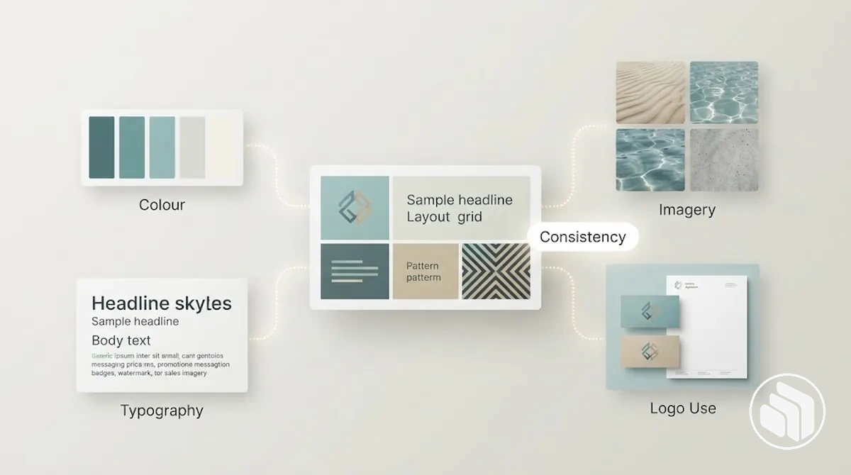
Colour, typography, logo use, and imagery operate as interdependent parts of one visual identity system rather than isolated design choices.
What each visual element must protect
Because these visual components interact, a weakness in one element can become more noticeable when another element introduces a related constraint, such as weak colour contrast combined with small typography.
Element-level mistakes can therefore compound when unsuitable or inconsistent states reinforce each other, although one weak component does not necessarily make the entire identity incoherent.
The illustration below shows how the four visual-system parts interact around these shared evaluative dimensions.
Brand colour mistakes occur when choices or usage states in the brand colour system reduce contrast, accessibility, recognition, or consistency.
Insufficient contrast can make text or graphic elements difficult to distinguish from their background, particularly when other legibility constraints are present.
Brand colours can also become less consistent when the palette lacks stable colour roles across applications.
Uncontrolled palette expansion can introduce competing primary, secondary, or accent colour roles, making consistent application harder to maintain.
Saturation becomes problematic when it reduces contrast or makes elements difficult to distinguish in their intended context, rather than because a particular saturation level is universally unsuitable.
Trend-led choices may also weaken consistency when brand colours change without regard to established palette roles or recognition cues.
A practical corrective direction is to define the role of each colour and evaluate contrast, accessibility, and consistency in the contexts where it will appear.
Digital and print reproduction can produce different colour appearances because the medium and production conditions differ, so consistency depends on checking the intended output rather than assuming identical reproduction.
For example, low-contrast text may lose legibility against its background, while a brand colour that appears suitable on a digital display may shift when reproduced in print.
The illustration below shows how palette roles, contrast, and medium-dependent colour appearance can affect a brand colour system.

Brand typography becomes problematic when font choice or application reduces readability, weakens hierarchy, disrupts consistency, or conflicts with the intended brand character.
Typography failure modes
There is no universal typeface count that defines a coherent brand type system.
The appropriate number depends on whether each typeface has a defined functional role and whether those typeface roles can maintain readability, hierarchy, brand fit, and consistency across applications.
Logo usage mistakes are deviations from approved treatments that reduce legibility or consistency and can weaken recognisability or adaptability across applications.
Logo usage conditions
For example, placing a dark logo on a similarly dark background can reduce legibility, while using the appropriate approved variant can restore sufficient visual separation.
Consistent logo usage therefore means maintaining proportion, clear space, background contrast, colour treatment, and approved variants according to the intended application.
Brand imagery can weaken visual continuity when its subject matter, visual treatment, quality, or style varies without a coherent rationale.
Irrelevant subject matter may not support the intended brand meaning, while unrelated image treatments can make separate applications appear visually disconnected.
Consistency does not require every image to look identical; controlled variation can remain coherent when recurring visual attributes connect the imagery across applications.
Composition and cropping can disrupt consistency when similar subjects are framed or positioned without a stable visual logic, while inconsistent colour treatment can make otherwise related imagery appear disconnected.
Resolution becomes a technical problem when an image does not contain enough detail for its required reproduction size or medium, making that asset unsuitable for the intended output without implying a universal resolution threshold.
For example, photographs can vary in subject matter or composition while maintaining visual continuity through a consistent colour treatment and visual style, whereas mixing unrelated photographic treatments can create visual drift.
Similarly, an image that appears adequate in a smaller application may be unsuitable when enlarged for another output if the available resolution cannot support that reproduction.
Reviewing subject matter, composition, cropping, resolution, colour treatment, and consistency against the intended application helps keep brand imagery coherent without requiring every asset to use the same composition.
Brand identity design process mistakes are sequencing or validation failures that allow weak design decisions to reach approval before their requirements and likely applications have been adequately tested.
Validation sequence before approval
These process failures can increase the risk of rework, inconsistency, or unsuitable outcomes when later requirements expose problems that earlier approval did not resolve.
This mistake-focused view identifies where weak inputs, sequencing, testing, validation, or approval can undermine decision quality; it does not prescribe one universally correct workflow.
The complete brand identity design process covers the broader creation sequence, while the concern here is whether decisions are validated before they become fixed.
Starting visual design before the audience, purpose, and practical requirements are sufficiently defined leaves design choices without reliable criteria for evaluating relevance or suitability.
Audience needs influence which visual cues and levels of clarity are appropriate, while purpose establishes the meaning and direction the identity needs to support.
Undefined applications, constraints, or success conditions can also leave important decisions untested against the contexts in which the identity must function.
These design inputs turn broad requirements into decision criteria without prescribing one visual solution.
Audience and purpose influence relevance and direction, while applications and constraints determine which conditions the identity must accommodate.
Success conditions provide a basis for evaluating whether those choices satisfy the defined requirements.
For example, the same visually detailed direction may suit an audience and application that support expressive presentation but be less suitable in an application requiring simpler reproduction or clearer small-format communication.
Defining the requirements therefore makes competing design choices easier to evaluate against the conditions that materially affect their use.
Individually acceptable elements can conflict when they are combined into a brand identity system, so isolated review cannot reveal every interaction that affects the final composition.
System testing shows whether colour contrast, typography hierarchy, logo prominence, imagery treatment, and spacing reinforce or compete with one another.
Without an integrated test, combinations that appear suitable separately can obscure hierarchy or weaken cohesion when used together.
For example, a colour palette may provide usable contrast, a type system may have a clear typography hierarchy, and a logo and imagery treatment may each work independently, yet their interaction can still create competition in one combined application.
Strong image contrast beside a prominent logo can divide attention, while tight spacing can make the typography and imagery feel more crowded even when each element is acceptable on its own.
Increasing separation or reducing the prominence of one competing element may improve balance, but the appropriate adjustment depends on the intended hierarchy and application.
System testing therefore evaluates the relationships among the combined elements rather than assuming isolated component quality equals system-level cohesion.
Brand identity assets should be checked at the scale, media, background, and application conditions they are expected to face before rollout.
Real-world testing verifies whether the identity remains legible, recognisable, reproducible, and coherent in its intended applications.
The relevant checks depend on the actual uses of the identity rather than requiring testing across every possible channel.
Application conditions may expose problems that are not visible in a single ideal mock-up.
A logo that appears legible at a larger scale may lose useful detail at a smaller intended size, while contrast can change when the same treatment moves between light and dark backgrounds.
Digital and print contexts may also reproduce colour differently, and imagery may require different resolution or cropping for its intended output.
These checks test distinct conditions that can affect legibility, recognisability, reproducibility, and versatility without imposing universal thresholds.
Brand identity application mistakes are execution failures that occur after the identity decisions already exist.
What should stay stable—and what can adapt
Identity invariants
Keep defining signals recognisable: logo integrity, colour roles, typography hierarchy, imagery direction, and recurring visual relationships.
Adaptable execution
Change layout, dimensions, crop, spacing, scale, or content arrangement when the medium or application genuinely requires it.
Visual drift
Occurs when stable identity signals are altered without a clear contextual need or governing rule, making applications feel disconnected.
The resulting visual drift can reduce consistency even when the underlying identity system itself has not changed.
The appropriate adaptation depends on context, but its consistency depends on retaining the identity invariants that connect different applications as expressions of the same brand identity.
Brand usage rules can fail in three distinct states: they may be undefined, inaccessible to the people applying the identity, or routinely ignored during execution.
Undefined rules leave controlled attributes open to interpretation, inaccessible rules prevent otherwise valid guidance from informing application decisions, and ignored rules allow execution to depart from established treatments.
Each state can produce inconsistency because repeated applications no longer rely on the same governing conditions.
These usage rules control different attributes, so their importance depends on which attributes and application conditions are involved rather than every rule carrying equal weight in every use.
For example, if two people receive the same logo assets but no clear rule for which variant belongs on a dark background, one may use a suitable contrasting treatment while the other chooses a version with poor visual separation.
Both are working from the same assets, but the absent rule leaves room for different execution behaviour and can produce inconsistent outputs.
Clear and accessible usage guidance reduces that ambiguity, while consistency still depends on the relevant rules being followed during application.
Uncontrolled variation occurs when cross-channel changes alter recognisable identity attributes without a clear contextual reason or governing rule.
Changing channel format, dimensions, or content needs can justify adaptation, but those conditions do not inherently require changes to the identity signals that support recognisability.
Controlled adaptation preserves relevant stable signals, whereas visual drift alters them without a defined application need.
Across channels, logo integrity, colour roles, typography hierarchy, imagery direction, and recurring layout cues can act as stable identity signals while execution adapts to the available format and content.
The exact layout, dimensions, image crop, or amount of content may change when the channel requires it, provided those changes do not unnecessarily replace the identity relationships that should remain recognisable.
The comparison separates context-driven adaptation from uncontrolled variation using the same identity attributes.
| Identity attribute | Controlled adaptation | Uncontrolled variation |
|---|---|---|
| Logo integrity | Uses an appropriate approved treatment while preserving the logo's defining form. | Distorts, alters, or substitutes the logo without a contextual rule. |
| Colour roles | Adapts colour use to the application while retaining defined primary, supporting, or accent roles. | Reassigns or replaces colour roles without a governing reason. |
| Typography hierarchy | Adjusts type size or arrangement for the format while preserving functional hierarchy. | Changes type roles or hierarchy inconsistently between applications. |
| Imagery direction | Changes subject, crop, or composition as content needs vary while retaining the intended visual direction. | Introduces unrelated imagery treatments that weaken continuity between channels. |
| Layout cues | Rearranges content for different dimensions while retaining recurring visual relationships where relevant. | Changes recurring layout cues without a channel or content requirement that explains the change. |
A recurring unexplained change in one of these stable signals can indicate visual drift, but the signal alone does not prove that an application is inconsistent because the execution context may justify the variation.
A brand identity audit can provide a diagnostic check by comparing the variation with the intended identity rules and application conditions.
Consistency therefore depends on preserving recognisable identity signals while allowing justified channel adaptation, not on making every execution the same.
Using exactly the same visual treatment across every medium can reduce legibility or functional fit when the context changes.
Different dimensions, backgrounds, viewing distances, interaction conditions, and content density may require adaptation in execution while the identity invariants remain recognisable.
Consistency therefore depends on preserving those identity invariants while adjusting execution details when medium conditions require it.
For example, the same identity used on a screen and a printed display can preserve its logo form, colour roles, typography hierarchy, and imagery direction while adapting execution to each medium.
A printed application viewed from farther away may require a larger typography scale, different spacing, and an imagery crop suited to its dimensions, while a screen viewed at closer range can accommodate a different layout, interaction pattern, and content density.
Background conditions may also require an appropriate logo variant, and colour treatment may need review when moving between screen and print reproduction.
These context-aware adjustments protect legibility and recognisability without changing the identity invariants that connect both applications.