
How to Create a Brand Identity Through a Structured Design Process
Creating a brand identity is a structured, iterative process: define the brief, audience, market context, constraints, and evaluation criteria; establish a visual direction; develop and test the identity as a system; then document the approved rules for implementation. There is no universal number of stages—move forward when each phase gives the next phase enough information to proceed, and iterate when review or testing reveals a criterion-linked mismatch.
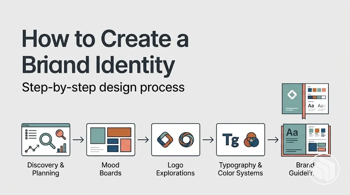
Brand identity creation process
Process at a glance: input → direction → system → proof → handoff
Use the sequence as a dependency map rather than a fixed timetable. Each stage produces a readiness condition for the next; a material mismatch sends the work back to the stage that controls the affected decision.
- 1Prepare the inputsClarify the problem, audience, brand qualities, market context, deliverables, constraints, and evaluation criteria.Ready when those inputs can guide real design choices.
- 2Establish the visual directionTranslate intended brand qualities into a coherent set of tone, form, colour, typography, imagery, and reference cues.Ready when one visual premise can guide development.
- 3Develop the core elementsDevelop the logo or mark, colour palette, typography, and imagery direction as connected parts of one identity system.Ready when the elements can be judged together, not only in isolation.
- 4Review and refineConnect feedback to a criterion, affected attribute, or observed use condition before changing the design.Revise the relevant decision, then recheck the result.
- 5Assemble and test the systemApply the identity across required sizes, backgrounds, formats, media, and accessibility conditions.A failure under a required condition is a reason to revise the affected rule or element.
- 6Document and verifyRecord approved assets, relationships, usage conditions, restrictions, and exceptions for handoff.Implementation is ready when no unresolved issue materially prevents correct use.
Brand identity is a connected visual system: the identifying mark, colour, typography, imagery, hierarchy, and spacing relationships should be developed and tested together rather than approved as isolated assets. Approved relationships should then be documented so another person can reproduce them consistently.
Sequence matters because later decisions depend on earlier ones. Begin visual exploration only when the strategic and practical inputs are clear enough to constrain decisions, and reopen an earlier phase only when a material mismatch gives a specific reason to do so.
Table of Contents
Prepare the Inputs for Brand Identity Design
Brand identity design should start when the strategic and practical inputs are clear enough to constrain visual decisions rather than leave them to arbitrary aesthetic preference.
The required depth depends on the project scope, audience, and intended applications, but the starting conditions should make the purpose of the work, its relevant context, and its practical boundaries clear.
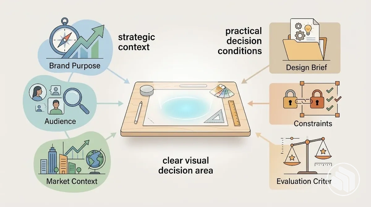
The brand identity design inputs fall into two connected groups: strategic inputs establish what the identity needs to communicate and to whom, while practical constraints establish what the design must accommodate and how proposed directions will be evaluated.
Each input constrains a different part of the design process, giving later design decisions a defined basis rather than requiring every visual choice to be resolved through subjective preference.
The following prerequisites move from strategic context toward practical decision conditions.
- Brand purpose: clarifies the goals and intended meaning that the visual direction needs to support.
- Audience: identifies the people the identity needs to communicate with, providing context for decisions about visual character and communication.
- Market context: establishes the environment in which the identity will appear, helping designers assess whether a direction is appropriately differentiated and relevant.
- Design brief: translates the project context into defined objectives, expected deliverables, and approval conditions that guide the design work.
- Constraints: establish practical boundaries such as required applications, existing assets, production conditions, or other project-specific limitations that proposed designs need to accommodate.
- Evaluation criteria: define the conditions used during review to judge whether a proposed direction addresses the brief instead of relying only on personal preference.
When a key input remains undefined, the uncertainty carries into later design decisions and feedback; for example, a vague objective can allow one reviewer to favour familiarity while another favours differentiation because neither is working from an agreed criterion.
Once the brand purpose, audience, market context, design brief, constraints, and evaluation criteria are sufficiently clear for the project's scope, the brief is ready for more specific verification before design exploration proceeds.
Confirm the Brand Brief and Design Constraints
The design brief is ready to guide visual exploration when it states the problem to solve, intended audience, desired brand qualities, deliverables, constraints, and approval conditions clearly enough to inform design decisions.
Verification is about decision readiness rather than document completeness: each requirement should give the designer a usable condition for choosing, developing, or evaluating a direction.
Ambiguity in the brief leaves important design decisions without a shared basis for review.
An unclear objective can produce competing interpretations of what the work should achieve, while unspecified deliverables or constraints can allow a direction to progress before practical requirements are considered.
Approval conditions should also identify what reviewers will evaluate, without implying that a clear brief guarantees approval or eliminates revision.
The checklist below tests whether each requirement has a defined state and a useful design implication, while the annotated example contrasts clear requirements with ambiguous inputs.

- Problem to solve: Defined when the brief identifies the communication or identity problem the work needs to address; ambiguous when it relies on a broad request such as “make it modern.” The design implication is whether proposed directions can be evaluated against a stated objective.
- Intended audience: Defined when the relevant audience is identified clearly enough to inform communication choices; ambiguous when the design is expected to appeal broadly without a decision-relevant audience. The design implication is whether visual choices can be assessed in relation to the people they need to communicate with.
- Brand qualities: Defined when desired qualities have enough context to guide interpretation; ambiguous when adjectives such as “modern” or “premium” have no supporting meaning. The design implication is whether different visual directions can be compared against the intended character rather than personal preference.
- Deliverables: Defined when the required outputs and intended applications are stated for the project; ambiguous when the expected design outputs are unspecified. The design implication is whether concepts can be developed for the contexts in which the identity must function.
- Constraints: Defined when relevant project limitations, existing requirements, or use conditions are stated; ambiguous when designers must discover those boundaries after exploration begins. The design implication is whether proposed directions can accommodate known practical conditions before further development.
- Approval conditions: Defined when reviewers know which agreed requirements will be used to assess a direction; ambiguous when approval depends on unstated preferences. The design implication is whether feedback can be connected to the project's requirements rather than shifting criteria.
A defined brief input connects an objective to a specific audience, category, application, or constraint, while an ambiguous brief input such as “make it modern” leaves the intended design implication open to conflicting interpretations.
This verification does not replace the deeper task of defining a brand identity brief; it confirms that the project brief is sufficiently clear to support visual exploration.
Review the Brand, Audience, and Competitive Context
Brand, audience, and competitive context should inform the design direction before visual concepts are developed.
Brand attributes and existing equity indicate where continuity may matter, audience expectations and recognition cues suggest how visual choices may be interpreted, and category conventions or competitor patterns reveal where familiarity or differentiation may be useful depending on the brief.
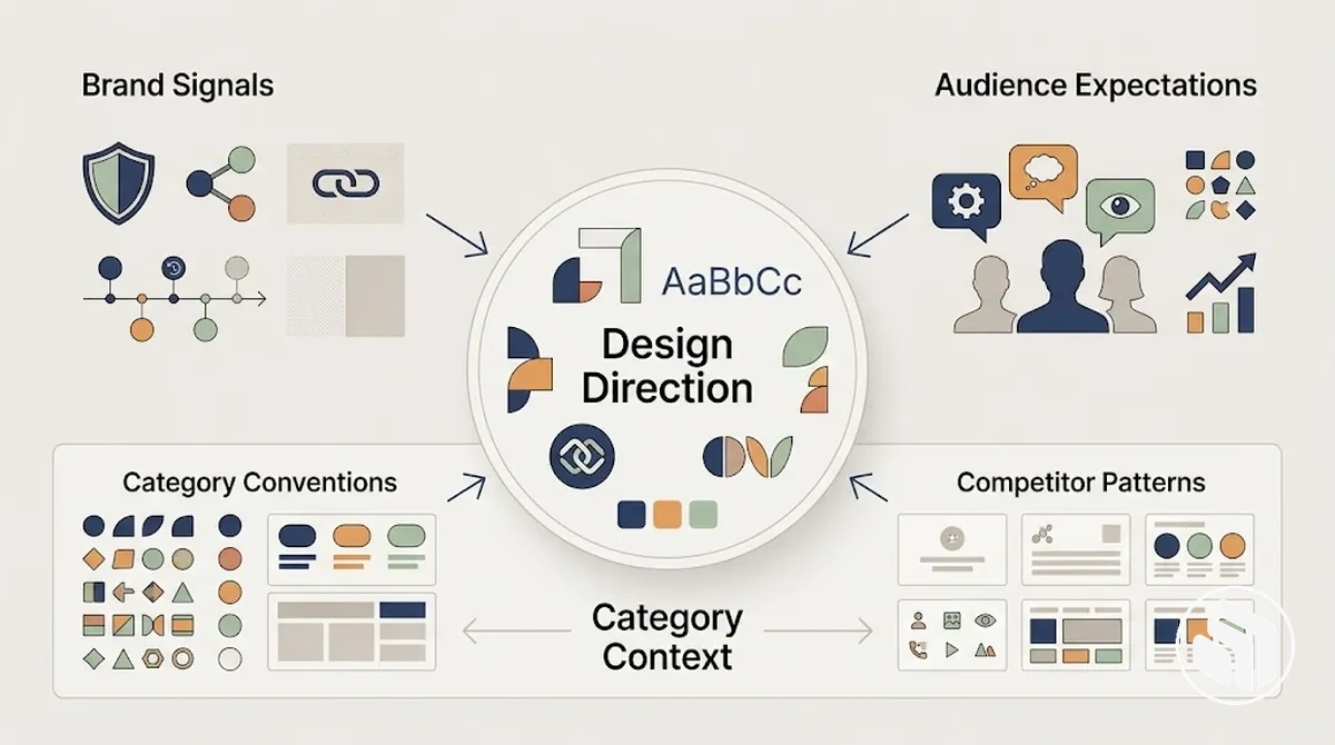
These evidence domains are separate sources of context rather than sequential stages, and each should connect an observation to a possible design implication.
Brand evidence can signal which established characteristics are worth carrying forward, audience evidence can suggest which cues support recognition or expected interpretation, and category evidence can show repeated visual patterns that may be retained, adapted, or deliberately avoided.
Competitor patterns can inform differentiation, but difference is useful only when it supports the intended audience, category context, and design brief rather than novelty alone.
The grouped observations below make those evidence-to-design relationships explicit.
- Brand evidence:
- Brand attributes: Identify established characteristics that the new identity may need to express or reinterpret; the design implication is which qualities should remain recognisable in the visual direction.
- Existing equity: Note familiar assets, associations, or recognition cues that already carry useful continuity; the design implication is whether those signals should be retained, adapted, or given less emphasis.
- Audience evidence:
- Audience expectations: Identify relevant needs and expectations that can affect how the identity is interpreted; the design implication is which visual choices may feel understandable and appropriate for that audience.
- Recognition cues: Observe visual signals the intended audience is likely to use when identifying the brand or its category; the design implication is whether those cues should support continuity, clarity, or deliberate distinction.
- Category and competitor evidence:
- Category conventions: Identify recurring visual conventions that help establish category context; the design implication is whether a convention should be retained, adapted, or deliberately avoided according to the brief.
- Competitor patterns: Observe repeated approaches across the competitive landscape without treating them as instructions to copy; the design implication is where meaningful differentiation may be possible without sacrificing relevant recognition cues.
For example, if a category commonly uses a particular visual convention to signal familiarity, a design direction might retain it when recognition is important, adapt it when the brand needs continuity with greater distinction, or avoid it when the brief supports a different interpretation.
The observed convention therefore informs the next design decision without determining the outcome by itself.
Define the Criteria for Evaluating the Identity
Identity evaluation criteria should translate the brief into consistent, decision-relevant checks so concepts are evaluated against what they need to achieve rather than personal preference alone.
The criteria should cover both strategic suitability and practical usability, giving reviewers observable conditions for discussing whether a concept fits the intended direction and can function as an identity system.
The diagram groups the criteria used to evaluate identity concepts and shows that evaluation is multi-criteria rather than taste-led.
Strategic criteria include strategic fit, distinctiveness, and recognisability, while practical and system criteria include coherence, flexibility, legibility, and reproducibility.

The relative importance of these evaluation criteria depends on the brief, audience, and intended applications, so they should not be treated as equally weighted or converted into a universal score.
The table converts each criterion into an observable condition and explains why that condition matters when comparing candidate directions.
| Criterion | What to Observe | Why It Matters |
|---|---|---|
| Strategic fit | Whether the concept expresses the intended brand qualities and addresses the direction established by the brief for the relevant audience. | Shows whether the concept supports the intended meaning rather than succeeding only as an attractive visual treatment. |
| Distinctiveness | Whether the concept can be distinguished from recurring category and competitor patterns without discarding useful category cues solely for novelty. | Supports meaningful differentiation while keeping the decision tied to the category and brief. |
| Recognisability | Whether recurring visual cues give the identity a consistent character that the intended audience can identify across relevant applications. | Indicates whether the system provides stable recognition cues without implying guaranteed recognition. |
| Coherence | Whether the visual elements relate consistently in form, hierarchy, and overall character when used together. | Shows whether individual design choices operate as a connected identity rather than unrelated assets. |
| Flexibility | Whether the identity can accommodate the formats, scales, and contexts required by the intended applications without losing its essential relationships. | Indicates whether the system can adapt to the project's required uses rather than working only in one presentation. |
| Legibility | Whether relevant names, typography, symbols, and other information remain clear under the viewing and application conditions defined by the project. | Identifies usability problems that visual appeal alone may not reveal. |
| Reproducibility | Whether the approved visual relationships can be applied consistently using the production methods and constraints relevant to the project. | Indicates whether the concept can become a repeatable identity system rather than depend on one carefully controlled execution. |
A visually appealing concept can still be unsuitable when it misses the brief, weakens required recognition cues, or fails in intended applications.
A less decorative concept may be the more suitable direction when it satisfies the required strategic and practical conditions more reliably, so evaluation should distinguish visual appeal from evidence of fit and usability.
Build the Brand Identity in a Deliberate Sequence
The brand identity design sequence should follow decision dependencies rather than a fixed industry-wide number of steps.
Each phase uses an input from earlier work, applies a focused design action, and produces an output or readiness condition that supports the next decision; review can send the work back when a mismatch becomes visible.
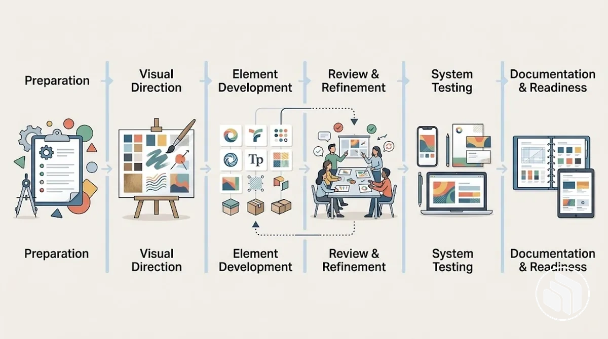
A phase is ready to move forward when its output gives the next phase enough direction to proceed without reopening unresolved foundational decisions.
The exact phase count and timing can vary with the brief and project scope, but the dependency logic remains useful because later identity elements and system decisions build on earlier direction.
- Prepare the inputs: Use the brief, audience and category context, constraints, and evaluation criteria as the input; confirm they provide a sufficiently clear basis for beginning visual exploration.
- Establish the visual direction: Translate the prepared input into an initial design direction; proceed when the direction expresses a coherent visual premise that can guide development rather than a collection of unrelated options.
- Develop the identity elements: Apply the visual direction to the identity elements and their relationships; the output should be a sufficiently developed set of elements that can be reviewed together rather than only as isolated assets.
- Review and refine: Check the developing identity against the brief and evaluation criteria, then revise decisions where feedback identifies a mismatch; proceed when the direction is coherent enough for broader system testing.
- Assemble and test the system: Apply the identity elements together across the intended applications and relevant conditions; the output should reveal whether the system remains coherent, flexible, legible, and reproducible or requires further revision.
- Document for implementation readiness: Record the approved visual relationships, usage rules, and application conditions once testing and review have resolved the relevant design decisions; the readiness condition is a documented system that can be applied consistently within the defined project scope.
Iteration is expected when review or testing reveals that an earlier assumption, direction, or design action no longer satisfies the defined criteria.
Purposeful iteration returns to the relevant phase, revises the identified issue, and rechecks the resulting output, rather than cycling between options without a clear reason or readiness condition.
Establish the Visual Direction
Visual direction translates brand attributes into a coherent aesthetic territory before individual identity elements are finalised.
It establishes how qualities in the brief may be expressed through related visual cues for the intended audience and category, giving later design decisions a shared direction without treating any single cue as a universal expression of an attribute.
- Tone
- Sets the overall character of the visual direction in relation to the brief.
- Form
- Guides whether shapes and compositions feel more structured, fluid, restrained, or expressive.
- Imagery and colour
- Define the visual atmosphere, emphasis, and kinds of image treatment worth exploring.
- Typographic character
- Suggests qualities such as formality, openness, density, or energy without selecting the final typefaces yet.
- Reference patterns
- Connect recurring relationships among form, imagery, colour, and type so the direction functions as a coherent premise rather than isolated aesthetic preferences.
The annotated example below makes these attribute-to-cue relationships visible without turning them into final component choices.
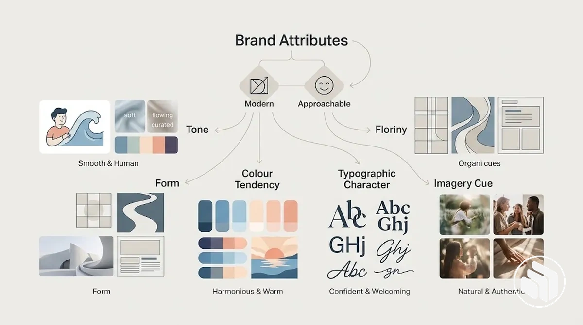
For example, an attribute such as trust could support a restrained, orderly visual interpretation where an audience expects stability, while the same attribute could support a warmer and more approachable interpretation where familiarity and human connection are more relevant to the category and audience.
These directional cues can then be organised and explored through a brand mood board before final colour, typography, logo, or imagery decisions are made.
Develop the Core Identity Elements
Core identity elements should be developed as coordinated parts of one visual system rather than as isolated assets.
The logo, colour palette, typography, and imagery direction each perform a distinct function, but each also constrains how the other components can establish hierarchy, support recognisability, and remain reproducible across the intended applications.
The table maps each component to its primary function, compatibility requirement, and implication for the identity system.
| Component | Primary Function | Key Compatibility Check | System Implication |
|---|---|---|---|
| Logo or identifying mark | Provides a recurring identifying element that can support recognisability. | Check whether its form, scale, contrast, and reproduction conditions remain compatible with the colour palette, typography, and intended applications. | The mark needs to remain identifiable without forcing the other visual elements into unsuitable arrangements. |
| Colour palette | Supports contrast, hierarchy, and the intended visual character across applications. | Check whether colour relationships provide suitable contrast and work with the logo, typography, imagery, and relevant reproduction conditions. | Colour choices influence how components are separated, emphasised, and combined across the system. |
| Typography | Organises written information through legibility, hierarchy, and typographic character. | Check whether type choices remain legible in the required applications and are compatible with the logo, colour relationships, and content hierarchy. | Typography needs to support information structure without competing with or weakening other identity components. |
| Imagery direction | Establishes a consistent approach to the tone and treatment of visual content. | Check whether imagery works with the colour palette, typography, logo or mark, and compositional hierarchy in the intended applications. | Imagery should reinforce the wider identity system without becoming visually disconnected from its other components. |
Compatibility should be evaluated through the relationships between components and the conditions in which they will be applied, rather than by judging each element independently.
The logo can affect available space and hierarchy, colour can change contrast between components, typography can alter legibility and visual emphasis, and imagery can strengthen or disrupt the shared tone of the system.
Colour decisions should therefore be checked against the logo, typography, imagery direction, contrast needs, and intended applications rather than selected in isolation.
The detailed method for brand colour selection belongs to its dedicated selection stage.
Typography follows the same system logic: a distinctive type choice may suit the intended character yet become impractical when small-scale applications reduce its legibility, creating a conflict between expression and reproducibility.
Resolving that conflict requires evaluating the type choice against the applications and other identity components, while the detailed method for brand font selection remains a separate selection task.
Refine the Identity Through Review and Feedback
Design review should convert observations into specific revisions that can be checked against the previously defined criteria.
Each feedback cycle should identify the affected design attribute, establish the evidence or rationale behind the observation, revise the relevant decision when warranted, and return the result to the criteria for a recheck.
- Observe the concept in context: Review the identity in the applications and conditions relevant to the project, noting the specific design attribute or relationship that creates the concern.
- Classify the feedback: Identify its source and determine whether the comment is supported by a criterion, usability observation, contextual evidence, or primarily by subjective preference.
- Identify the underlying issue: Connect supported feedback to the affected design attribute and state why that attribute does not currently satisfy the relevant criterion or system requirement.
- Revise the relevant decision: Change the specific design decision implicated by the evidence while checking that the revision does not weaken system coherence elsewhere.
- Recheck the result: Review the revised decision against the relevant criteria and surrounding identity elements to determine whether the identified issue has been addressed without creating another conflict.
Feedback warrants revision when its rationale identifies a relevant issue that can be connected to the criteria, evidence, or the identity's intended use; a stakeholder comment does not become equivalent evidence simply because it expresses a preference.
The revision implication should therefore follow from the affected attribute and the reason for the concern rather than from the wording or forcefulness of the comment.
After a revision, the recheck should include the changed attribute and its relationship with other components so a local correction does not weaken system coherence.
This keeps the refinement cycle tied to identifiable decisions rather than allowing iteration to continue without a criterion-linked reason.
Key distinction: actionable feedback vs vague preference
“The heading loses legibility in the required small-format application.”
Why it can guide revision: it identifies the affected attribute, the use condition, and a criterion that can be rechecked after a typography change.
“Make the design feel stronger.”
What is missing: the intended attribute, supporting rationale, and evaluation criterion. Until those are explicit, the comment does not identify a specific revision.
Assemble the Elements Into a Coherent Identity System
Approved elements become an identity system when their relationships, hierarchy, and interaction rules can be applied repeatedly across the intended applications.
Reusing the same logo, colour palette, typography, and imagery does not by itself create consistency; the system also needs defined relationships that coordinate how those elements behave together.
The table maps those interaction rules to the conditions in which they apply and their implications for consistency without documenting the full guideline set.
| Elements in Relation | Rule or Relationship | Valid Condition | Consistency Implication |
|---|---|---|---|
| Logo and spacing | Preserve the intended spatial relationship between the identifying mark and surrounding elements. | Apply the relationship according to the available format, scale, and composition rather than imposing an unsupported universal spacing ratio. | Stable spacing helps the logo retain its intended prominence without allowing nearby elements to disrupt the hierarchy. |
| Typography and colour hierarchy | Coordinate typographic hierarchy with colour roles so emphasis and information structure reinforce rather than contradict one another. | Apply the relationship where headings, supporting text, and other information require distinguishable levels of emphasis while maintaining suitable legibility and contrast. | Aligned typographic and colour roles support a recognisable hierarchy across different applications. |
| Logo, colour roles, and background | Use colour relationships that preserve the intended visual separation between the identifying mark and its surrounding field. | Select the appropriate approved relationship for the background and application rather than assuming one colour treatment suits every context. | The logo can remain visually distinct while the wider colour system retains its established roles. |
| Imagery, typography, and layout | Coordinate imagery treatment with type placement, spacing, and compositional hierarchy. | Apply the relationship according to the content and format while preserving the intended visual character of the identity system. | Imagery and typography can vary by application without becoming disconnected from the wider system. |
System behaviour depends on these relationships remaining understandable when applications change.
Hierarchy determines which elements receive emphasis, spacing regulates how components relate within a composition, colour roles support separation and emphasis, and typography and imagery need to coordinate with those decisions rather than operate independently.
The valid expression of each rule can change with the application, but the relationship should continue to support the intended system behaviour instead of requiring identical execution everywhere.
For example, the same logo, typefaces, colours, and image assets can appear inconsistent when one application changes the hierarchy, compresses spacing, reverses established colour roles, or treats imagery differently without a governing relationship.
Deeper decisions about consistent imagery treatment belong to the dedicated brand imagery style process; at this stage, the requirement is that imagery relates coherently to the other approved elements before the identity system is formally documented.
Test the Identity System in Realistic Applications
Identity system testing should expose the design to realistic applications before it is treated as ready for implementation.
Representative conditions should vary size, background, format, medium, legibility, and accessibility needs so observed behaviour can reveal where an identity rule remains coherent or produces a failure signal that requires revision.
The checklist separates technical usability checks from identity-coherence checks so each condition can lead to a specific revision implication rather than relying on one polished mock-up.
- Technical usability — size: Test the identity at the smaller and larger sizes required by its intended applications; identifying elements and typography should remain usable at those application-specific sizes, while loss of legibility, recognition, or necessary detail is a failure signal that suggests revising the affected element or its usage condition.
- Technical usability — background: Test relevant light, dark, photographic, or otherwise variable backgrounds; important elements should remain distinguishable in the intended context, while insufficient separation or obscured information indicates that the colour treatment, placement, or permitted background condition needs revision.
- Technical usability — format: Apply the system to materially different formats required by the project; hierarchy and essential relationships should remain understandable, while layouts that force elements into conflicting positions or remove necessary emphasis indicate that the format rule or composition needs revision.
- Technical usability — medium: Check the identity in the relevant digital, print, or other production environments included in the project scope; elements should remain reproducible and functional under those conditions, while degradation or loss of required information suggests revising the affected treatment for that medium.
- Technical usability — legibility and accessibility: Check whether required information remains perceivable and legible under the relevant viewing and accessibility conditions; difficulty distinguishing, reading, or interpreting essential content is a failure signal that suggests revising contrast, typography, hierarchy, or another affected design attribute.
- Identity coherence — recognition: Compare representative applications to check whether recurring identifying cues remain recognisable when size, format, or background changes; loss of those cues suggests revising the application rule rather than assuming reuse of the same asset is sufficient.
- Identity coherence — system relationships: Check whether spacing, colour roles, typography, imagery, and identifying elements preserve their intended relationships across contrasting applications; inconsistent hierarchy or visual character indicates a revision implication for the relevant system rule.
Testing produces actionable evidence when each failure is connected to the condition in which it occurs and to the identity rule or design attribute that needs reconsideration.
A failure in one application does not establish universal incompatibility, but it can indicate that the current rule is unsuitable for that condition.
Revisions should therefore address the observed behaviour and then be rechecked under the same condition, while also confirming that the change does not weaken coherence in other representative applications.
For example, an identity may remain coherent on a large light-background layout but lose logo recognition and text legibility in a smaller dark-background format; that contrast identifies specific conditions for revising the relevant logo, colour, or typography treatment rather than treating either mock-up as proof of general usability.
When testing exposes logo-specific conditions such as placement, background treatment, or permitted configurations, those conditions can be formalised through dedicated logo usage rules.
Document the Approved Identity for Implementation
Implementation documentation should record approved design decisions clearly enough for another person to reproduce the intended identity during handoff without reinterpreting each rule.
The required depth depends on the identity's complexity and intended applications, but the documentation should specify the relevant assets, conditions, restrictions, and exceptions before implementation begins.
The checklist confirms whether those approved decisions are reproducible by distinguishing what must be specified from what should be illustrated with examples.
- Specifications: Record the approved properties and relationships needed to apply each relevant identity element; permitted use follows those specifications, while an implementation that changes them without an approved exception should be treated as restricted use and corrected before handoff.
- Asset variants: Identify each approved logo, mark, colour, typography, or other required asset variant and the condition in which it may be used; using an unapproved variant or applying an approved variant outside its intended condition indicates which asset choice needs correction.
- Usage conditions: Specify the backgrounds, formats, placements, or other application conditions under which an approved treatment is permitted; where a condition makes the treatment unsuitable, record the restricted use and the alternative approved treatment when one exists.
- Exceptions: Record approved exceptions to a general rule together with the condition that activates each exception; this prevents an exception from being interpreted as permission to disregard the underlying rule in other applications.
- Restricted use: Identify applications or treatments that conflict with an approved relationship, asset, or usage condition; stating the restriction clarifies which implementation choices require adjustment rather than leaving the boundary to individual interpretation.
- Examples: Illustrate representative permitted use and, where useful, restricted use for rules that may remain ambiguous in prose; the example should clarify how the approved rule operates without creating a new rule that was not part of the design decision.
Specifications define what must remain stable, asset variants identify which approved files apply under particular conditions, and usage conditions distinguish permitted use from restricted use across relevant applications.
Exceptions should state the condition that makes the normal rule inapplicable, while examples should clarify rules that could otherwise be interpreted differently during implementation.
Together, these records make the handoff actionable without expanding the documentation into ongoing governance or requiring every possible application to be predetermined.
For example, if a logo-background rule is undocumented, one implementer may place the standard logo on a background where it becomes difficult to distinguish while another may select a different variant, creating inconsistent implementation from the same approved assets.
Recording the permitted background condition, restricted condition, and appropriate asset variant removes that specific ambiguity; the broader method used to build brand guidelines belongs to the dedicated documentation stage.
Verify That the Brand Identity Is Ready for Implementation
Implementation readiness means the identity has no unresolved issue that would materially prevent correct use within the brief and intended applications.
Final verification is a readiness gate rather than another design stage: it evaluates existing evidence and identifies whether an unresolved condition blocks implementation or can remain a non-critical refinement.
- Strategic readiness — strategic fit: Evidence should show that the approved identity still meets the relevant objectives and intended brand qualities defined by the brief. If a material mismatch remains between the identity and those requirements, the unresolved condition is a blocker because implementation would reproduce a direction that does not meet the agreed strategic criterion.
- Strategic readiness — recognition: Evidence from the approved identity and representative applications should support the intended identifying cues for the relevant audience and context. If an essential identifying cue becomes unclear under a required condition, the issue blocks implementation until the affected decision is resolved; a minor presentational adjustment that does not materially change recognition can remain a refinement.
- System readiness — system coherence: Evidence should show that the approved elements maintain their intended hierarchy and relationships when used together. An unresolved conflict that causes required applications to express contradictory or unstable relationships is a blocker, while a small adjustment that preserves those relationships can be treated as a refinement.
- System readiness — reproducible use: Evidence should support applying the approved elements and relationships without requiring implementers to invent missing design decisions. If a required application depends on an unresolved rule or incompatible element relationship, implementation should be blocked until that condition is resolved.
- Usability readiness — required applications: Testing evidence should show that the identity remains usable under the size, background, format, medium, legibility, and accessibility conditions relevant to the intended applications. A failure that prevents required information or identifying elements from functioning under one of those conditions is a blocker; an optional improvement that does not materially affect required use is a refinement.
- Usability readiness — unresolved test failures: Evidence from rechecks should show that material failures identified during application testing have been addressed without creating another significant conflict. A material failure that remains reproducible in a required condition blocks implementation, whereas a minor visual refinement can be scheduled without reopening the identity system.
- Documentation readiness — implementation rules: Documentation should provide the specifications, approved assets, usage conditions, restrictions, and relevant exceptions needed for handoff. Missing information is a blocker when another person cannot determine the correct treatment for a required application; supplementary clarification that does not change correct use can remain a refinement.
The readiness decision should consider strategic fit, system coherence, usability, and documentation together because evidence in one area does not resolve an outstanding issue in another.
Each criterion should be evaluated against the brief and intended applications by identifying the supporting evidence, any unresolved condition, and the consequence of carrying that condition into implementation.
Final verification should reopen an earlier design decision only when the unresolved condition materially affects recognition, coherence, usability, or correct use rather than merely because further refinement is possible.
Implementation decision boundary
A blocker prevents reliable implementation under a required condition. Resolve it before the identity moves into use.
A non-critical refinement does not materially prevent correct implementation and can be scheduled without reopening the identity system. Readiness therefore does not require the identity to be treated as perfect or incapable of later improvement.
Check Strategic Fit and Distinctiveness
Strategic fit and distinctiveness are separate criteria: the identity must express the intended meaning and brand attributes defined by the brief while remaining sufficiently distinguishable within its relevant category.
An identity can align with the strategy yet appear too generic to provide a clear recognition cue, or it can look highly distinctive while expressing signals that do not suit the intended audience or position.
The table separates these two checks so observed design cues can be evaluated against the appropriate criterion rather than treating visual difference alone as evidence of quality.
| Criterion | Evidence to Check | Possible Failure | Implication |
|---|---|---|---|
| Strategic fit | Check whether the observed design cues express the intended brand attributes, support the meaning established by the brief, and remain appropriate for the audience and relevant category cues. | The identity may be visually distinctive but communicate a character, tone, or interpretation that conflicts with the intended position or audience context. | The design requires revision because differentiation does not compensate for strategic misalignment. |
| Distinctiveness | Check whether the identity provides recognisable cues that can be distinguished from common category patterns while remaining understandable within the audience and category context. | The identity may align with the brief but rely so heavily on familiar category cues that it becomes difficult to distinguish from other identities in the same context. | The design requires greater differentiation where the lack of a clear recognition cue materially weakens distinctiveness, without introducing novelty that reduces comprehension or strategic fit. |
The final decision should connect the brief, audience, category cues, and observed design signals rather than treating competitor similarity or novelty as automatic evidence of failure or success.
A distinctive but misaligned identity may create clear visual difference while expressing the wrong brand meaning, whereas an aligned but generic identity may communicate the intended attributes yet provide too little differentiation to support recognisability.
Sufficient distinctiveness therefore depends on preserving strategic fit while establishing a meaningful recognition cue for the relevant audience and category.
Check Consistency and Practical Usability
Consistency and practical usability require the approved identity system to reproduce its governing rules reliably while remaining usable under the conditions it was designed to support.
The final check should verify repeatability, hierarchy, legibility, accessibility, technical reproduction, asset availability, and rule clarity under intended applications rather than assuming that consistent use means identical execution in every context.
- Repeatability: Under repeated use across intended applications, the same identity rules should produce recognisable relationships between elements. If implementers must reinterpret those relationships each time, the failure state is insufficient repeatability and the implementation consequence is to clarify or revise the affected rule before use.
- Hierarchy: When format, content, or scale changes, the intended information and visual hierarchy should remain understandable. If adaptation causes primary and secondary elements to compete or reverses their intended emphasis, the hierarchy has failed and the relevant layout or application rule requires revision.
- Legibility: Under the sizes, backgrounds, formats, and media conditions required by the project, essential text and identifying elements should remain legible. If required information becomes difficult to read or distinguish, the affected typography, contrast, scale, or placement condition should be revised before implementation.
- Accessibility: Under the accessibility needs relevant to the intended application, important information should remain perceivable and understandable. If an approved treatment prevents required content or identifying information from being accessed effectively, that condition represents a usability failure requiring an alternative treatment or clearer rule.
- Technical reproduction: In the production environments included in the project scope, approved colours, marks, typography, imagery, and other assets should reproduce sufficiently to preserve their intended function. If a medium or technical condition materially alters a required element or relationship, the implementation treatment for that condition should be revised.
- Asset availability: Implementers should have the approved asset variants needed for the intended conditions and formats. If a required use depends on an unavailable variant and forces an improvised substitute, the handoff is incomplete and the necessary asset should be supplied before implementation.
- Rule clarity: Usage rules should make permitted adaptations and restrictions clear enough for another person to apply the identity without inventing a new design decision. If two reasonable interpretations of the same rule produce materially different recognition, hierarchy, or usability, the rule needs clarification before implementation.
These checks should be considered together because practical usability can fail even when individual assets appear visually correct.
Repeatability and rule clarity support consistency, while hierarchy, legibility, accessibility, technical reproduction, and asset availability determine whether the system remains usable under the intended conditions.
A failure should therefore be linked to the operating condition in which it occurs and to the specific implementation consequence rather than treated as evidence of universal incompatibility.
Controlled flexibility preserves the identity's governing rules while adapting their expression to the application; for example, spacing or layout may change to suit a narrower format while recognition and hierarchy remain intact.
Inconsistency occurs when an adaptation changes a governing relationship, such as altering hierarchy or an identifying treatment so substantially that recognition or usability is weakened.