
How to Choose Brand Fonts for a Coherent Brand Identity
Choose brand fonts by matching the brand’s intended character to its real use requirements, then eliminate candidates that fail readability, family capability, language or licence coverage, compatibility, or representative-use testing. Judge the individual typeface in context: serif, sans serif and display categories can narrow options, but they do not determine personality or readability by themselves.
Selection assistant
Prioritise the right brand-font checks
Set the conditions the typeface must handle. The guide prioritises evaluation criteria; it does not pick a font by stereotype.
Core decision rule
- Define the intended brand tone and the real text conditions.
- Reject candidates that cannot perform in required sizes, media, characters or licensed uses.
- Check family range and, when multiple families are needed, useful contrast plus shared tone.
- Validate the shortlist in representative brand applications before finalising it.
Important: a category label such as serif or sans serif is only a starting filter. Suitability belongs to the individual typeface under the conditions tested.
In this article, brand fonts means the typeface families selected for the identity; individual weights and styles are variants within those families. Aesthetic preference can start a shortlist, but final selection should be based on identity fit and functional suitability.
Table of Contents
Set the Criteria for Choosing Brand Fonts
Brand-font selection criteria should be defined before individual typefaces are compared, so candidates are judged against brand and use requirements rather than appearance alone.
The criteria should cover both identity fit and functional use, with their relative importance determined by where and how the fonts need to work.
Font selection sits within the wider Brand Identity Design system, so the chosen typeface needs to support rather than conflict with the identity's intended visual character.
Brand identity context and usage conditions change which criteria carry the most weight.
A font intended for frequent small text, for example, places greater emphasis on legibility and readability at the required text size than a typeface used mainly for large display text.
These criteria guide typeface selection; they do not define the permanent role hierarchy of the later typography system.
The diagram shows how the main evaluation dimensions relate to overall font suitability, while the criteria list applies each dimension as a condition-and-implication check.
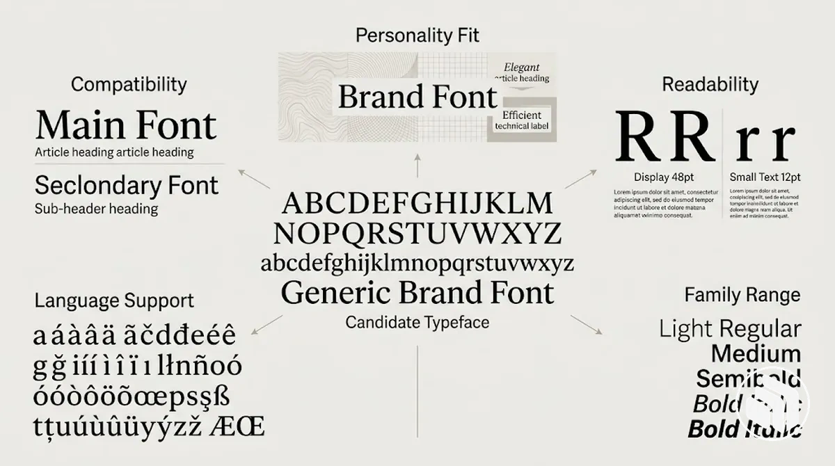
- Brand personality: Identify the tone, values and visual character the brand needs to express, then assess whether the candidate's characteristics support that direction. A typeface whose visual character conflicts with the intended personality is a weaker identity fit even when it is functionally capable.
- Readability and legibility: Check whether the typeface remains clear for the kinds of words, passages and viewing conditions it will handle. If letterforms become difficult to distinguish or extended text becomes difficult to follow in a required context, suitability decreases for that use.
- Intended media and text size: Evaluate candidates in the screen, print and other media, as well as the text sizes, required by the brand. Performance in one condition does not establish suitability in another, so a candidate should remain functional in the applications that matter to the identity.
- Font family range: Check whether the font family provides the weights and styles needed for expected applications. A family with insufficient variants can constrain use, while broader capability provides more flexibility when those variants are genuinely required.
- Language support: Confirm that the typeface contains the characters needed for the languages the brand must present. If a required writing system or character set is unsupported, the family is unsuitable for that language context regardless of its visual fit.
- Compatibility: When more than one typeface is required, assess whether candidates can work together with purposeful contrast while maintaining a coherent shared tone. A candidate that works well alone can become less suitable if its pairing creates visual conflict in the intended applications.
- Licensing and deployment rights: Confirm that the font licence permits the intended brand uses and deployment methods, such as the required desktop, web, app, print or shared-file use. A typeface is not operationally suitable when the necessary use is outside its licence, even if its visual and functional fit is strong.
Translate Brand Personality into Typeface Characteristics
Brand adjectives become useful selection criteria when they are translated into observable typeface characteristics rather than matched to a broad font-category stereotype.
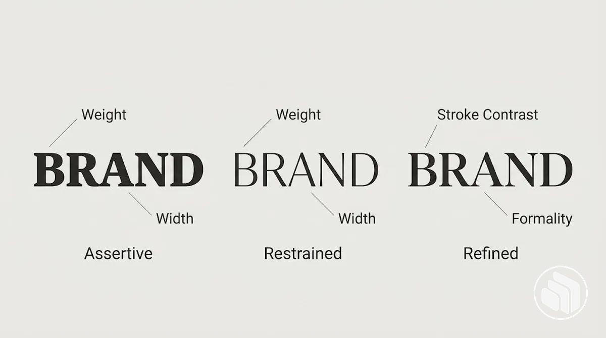
Compare features such as weight, width, proportion, stroke contrast and formality, then judge whether those traits align with the intended brand personality.
The same category can contain individual typefaces with markedly different visual tones, so category alone is not a reliable personality shortcut.
The image compares the same neutral word across different treatments so changes in weight, width, stroke contrast and formality can be inspected against the intended visual tone.
- Weight and width
- Heavier weight or wider proportions can support a more forceful or expansive tone in some contexts, while lighter or narrower forms can support a more restrained tone. These are contextual tendencies, not guarantees.
- Stroke contrast and formality
- Changes in stroke contrast and construction can shift the perceived expression or formality, so the actual letterforms should be compared rather than inferred from the category name.
- Variation inside one category
- Two sans serifs can communicate noticeably different tones: a heavy, wide design may appear more assertive while a lighter, narrower design may appear more restrained.
- Decision rule
- Evaluate the visible characteristics of the individual typeface against the intended brand personality instead of assigning one personality to an entire category.
Define Readability Requirements Across Brand Uses
Brand-font readability requirements should be defined by the actual use context rather than by a universal ranking of font categories.
A candidate needs to remain clear at the text size and text length required for its screen, print, display use and body text applications.
Its performance depends on the design of the actual typeface, including its letterforms and spacing, so suitability in one condition does not establish suitability in another.
Legibility
How readily individual characters and letterforms can be recognised at the required size and under the intended viewing conditions.
Readability
How comfortably text can be followed as words, lines and passages in the intended layout, length and medium.
Selection boundary: a typeface can have distinguishable characters yet still be uncomfortable for sustained reading. Test both properties in the conditions where the font will actually appear.
The comparison image shows the same sample text under display, smaller-size, screen-like and print-like conditions, while the criteria list applies those conditions to font selection.
For example, a display-oriented typeface may remain clear and distinctive in a short headline but become dense or tiring in a long passage of body text, so suitability should be verified in the intended use rather than inferred from a serif or sans serif category label.
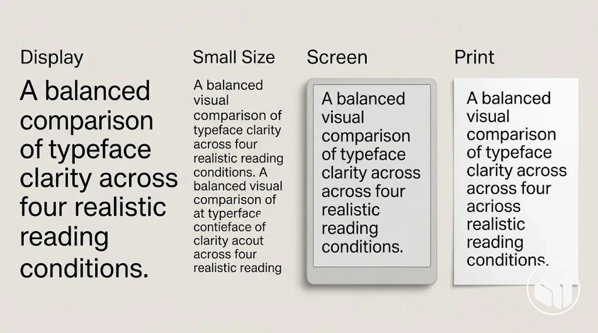
- Display use: Check the typeface at the larger sizes and shorter text lengths expected for headlines or prominent messages. A distinctive treatment may remain clear in this condition even when it is unsuitable for sustained reading.
- Body text: Test longer passages rather than judging the font from isolated words or headings. If the letterforms or spacing make extended reading uncomfortable in the intended layout, choose a candidate better suited to that text-heavy use.
- Text size: Inspect the typeface at the smaller sizes the brand actually requires. If important letterform distinctions become difficult to recognise as size decreases, legibility is insufficient for that condition even if the font works well at display size.
- Screen: Evaluate the font in the digital contexts where it will appear, using the relevant sizes and text lengths. A candidate should remain clear under those screen conditions rather than being assumed suitable from its performance in another medium.
- Print: Check the typeface in representative printed applications because its clarity and density may differ from its screen presentation. Selection should reflect performance in the print conditions the brand expects to use.
Check Typeface Family Range and Available Styles
Typeface family range matters when one selected font family needs to cover several expected brand uses without forcing additional families into the identity.
A candidate should provide the weights, styles and variants those uses actually require, rather than simply offering the largest possible range.
A narrow family can become a constraint when a needed variant is absent, while a broader family provides greater flexibility when its additional variants serve real requirements.
Family range also depends on consistency across variants and, where the intended audience requires it, verified language support and character support.
Related weights and styles should retain enough family consistency to function as variants of the same design, while the required characters must actually be present for the languages the brand needs to communicate in.
Insufficient range limits the applications the family can support; adequate range gives the identity more flexibility within its expected uses.
The image compares limited and broader family capability through weight and style availability without assigning permanent brand-system roles; language support remains a separate check when relevant.
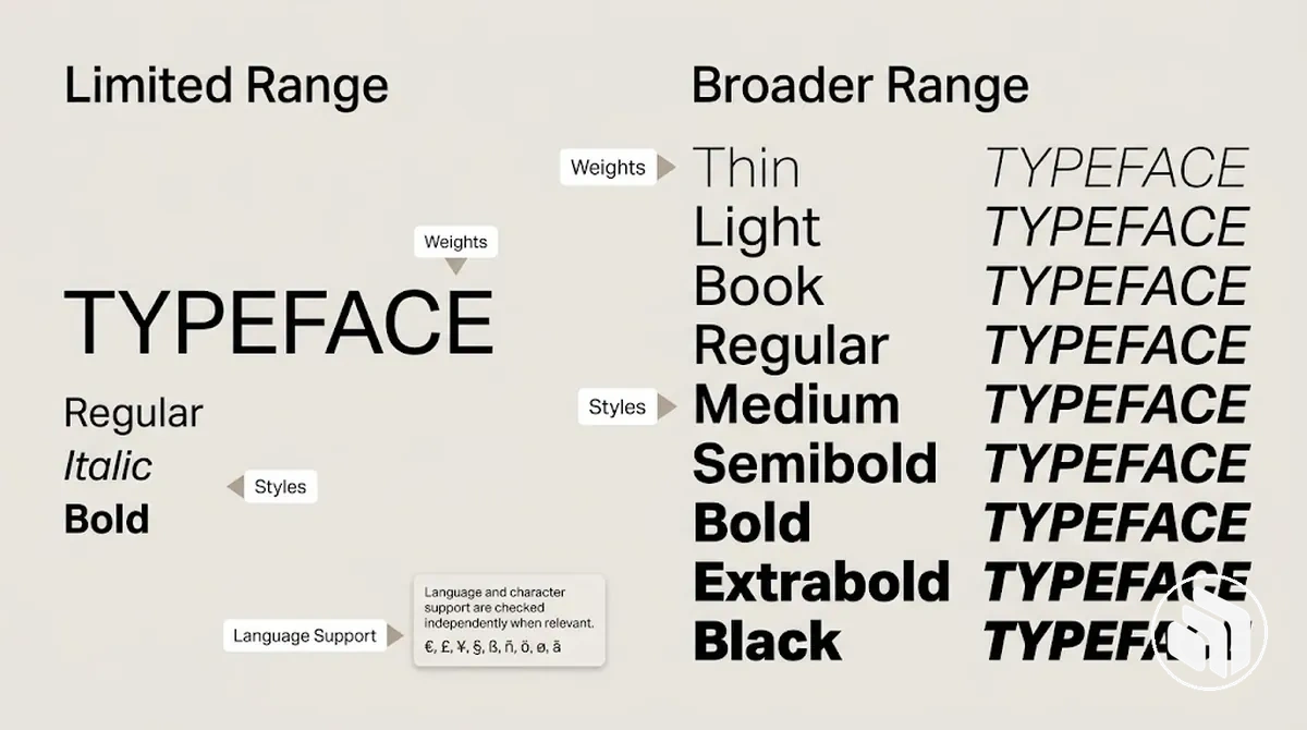
The following checks separate core family capability from support that depends on the intended audience, with each attribute linked to the flexibility or constraint it creates.
- Core family capability — weights: Check whether the font family includes the weights required for the expected applications. If a needed weight is absent, the family constrains those uses; additional weights add flexibility only when they serve an identified requirement.
- Core family capability — styles: Verify whether required styles, such as upright and italic variants where needed, are available. Missing styles can force substitutions or limit how the family can be used.
- Core family capability — variant consistency: Compare the available variants for consistency in their underlying family design. If variants appear insufficiently cohesive for the intended applications, the apparent breadth of the family provides less practical flexibility.
- Context-dependent support — language support: When the intended audience uses multiple languages or writing systems, verify that the candidate supports those required languages. A family without the necessary coverage is constrained for that audience regardless of how many weights or styles it contains.
- Context-dependent support — character support: Check that the specific characters, diacritics or symbols required by the intended content are present. Missing required characters make the family incomplete for that use context.
For example, a narrow family with only a small set of variants may suit a limited application but become restrictive when expected uses require different weights or styles.
A broader family containing the required variants can accommodate those uses more flexibly, provided its variants remain consistent and its relevant character coverage is verified.
Choose a Typeface Style That Fits the Brand
Choose a typeface style by matching the desired brand tone with the intended use, then evaluate individual typefaces within the most suitable broad categories.
Serif, sans serif and display typeface categories can suggest different visual directions, but a category does not determine brand character by itself.
Individual typefaces within the same category can differ substantially in their design and expression, so category is a way to narrow candidates rather than make the final choice.
Typeface-style suitability therefore has two filters: tone fit and use fit.
Tone fit asks whether the individual design supports the intended impression and values, while use fit asks whether it remains suitable for the required context, such as the medium, text size and amount of text.
A display typeface may suit an expressive direction for short prominent text yet become less suitable when the intended use requires extended reading.
Likewise, a serif or sans serif can support different brand tones depending on its individual design and the context in which it appears.
The image compares broad style directions using consistent sample text, showing visible differences among serif, sans serif and display treatments without treating those categories as fixed personality labels or final font choices.
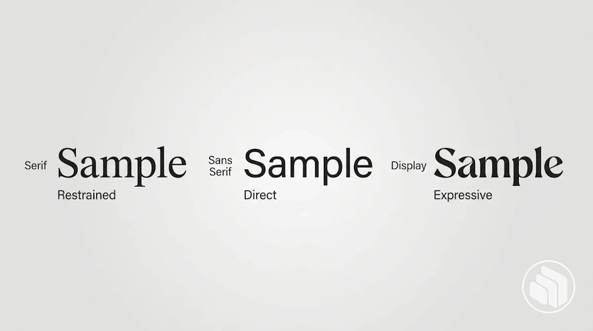
Before narrowing candidates, test each broad style direction against both the desired brand tone and the intended use.
These checks separate category-level direction from the suitability of an individual typeface.
Tone fit
Identify the impression the brand needs to support, then compare individual typefaces within promising categories. Two serif, sans serif or display designs can communicate noticeably different character, so category membership is not enough.
Use fit
Test the individual design in the required medium, text size and text length. Retain a style direction only when it supports the desired tone and remains functional in the intended use.
For example, a restrained identity could use a serif when a particular serif design supports the required tone and intended applications, while another restrained identity could reach a similar tonal direction with a suitable sans serif.
An expressive identity might consider a display typeface for short prominent applications but use a less decorative style where longer reading is required.
These situations narrow the selection by context rather than establishing a fixed rule, which sets up a closer comparison of serif and sans serif styles.
Compare Serif and Sans Serif by Brand Tone and Use
Serif and sans serif typefaces should be compared on the same basis: the brand tone they can support and their suitability for the intended use context.
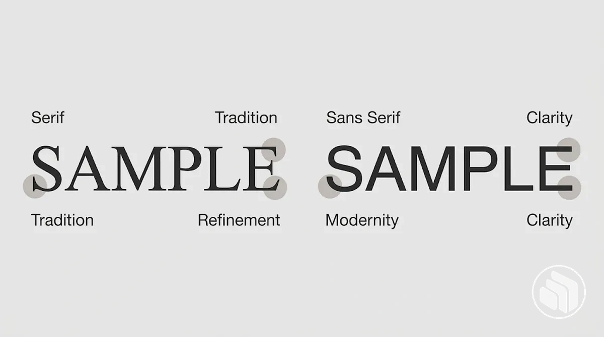
Serif designs are commonly associated with qualities such as tradition, authority or refinement, while sans serif designs are commonly associated with modernity, simplicity or clarity, but these are tendencies rather than fixed meanings.
Neither category is universally better, and neither category is inherently more readable across every screen, print or text condition.
The image makes the visible structural distinction between the categories concrete, while the table compares their common associations and practical trade-offs without declaring a winner.
| Typeface category | Common tonal associations | Practical consideration | Suitable context |
|---|---|---|---|
| Serif | Often associated with tradition, authority, refinement or an editorial tone. | Serif details and the wider typeface design affect the visual character; readability depends on the individual design and application conditions rather than the presence of serifs alone. | May suit a brand context where the particular serif design supports the intended tone and remains functional at the required sizes, media and text lengths. |
| Sans serif | Often associated with modernity, simplicity, directness or visual clarity. | The absence of serifs does not by itself establish readability or suitability; proportions, spacing, weight and other characteristics of the individual typeface remain relevant. | May suit a brand context where the particular sans serif design supports the intended tone and performs appropriately in the required applications. |
Category-level associations can help narrow the comparison, but individual typeface design can depart substantially from those tendencies: a serif can appear restrained or contemporary, while a sans serif can appear formal or authoritative depending on its design.
Readability and clarity also depend on application conditions such as text size, spacing, medium and text length, so the category label alone does not establish performance.
The final choice should therefore be tested at the typeface level in the actual use context rather than inferred from serif or sans serif classification alone.
Select a Compatible Set of Brand Fonts
A compatible brand-font set starts by determining the functional need for one font family or multiple families, then selecting an anchor font, shortlisting each complementary candidate and testing the candidates together.
The anchor family provides a reference point for selection rather than defining the final typography system.
Supporting candidates should be considered only when they add a useful function or distinction instead of duplicating what the anchor font already provides.
At this stage, compatible means the selected families maintain a coherent shared tone while providing useful contrast and functional distinction in the brand applications where they will appear together.
Compatibility is judged from the relationship between candidates, not from surface similarity or a preset combination.
A set that appears coherent in one context should still be tested across representative applications before it is treated as suitable.
The sequence below establishes what the set needs to achieve before the candidates are judged together, reducing the risk of pairing fonts by appearance alone.
Detailed decisions about font count and pairing mechanics can then be handled separately.
- Determine whether more than one family is needed: Identify whether the required brand applications can be handled by one font family or whether a functional need justifies adding another family, avoiding extra families that only create redundancy.
- Select an anchor family: Choose the strongest individually suitable font family as the anchor font against which supporting candidates will be assessed for shared tone, contrast and functional distinction.
- Shortlist complementary candidates: Compare a limited set of supporting families with the anchor and retain candidates that add a useful distinction while remaining visually coherent with it.
- Test the set together: Place the anchor font and each complementary candidate into representative shared brand applications and check whether the set remains coherent and functionally distinct across the conditions in which it is expected to appear.
Decide How Many Font Families Are Necessary
A small set is common, but the right number depends on distinct functional needs.
As a rule of thumb, many brand systems use a small number of font families, often one to three, but this range is not a strict maximum or universal standard.
The necessary count should follow the brand's communication needs rather than the number alone.
Font families should not be confused with their individual weights and styles, because variants within the same family do not automatically count as separate families.
An additional family is justified when it supplies a distinct capability that the existing family does not provide for the required communication.
If it mainly duplicates an existing function, it adds redundancy and complexity rather than useful capability.
The criteria below test whether another family contributes a necessary function or creates avoidable redundancy and consistency costs.
- Distinct need: Add another family only when a communication need is not adequately served by the family or families already selected.
- Added capability: Retain an additional family when it contributes a necessary function rather than merely providing another visual option.
- Redundancy: Remove a family when its intended function substantially duplicates what an existing family can already provide.
- Consistency cost: Reconsider an additional family when the extra variation increases complexity without adding enough functional value to justify it.
Pair Fonts Through Complementary Contrast and Shared Tone
Font pairing compatibility depends on creating enough contrast for functional distinction while retaining enough shared tone for coherence.
Useful contrast allows two families to appear intentionally different and can provide a hierarchy cue when they serve different purposes.
Shared character in features such as proportion, visual rhythm or overall tone can keep that distinction from becoming visual conflict.
A complementary pairing balances both qualities rather than relying on similarity alone.
Evaluate the candidate families together in the same application because compatibility depends on how their characteristics interact in context.
Contrast should make their functions distinguishable, while shared tone should give the combination enough visual relationship to appear intentional.
Functional distinction should remain clear in representative headline and supporting-text contexts without defining the complete typography system.
The appropriate degree of difference depends on the selected typefaces and application, so test the font pairing in context rather than applying a universal formula.
The following checks diagnose whether two selected families provide useful distinction while maintaining coherence.
- Contrast: Check whether the families are visibly different enough to create a useful hierarchy cue. If their key characteristics are too similar, the second family may add little functional distinction.
- Shared tone: Compare characteristics such as proportion, visual rhythm and overall character. If the families differ so strongly that they appear unrelated in the application, the contrast becomes conflict rather than complementary distinction.
- Functional distinction: Confirm that each family contributes a recognisable purpose in the application rather than competing for the same visual function.
- In-context test: Place both families in the same representative application and judge their performance together. A compatible result should retain both distinction and coherence under the conditions in which the fonts are expected to appear.
A brief contrast check can clarify the result without replacing the underlying compatibility criteria.
Too similar
Few meaningful visual differences weaken the hierarchy cue, so the second family adds little functional distinction.
Too conflicting
Differences in character or visual rhythm make the families appear unrelated, reducing coherence even when contrast is obvious.
Complementary
The families remain clearly distinct while sharing enough character for the pairing to feel intentional in the tested application.
Validate the Font Choices in Representative Brand Applications
Shortlisted fonts should be tested in representative applications before the selection is finalised.
Font-choice validation applies the same candidates to realistic brand situations so weaknesses in readability, tonal fit or practical performance appear before implementation.
A successful result supports the candidate only under the conditions tested rather than proving suitability for every possible application.
Use realistic sizes and representative content, including paired use where more than one family has been shortlisted.
Where relevant, compare screen and print applications, test the family variants required for expected uses, and verify any language support or character requirements established during selection.
These conditions provide observable evidence for whether each candidate remains clear, coherent and functional in the situations the brand expects to use.
The verification checklist separates functional validation from identity-fit validation so a font does not pass solely because it looks appropriate for the brand.
Keep a candidate when it satisfies an important requirement under the representative test condition; when it fails, revise the choice or application and retest rather than rationalizing the failure.
- Functional validation — readability at realistic sizes: Test the shortlisted fonts at the sizes and text lengths expected in representative applications. Keep a candidate when its letterforms and text remain sufficiently clear for the required use; revise it when readability becomes inadequate under an important condition.
- Functional validation — screen and print: Where both media are required, compare the same candidate in representative screen and print conditions. Keep it when it remains functional in each required medium; revise or retest when performance in one required medium is unsuitable.
- Functional validation — family variants: Test the weights and styles that the expected applications actually require rather than validating only one variant. Keep the family when the required variants perform consistently enough for those uses; revise the selection when an essential variant does not.
- Functional validation — language support: Test the characters, diacritics or writing systems required by the intended content. Keep the candidate when the required language and character coverage is present and usable; revise it when required content cannot be represented appropriately.
- Identity-fit validation — tonal fit: Place the candidate in representative brand content and compare the observed character with the intended brand personality. Keep it when the typeface continues to support the intended tone in context; revise it when the application reveals a conflicting visual character.
- Identity-fit validation — paired use: When multiple families are shortlisted, test them together in the same representative application. Keep the pairing when useful contrast and shared tone preserve functional distinction and coherence; revise it when the families become too similar, visually conflicting or unclear in their intended distinction.
- Operational validation — licence and deployment: Confirm that the selected typeface can legally be used in every required deployment context under its actual licence. Keep it when the required uses are permitted; revise the selection or obtain appropriate rights when a necessary use is not covered.
Once the shortlisted fonts pass the required validation conditions, assigning durable roles and hierarchy belongs to the next implementation context: build a brand typography system.
Common Brand Font Selection Mistakes to Check Before Finalising
Brand-font selection mistakes often occur when personal taste, stereotypes or untested assumptions replace criteria-based evaluation.
An attractive font can still be unsuitable when its readability, functional capability or relationship with other selected fonts does not meet the brand's actual requirements.
The consequence may only become visible when the typeface is placed in a representative application.
A final selection check should therefore diagnose whether each choice remains justified by the requirements established earlier.
A selection mistake can be recognised when the reason for keeping a font is disconnected from an identified requirement or when representative testing exposes a weakness that has not been resolved.
The diagnostic pattern below identifies the consequence, recognition cue and corrective direction for each selection-stage error before finalising the fonts.
- Choosing by personal taste alone: Personal preference can produce a selection that looks appealing but lacks demonstrated suitability for the brand. The mistake is visible when the main justification is liking the font rather than its fit with defined criteria; the corrective direction is to reassess the candidate against the required tone, uses and capabilities.
- Ignoring readability: A visually suitable typeface can become difficult to use when its letterforms or text performance are inadequate in a required context. Recognise the problem when clarity deteriorates at realistic sizes or text lengths; correct it by testing the candidate under those conditions and revising the choice when readability is insufficient.
- Relying on a category stereotype: Treating every serif, sans serif or other category as having one fixed personality can exclude suitable candidates or retain a poor individual fit. The recognition cue is a decision justified mainly by category membership rather than the characteristics of the actual typeface; correct it by evaluating the individual design against the intended tone and use.
- Selecting too many families: Additional families can create redundancy and unnecessary complexity when they do not contribute a distinct function. Recognise this mistake when multiple families substantially duplicate the same capability; correct it by retaining only families that satisfy an identified need not already covered by the selected set.
- Pairing with insufficient contrast or a tonal mismatch: Insufficient contrast can weaken functional distinction, while a tonal mismatch can reduce coherence between the families. The warning sign is a pairing in which the fonts either appear difficult to distinguish in their intended functions or visually unrelated in the same application; correct it by revising the pairing until useful contrast and enough shared tone coexist.
- Skipping representative testing: Selecting candidates from isolated samples can leave application-specific weaknesses undiscovered before implementation. Recognise the problem when the fonts have not been tested with realistic content, sizes, required variants, media, pairings or language requirements; correct it through representative testing and revise any candidate that fails an important requirement.
These checks address errors in selecting the fonts themselves; once the choices are validated, documenting approved font rules belongs to the governance stage in the brand guidelines.