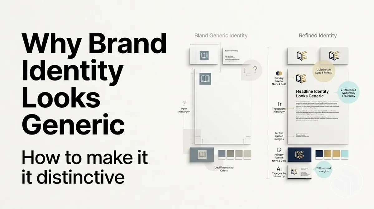
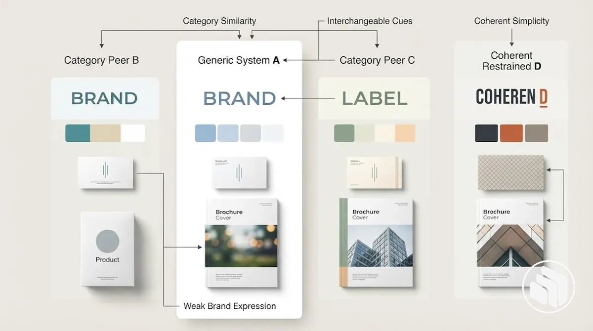
A brand identity looks generic when its prominent visual and verbal cues are so similar to category peers,
inconsistently applied, or weakly tied to specific brand characteristics that they provide too little brand-specific information.
To make it more distinctive, diagnose the dominant weakness, strengthen a small set of relevant and repeatable cues,
and verify the revision against the earlier identity rather than novelty alone.
The central distinction is not simplicity versus complexity: useful category familiarity can remain while brand-specific cues become easier to recognise.
From generic-looking to distinctive: a diagnostic path
Start with the dominant observable pattern. The same symptom can have different explanations, so use the branch that best matches how the identity behaves before choosing a correction.
If the main issue is similarity
Signal: prominent cues closely resemble relevant category peers and carry little brand-specific difference.
Correction: refine those cues so useful category clarity remains while the treatment carries more specific brand meaning.
If the main issue is inconsistency
Signal: recognisable cues appear in some applications but change substantially or disappear in others.
Correction: define the reusable characteristics of those cues and preserve them through context-sensitive adaptation.
If the main issue is weak brand-specific meaning
Signal: the identity is coherent, but its typography, colour, imagery, graphic language or tone says little about the particular brand.
Correction: connect specific brand characteristics to observable cues and reinforce a small set that can recur coherently.
Verify the revision against the baseline
Differentiation
Relevant cues show clearer brand-specific differences from comparable identities.
Non-name recognisability
Under comparable audience and use conditions, more identifying information is carried by cues beyond the brand name.
Coherence
Selected cues recur consistently while allowing necessary variation.
Brand fit
Observable choices connect more clearly to defined characteristics, positioning and audience relevance.
Adaptability
Identifying cues remain recognisable across representative touchpoints and constraints.
Do not treat this as a scoring system: no single signal proves that an identity is generic, and no single criterion proves that a revision is successful.
The problem is not simply a lack of decoration or visual complexity.
A restrained brand identity can be deliberately simple while still using brand-specific cues that make its character coherent and recognisable.
A generic-looking identity instead has identifying cues that can feel interchangeable with those of comparable brands.
Distinctiveness works alongside relevance and category fit rather than replacing them.
Familiar category signals can help a brand identity communicate what kind of organisation, product, or service it represents, but relying on those signals without enough brand-specific expression can make recognition more difficult.
Visual cues such as typography, colour and imagery, together with verbal cues such as tone, can strengthen recognisability when they consistently express relevant brand characteristics.
Coherence matters because distinctive cues need to operate as parts of the same identity rather than as isolated attempts to appear different.
Fixing a generic-looking brand identity therefore starts by locating where distinctive information is being lost and determining which brand-specific cues can be strengthened without discarding useful category signals.
The next step is to look for observable signs of interchangeability, weak recognisability and insufficient brand-specific expression before deciding what needs correction.
Table of Contents⌄
How to Recognise a Generic Brand Identity
A generic brand identity is best recognised from a pattern of observable signals rather than one isolated sign.
Relevant signals include strong similarity to category peers, interchangeable design choices, weak expression of brand-specific characteristics, and limited memorability or recognisability in the context where the identity appears.
None of these signals alone confirms that a brand identity is generic because familiarity, audience exposure, and category expectations can affect their interpretation.
Similarity becomes more meaningful when several identity cues could plausibly belong to comparable brands without changing their apparent meaning.
Limited memorability can suggest that the identity provides too few distinctive cues for recognition, while weak expression of brand-specific characteristics suggests that the visual or verbal system communicates the category more clearly than the particular brand.
These are diagnostic indications rather than fixed thresholds: there is no universal number of matching signals that confirms a generic brand identity.
Deliberate simplicity is not the same as interchangeable sameness.
A restrained identity may use few visual elements while maintaining coherence through recognisable typography, colour, imagery or verbal choices tied to specific brand characteristics; interchangeable sameness is suggested when those choices provide little brand-specific distinction from category peers.
The following checklist separates low-distinctiveness signals from characteristics compatible with deliberate simplicity.
Each item pairs an observable cue with its diagnostic interpretation, so the pattern can be assessed without treating subjective taste or one familiar convention as proof.
High similarity to category peers: several visual or verbal cues resemble those of comparable brands, suggesting limited brand-specific differentiation when the similarities occur as a pattern.
Interchangeable design choices: typography, colour, imagery or tone could plausibly belong to multiple category peers with little change in apparent identity, suggesting that the cues express category membership more strongly than individual brand characteristics.
Weak brand-specific expression: the identity communicates few observable characteristics associated with the particular brand, which can reduce its recognisability relative to comparable identities.
Limited memorability or recognisability: distinctive cues are difficult to identify or recall in the relevant context, which can suggest weak differentiation but does not by itself confirm genericity.
Simple but coherent cues: a restrained set of elements remains consistently connected to recognisable brand-specific characteristics, which is compatible with deliberate simplicity rather than interchangeable sameness.
When several low-distinctiveness signals appear together, they provide a reason to investigate where differentiation is being lost rather than proof of a single cause.
The next diagnostic task is to identify which identity cues or conditions are producing that pattern.
Why a Brand Identity Looks Generic
A generic brand identity usually develops through interacting contributing factors rather than one isolated design flaw.
When several individually acceptable but undifferentiated choices reinforce the same category conventions without enough brand-specific meaning, the combined effect can weaken differentiation, recognisability, and personality.
The relevant issue is therefore how those choices interact in context, not whether any single convention or trend is inherently unsuitable.
Causes are mechanisms that directly shape the identity system, while contributing factors are conditions that can increase similarity without producing genericity on their own; visible sameness is the resulting state rather than proof of one specific cause.
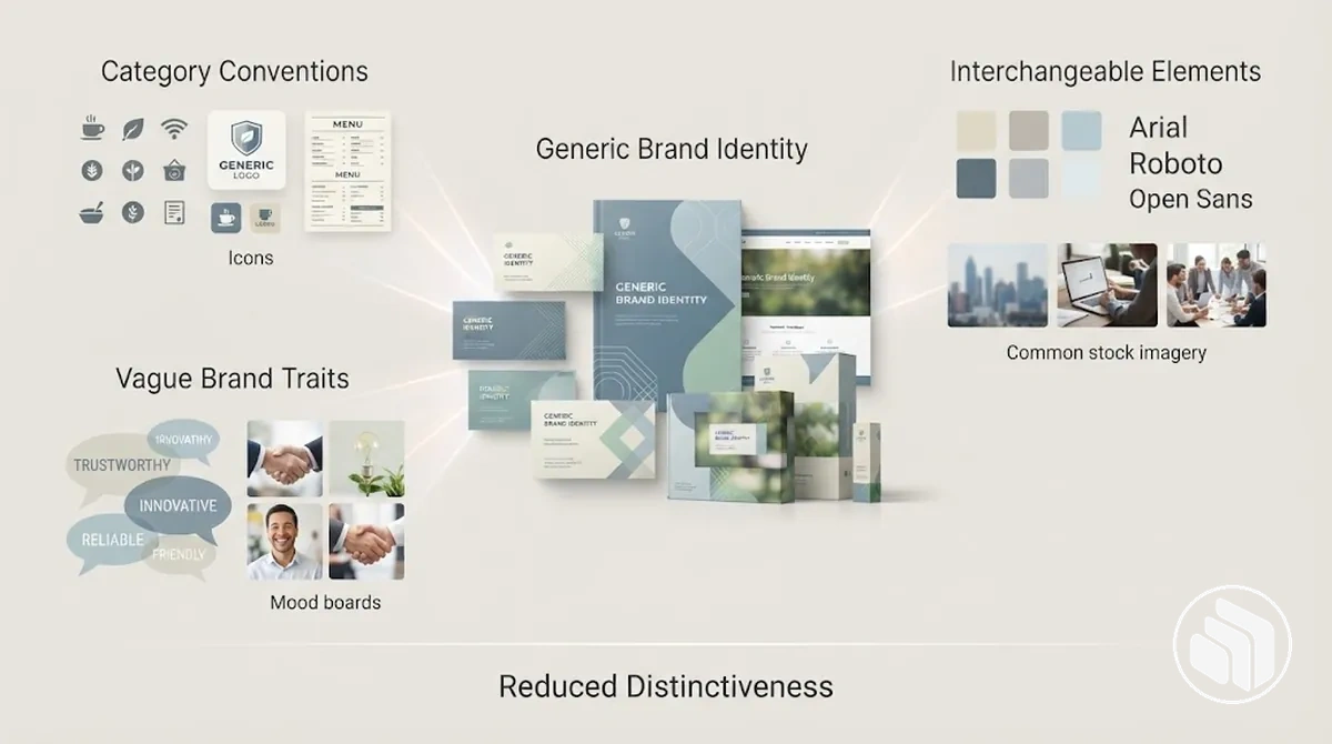
For example, familiar category conventions may support category recognition, but if vague brand characteristics also lead to interchangeable typography, colour, imagery, and verbal choices, fewer cues remain to express a particular brand personality.
In that combination, the affected attribute is brand-specific differentiation, and the resulting state can be greater similarity to comparable identities.
The diagram illustrates this cumulative relationship rather than a deterministic causal chain.
Compounding matters because several choices that are reasonable in isolation can collectively produce an interchangeable identity when they repeatedly express category membership more strongly than brand-specific characteristics.
The cause subsections that follow separate these contributing mechanisms so their effects on distinctiveness, personality, and recognisability can be examined without assuming that any one factor guarantees a generic result.
Overreliance on Category Conventions and Design Trends
Category conventions and design trends can increase similarity when they dominate brand-specific meaning rather than simply helping an identity feel familiar within its category.
Overreliance occurs when shared category codes or fashionable treatments are adopted with too little adaptation, leaving fewer cues that distinguish the particular brand.
The contrast is between familiarity that supports comprehension and dependence that weakens distinctiveness.
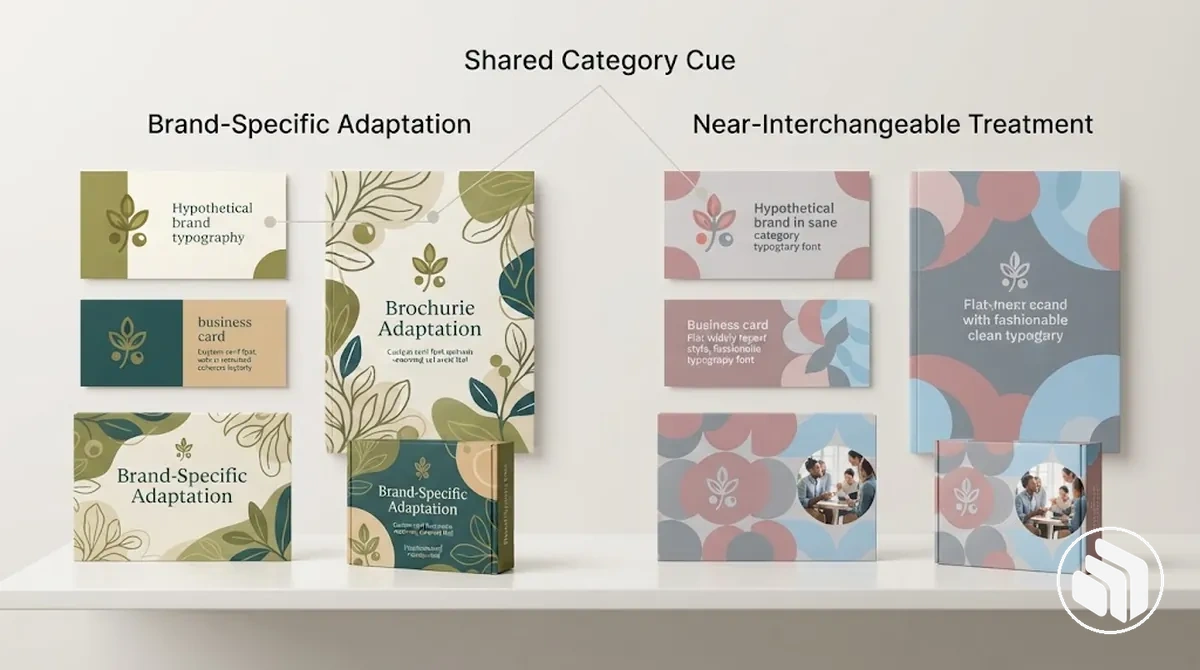
A familiar category cue can help people understand what kind of brand they are encountering, while a brand-specific adaptation can give that cue a more particular identity.
By contrast, repeating the same fashionable typography, colour treatment, imagery style, or graphic language as category peers can contribute to near-interchangeability when those choices carry little brand-specific meaning.
The comparison below shows how the same category familiarity can coexist with different degrees of differentiation and recognition.
For example, two hypothetical identities might use the same familiar category cue, but one adapts it through a consistent brand-specific visual treatment while the other combines it with several widely repeated trend choices; the latter can produce greater similarity to category peers.
Familiarity therefore remains useful when it aids recognition or comprehension without overwhelming the cues that give the identity its own meaning.
Weak Translation of Brand Characteristics Into Design Choices
Brand characteristics can be strategically clear yet still produce a generic-looking identity when they are not translated into specific design choices.
Personality, positioning, values and audience relevance remain abstract until they inform an observable cue such as typography, colour, imagery or tone, and more than one valid expression may communicate the same characteristic.
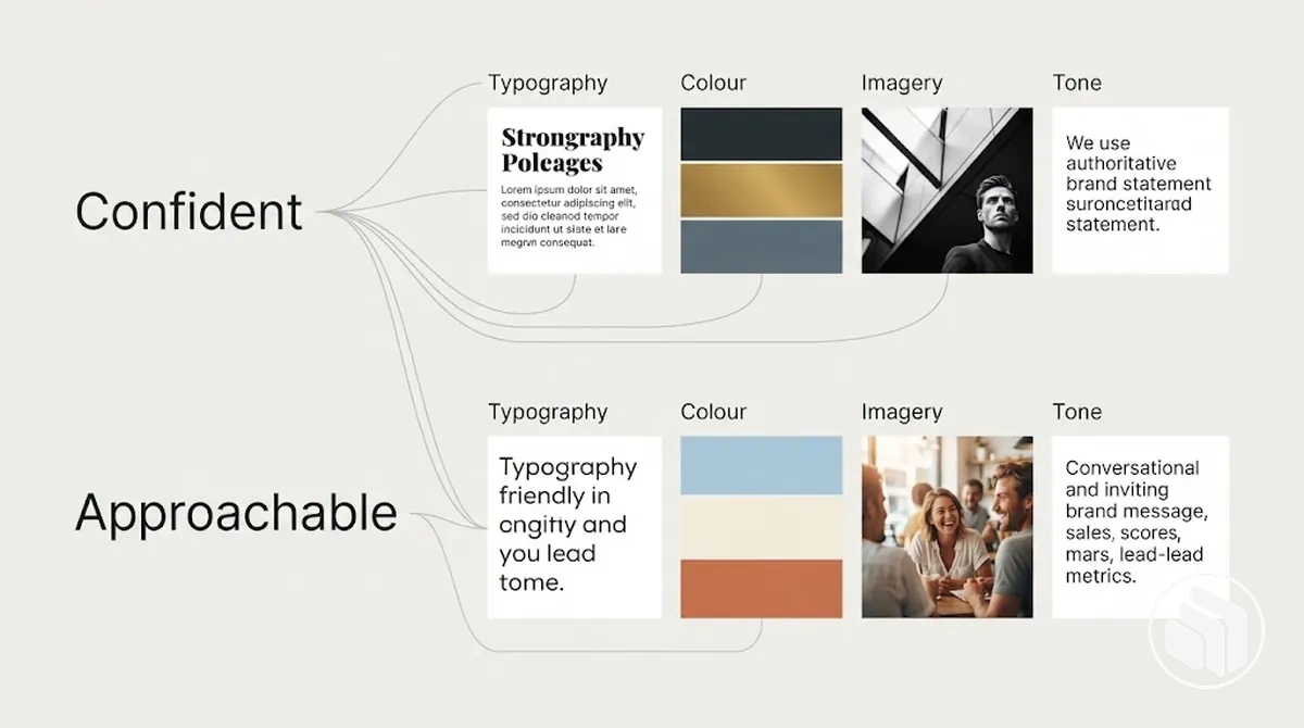
The relationship matters because a broad direction such as “confident” provides little distinction by itself, whereas a hypothetical identity might express that characteristic through assertive typographic hierarchy, restrained colour relationships and concise verbal tone to imply clarity and decisiveness.
Another identity could express the same characteristic through different cues, so the mapping is illustrative rather than a universal visual meaning.
The annotated example shows how selected characteristics can connect to observable visual and verbal choices without treating those choices as guaranteed perceptions.
Likewise, a vague direction such as “approachable” becomes more specific when audience relevance and positioning inform concrete imagery, typography and tone choices instead of relying on the adjective alone.
Distinctiveness can be supported when brand characteristics are translated into specific, relevant cues that work together as an identity rather than remaining generic strategic language.
Core Identity Elements That Feel Interchangeable
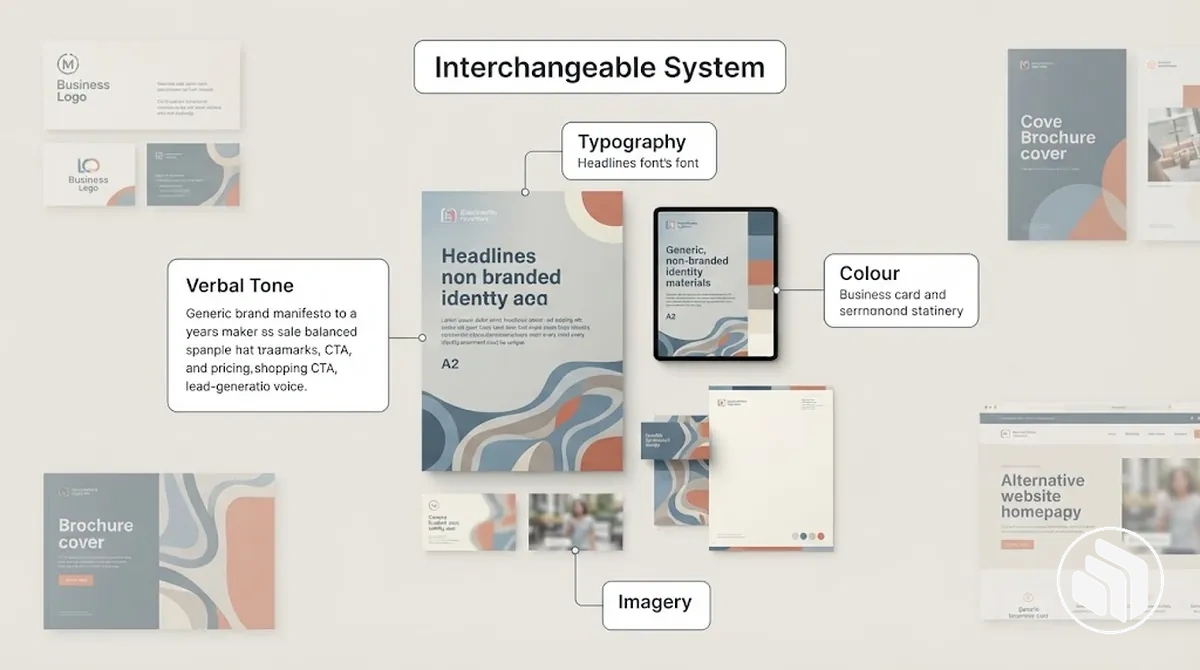
Core identity elements can be competently designed in isolation yet still form an interchangeable brand identity system when too few of them carry brand-specific information.
Typography, colour, graphic language, imagery, iconography and verbal tone operate together, so recognisability and personality depend on their combined contribution rather than any single element defining the identity.
The most relevant elements are the ones whose current treatment either carries distinctive information or could plausibly be exchanged with a comparable identity without changing much of its apparent character.
The following examples connect each element's treatment to its possible contribution to recognisability or personality rather than treating every component as equally important.
Typography: a conventional type treatment with little brand-specific variation may contribute less distinctive information when comparable identities use similar typographic choices.
Colour: a familiar palette can support coherence and category fit, but it may contribute little to recognisability when its treatment is difficult to distinguish from comparable identities.
Graphic language: recurring shapes, layouts or compositional devices can carry personality when they form a coherent brand-specific pattern; generic treatment can make that layer feel replaceable.
Imagery: broadly interchangeable subject matter, composition or art direction may communicate the category while carrying limited information about the particular brand.
Iconography: standardised icons can support functional clarity, but their contribution to personality may remain limited unless their treatment participates in the wider identity system.
Verbal tone: familiar category language may communicate clearly while adding little brand-specific personality when its phrasing and manner remain interchangeable with peers.
These elements are therefore useful to consider as a connected system rather than as isolated design assets, because their combined treatment influences how much distinctive information the identity can carry.
The broader Brand Identity Design context covers the complete identity system; here, the relevant boundary is only how interchangeable treatment contributes to a replaceable overall impression.
How to Diagnose Where Distinctiveness Is Being Lost
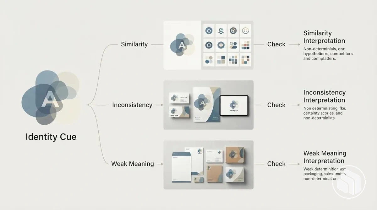
Distinctiveness diagnosis requires locating which identity cues fail to differentiate the brand and determining whether the primary issue is similarity, inconsistency, or weak brand-specific meaning.
These are diagnostic states rather than definitive causes: similar symptoms can have different explanations, so each signal requires a relevant diagnostic check before an interpretation is made.
The diagnostic branches separate cues that resemble category patterns from cues that vary across applications or communicate too little about the particular brand.
Keeping these branches separate helps prevent a familiar-looking, inconsistent, or weakly expressive identity from being assigned the same explanation simply because each can reduce recognisability.
A useful assessment follows signal → check → interpretation: observe the identity cue, test the plausible issue against relevant evidence, and interpret what that state suggests before choosing a corrective direction.
The table applies that logic to three plausible branches without treating any single indicator as proof.
Signal, diagnostic check and interpretation
Observed signal
Possible issue
Check
Interpretation
Several prominent identity cues closely resemble those of relevant category peers.
Similarity
Compare the same cues against relevant category patterns and identify whether they carry recognisable brand-specific differences.
If the cues remain difficult to distinguish from category peers, the loss of distinctiveness may be primarily associated with similarity.
Recognisable cues appear in some applications but change substantially or disappear in others.
Inconsistency
Compare repeated uses of the same identity cues across representative applications for coherent treatment.
If the identifying cues are not carried consistently, recognisability may be weakened by inconsistency rather than by similarity alone.
The identity is coherent but its cues communicate little that is specific to the brand.
Weak brand-specific meaning
Assess whether the cues remain recognisable without the brand name and whether their expression connects to identifiable brand characteristics.
If coherence is present but the cues remain broadly interchangeable or non-specific, weak brand-specific meaning is the more plausible diagnostic interpretation.
For example, two hypothetical identities might both be difficult to recognise without their names, yet one may closely mirror category peers while the other uses internally consistent cues that express little brand-specific meaning.
The same recognition symptom therefore supports different interpretations after the relevant checks.
Diagnosis should identify the most plausible source of lost distinctiveness before corrective work begins.
Compare the Identity With Relevant Category Conventions
Comparison with category conventions should use the same comparison criteria for the current brand and relevant category patterns, distinguishing where familiarity supports recognition from where similarity leaves little meaningful distinction.
The purpose is diagnostic rather than competitive: departure from a convention can create an opportunity for differentiation, but being uncommon does not by itself make an identity more effective.
Typography, colour and imagery are useful comparison criteria when they are visibly relevant to both the brand and comparable identities; graphic motifs, tone or compositional patterns can be included on the same basis.
Each attribute should be assessed for whether the current treatment aligns with, resembles or differs from the common category pattern, then interpreted according to what that relationship means for familiarity and differentiation.
Category convention comparison criteria
Identity attribute
Common category pattern
Current brand treatment
Diagnostic implication
Typography
The recurring typographic character observed across relevant comparable identities.
Compare the brand's type character, hierarchy and treatment against that recurring pattern.
Close resemblance may indicate an over-conventionalised cue; a meaningful departure may provide differentiation if it remains appropriate to the brand and context.
Colour
The colour tendencies that recur across the relevant category sample.
Compare the brand's palette and colour treatment with those recurring tendencies.
Alignment may provide useful familiarity, while substantial similarity across several cues may leave less visual distinction.
Imagery
The subject matter, composition or art direction that appears repeatedly among comparable identities.
Compare the brand's imagery style with those recurring visual patterns.
A closely shared treatment may carry limited brand-specific distinction; a relevant departure may offer an available point of differentiation.
Graphic motifs
The recurring shapes, devices or compositional patterns used within the category.
Compare the brand's graphic language with those repeated motifs and arrangements.
A familiar motif can support category fit, but a largely interchangeable treatment may contribute little additional distinction.
The interpretation should separate cues that appear over-conventionalised from those that provide appropriate familiarity and those that offer a plausible opportunity for differentiation.
That distinction identifies where the identity aligns with category conventions and where a departure may be useful without treating rarity itself as a measure of quality.
Identify Which Identity Elements Carry the Least Distinctive Information
Identity elements carry the least distinctive information when their observable treatment contributes less to recognising the particular brand or expressing characteristics specific to it.
The diagnostic target is weak identifying value rather than aesthetic dislike, and the importance of that weakness depends on the element's contribution to the identity system as a whole.
Assess the most relevant identity elements using recognisability, specificity, consistency and relevance, prioritising weak carriers with the greatest system impact.
These criteria separate elements that contribute little brand-specific information from neutral elements whose limited distinctiveness has little effect on the overall identity.
Recognisability: an element has weaker identifying value when its observed treatment provides few cues for recognising the particular brand in the relevant context; the implication is greater when that element is prominent or repeatedly encountered across the system.
Specificity: an element contributes less brand-specific information when its treatment could plausibly belong to comparable identities with little change in apparent meaning; this makes it a higher diagnostic priority when it is expected to carry brand character.
Consistency: an element may carry recognisable information in one application but contribute less to overall recognisability when that treatment changes substantially or disappears across other relevant applications.
Relevance: a distinctive-looking element can still have weaker identifying value when its treatment has little observable connection to relevant brand characteristics or context, while a restrained but relevant cue may contribute more meaningfully to the system.
High-impact weak carriers are the elements whose limited recognisability, specificity, consistency or relevance affects the identity across prominent or repeated applications.
Low-impact neutral elements can remain lower diagnostic priorities when they carry little brand-specific information but also have limited influence on the system's overall identifying character.
Check Whether the Identity Is Recognisable Without the Brand Name
Recognisability without the brand name can indicate whether non-name cues carry enough identity information for the brand to remain identifiable when its name is removed.
It is not a universal benchmark: brand maturity, audience familiarity and channel context affect how much recognition can reasonably be expected.
The check should consider whether colour, typography, imagery, graphic devices and other relevant identifying cues remain coherent and associated with the same identity without the brand name.
A mature brand seen repeatedly by a familiar audience may be recognisable from fewer cues, while a newer brand can have a coherent identity without strong unaided recognition.
Interpretation should therefore combine observable cue behaviour with the audience's prior exposure and the context in which those cues appear.
The following checks assess whether relevant non-name cues continue to carry identifiable information while keeping those contextual conditions explicit.
Colour: assess whether the colour treatment remains coherent and identifiable after the brand name is removed; recognisability can indicate that colour contributes useful identity information, but audience familiarity affects the interpretation.
Typography: check whether the typographic character and hierarchy still suggest the same identity without the name; a generic type treatment may carry less identifying information even when it remains visually consistent.
Imagery and graphic devices: assess whether recurring imagery, graphic devices or layout behaviour remain sufficiently coherent to suggest the same identity; resemblance to common category patterns can make the result less conclusive.
Iconography and tone: where these cues are prominent, check whether their treatment remains consistent and specific enough to support recognition without relying on the brand name.
Audience familiarity: interpret recognition relative to prior exposure; limited recognition among people unfamiliar with a newer brand does not by itself indicate a weak identity system.
Channel context: assess the cues in the environments where the identity normally appears, because packaging, social content, websites or other channels can provide different contextual information for recognition.
If several non-name cues remain coherent and identifiable, the check suggests that identity information is distributed beyond the brand name.
If recognition is limited, the result identifies a point for further diagnosis rather than proving poor design, because maturity, familiarity and context can change the interpretation.
How to Make the Brand Identity More Distinctive
Brand identity correction should strengthen brand-specific cues systematically while retaining useful category clarity and coherence.
The corrective direction depends on the diagnosed weakness: refine the cues that are limiting differentiation rather than adding novelty or visual complexity for its own sake.
Match the correction to the diagnosed weakness
Similarity
Refine the relevant identifying cues. Keep the category signals that aid comprehension, but give the treatment more brand-specific meaning.
Inconsistency
Align recognisable cues across applications. Preserve their identifying characteristics while allowing context-sensitive changes in layout, scale or emphasis.
Weak brand-specific meaning
Strengthen the characteristic-to-cue connection. Make selected typography, colour, imagery, graphic language or tone express something more specific about the brand without changing unrelated parts of the system.
Targeted refinement
Use it when the weakness is concentrated in a limited set of cues and the rest of the identity already supports recognition, personality and coherence. If typography is weak but imagery is already recognisable and brand-specific, refining typography can be more proportional than reworking both.
Broader reworking
Use it when several important cues are simultaneously interchangeable, inconsistent or weakly connected to the brand, because isolated adjustments may leave the system-level weakness intact.
Decision rule: make the correction proportional to the diagnosed weakness and preserve useful existing signals; more change does not automatically create more distinctiveness.
When broader reconstruction is required, the brand identity creation process provides the wider process context beyond these proportional corrective decisions.
Anchor Design Decisions in Specific Brand Characteristics
Anchoring design decisions in specific brand characteristics means using concrete, differentiating and relevant traits as decision criteria for observable design choices.
A characteristic should inform design expression according to the brand's positioning and audience rather than dictate one universal visual or verbal treatment.
Characteristic → cue → intended effect
Define the characteristic in context. Use positioning and audience relevance to make a broad trait specific enough to guide design.
Translate it into observable cues. Choose typography, colour, imagery, graphic language or tone that can express that characteristic in this identity.
Check the intended effect. Ask whether the cue expresses the characteristic with more specificity and relevance than a generic stylistic preference. Treat the mapping as illustrative, not a universal visual rule.
Illustrative example: “confident”
If positioning clarifies the trait as direct and assured, a firm typographic hierarchy and concise tone could express that character consistently.
Illustrative example: “approachable”
For a different audience and positioning, warmer imagery and a more conversational tone could express approachability. There is no single correct look for a characteristic.
A brand mood board can then help organise and compare visual references against those criteria, but the references should support the characteristic-to-cue mapping rather than substitute for it.
Strengthen Distinctive Cues Across the Core Identity System
Strengthen a small, repeatable set of distinctive cues across the identity system rather than changing every component at once.
Strengthen the cue, not the noise
Typography
If it is distinctive in one application but generic elsewhere, preserve and repeat its identifying character, then coordinate it with other selected cues rather than adding unrelated variation.
Colour or imagery
If the treatment already carries useful brand-specific information but appears inconsistently, repeat the relevant relationship or art direction where appropriate so it becomes a coherent system cue.
Verbal tone
Coordinate tone with the selected visual cues when it reinforces the same identity. Which cues deserve emphasis depends on the diagnosed weakness and the role each cue already plays.
The aim is interaction among a few identifying cues, not maximal uniqueness or additional complexity in every element.
Apply Distinctive Choices Consistently Across Brand Touchpoints
Consistency across brand touchpoints means preserving reusable cues that carry identity while allowing context-sensitive variation in how those cues are applied.
The objective is coherent adaptation rather than exact repetition, because different touchpoint conditions can require changes in scale, layout, emphasis or format without removing the identifying characteristics that support recognition.
Implementation benefits from a short sequence that preserves each cue while testing whether its adaptation remains coherent across representative applications.
The allowable variation depends on the touchpoint constraint, but the identifying characteristics of the cue should remain sufficiently stable to connect the applications as parts of the same identity system.
Define the reusable cue: specify the identifying characteristic that should be preserved, such as a particular typographic relationship, colour relationship or imagery treatment, without requiring every surrounding element to remain identical.
Apply it in representative contexts: use the cue across a small set of relevant touchpoints and adapt its scale, composition or emphasis where the context requires variation while preserving its identifying character.
Verify coherence and recognition: compare the applications to check whether the adapted cue still appears connected to the same identity rather than becoming generic, inconsistent or dependent on exact duplication.
Adjust the variation: if an adaptation weakens that connection, refine the variable treatment while preserving the reusable cue instead of standardising the complete application.
For example, the same typographic relationship and colour treatment might remain recognisable on a compact digital application and a larger printed application even though their layouts differ.
Consistent adaptation preserves those cues while responding to context; exact repetition would copy the complete arrangement even when the touchpoint requires a different composition.
How to Avoid Replacing Generic Design With Random Difference
Meaningful distinctiveness should be relevant to the brand and repeatable across its identity system, not merely unusual.
Novelty can support differentiation when it expresses brand meaning coherently, but random difference becomes an overcorrection when an attention-grabbing choice has little connection to the brand or cannot be applied consistently.
The main mistake patterns differ in form but share the same corrective test: identify the unusual choice, examine its consequence for recognition or coherence, and determine whether it reinforces a meaningful cue.
This distinguishes purposeful differentiation from arbitrary deviation without treating unconventional design as inherently weak.
Novelty without relevance: an unusual visual or verbal choice may attract attention but fails to reinforce brand meaning when its treatment has no clear connection to relevant brand characteristics. The corrective direction is to retain or refine the choice only when it can carry a recognisable, brand-specific idea.
Inconsistent experimentation: repeatedly changing distinctive treatments between applications can undermine coherence when audiences encounter different identifying cues each time. Preserve the experimental element where useful, but coordinate its recurring characteristics so adaptation still supports recognition.
Excessive departure from useful category cues: removing familiar category cues simply to appear different may reduce comprehension when those cues help people interpret what the brand represents. A departure can still be useful when it remains relevant and coherent, so the correction is to differentiate selectively rather than defaulting either to convention or novelty.
One-off effects: a distinctive treatment that works only in one composition may fail to reinforce recognition across the wider identity system if its identifying quality cannot survive adaptation. Refine the cue into a repeatable characteristic that can remain recognisable under different application constraints.
For example, a distinctive typographic treatment that expresses a specific brand characteristic and remains recognisable through controlled adaptation carries brand meaning; an unrelated decorative effect used once primarily to attract attention is arbitrary difference.
The broader set of brand identity mistakes extends beyond this overcorrection risk, while the corrective direction here is specifically to preserve relevance, repeatability and coherent differentiation.
How to Verify That the Revised Identity Is More Distinctive
Verification should compare the revised brand identity with its earlier baseline across several relevant criteria, not judge improvement by novelty alone.
A stronger revised state should show more brand-specific differentiation and recognisability while retaining coherence, appropriate category cues and adaptability across relevant touchpoints.
The criteria below compare the same dimensions before and after revision so each observed condition has a practical interpretation.
No single criterion proves success because differentiation, recognisability, brand fit, coherence and adaptability can improve unevenly, and audience recognition or category appropriateness remains dependent on the relevant audience and use context.
Earlier baseline versus revised identity
Criterion
Earlier baseline
Revised state
Interpretation
Differentiation from relevant peers
Important identity cues closely resemble comparable brands.
Relevant cues show clearer brand-specific differences while retaining useful category appropriateness.
The change supports meaningful differentiation when those differences express the brand rather than novelty alone; continued interchangeability requires further refinement.
Recognisability without the name
Few non-name cues remain identifiable or connected to the same identity.
Typography, colour, imagery or other relevant cues form a more recognisable pattern without relying entirely on the brand name.
Greater recognisability suggests that more identifying information is carried by the wider system, subject to audience familiarity and context.
Consistency of distinctive cues
Potentially distinctive cues vary substantially or disappear between applications.
Selected cues recur coherently while allowing context-sensitive adaptation.
Consistent recurrence supports recognition; substantial unexplained variation indicates that coherence requires further refinement.
Fit with defined brand characteristics
Identity choices communicate little that is specific to relevant brand characteristics.
Observable cues have clearer connections to defined characteristics, positioning or audience relevance.
The revised state is more brand-specific when those connections remain coherent rather than functioning as isolated stylistic effects.
Adaptability across touchpoints
Identifying cues depend on one application or lose their character when the context changes.
Reusable cues preserve their identifying characteristics across representative touchpoints while allowing necessary variation.
Successful adaptation supports system-level coherence; cues that lose their identifying value under normal application constraints require further refinement.
Verification should interpret these criteria together because mixed results can indicate improvement without showing that refinement is complete.
Evidence of clearer differentiation, stronger non-name recognisability and coherent adaptation supports a qualified conclusion that the revised identity carries more distinctive information than the baseline, while persistent similarity, inconsistency or weak brand-specific expression identifies where further refinement is still required.
The evaluation does not guarantee audience recognition or establish a universal threshold for category appropriateness.
For example, a hypothetical earlier identity might have used cues that closely resembled relevant peers and became inconsistent when the brand name was removed or the application changed.
If the revised identity shows more brand-specific cues, preserves them coherently across touchpoints and remains appropriate to its category, evidence from several criteria supports the conclusion that distinctiveness has improved relative to that baseline rather than merely becoming more unusual.