
How to Define a Brand Imagery Style
A brand imagery style is a set of repeatable visual rules that translates brand character into decisions about mood, subject matter, composition, lighting, colour, texture, and image treatment. Define each dimension with a preferred tendency, acceptable range of variation, and exclusion or revision boundary, then use the same criteria to source, produce, edit, and approve images. Consistency comes from repeating the visual logic, not from making every image identical.
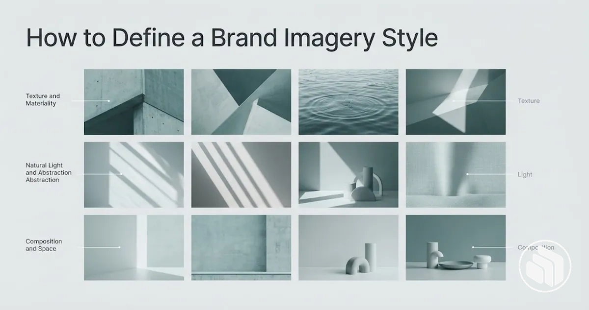
Brand imagery style definition framework
Turn the brand character and intended message into six linked decisions. Each decision narrows what should stay consistent while leaving controlled room for variation.
-
Character and messageState the traits the imagery must express and the message each image needs to support.
-
Mood, subjects, and settingsDefine the emotional direction, suitable people or objects, activities, environments, and recurring scene types.
-
Composition and perspectiveSet tendencies for framing, viewpoint, negative space, depth, cropping, and focal emphasis.
-
Lighting, colour, and textureSpecify lighting quality and direction, tonal behaviour, colour temperature and saturation, palette interaction, background tones, and surface detail.
-
Image treatmentSet boundaries for crop, exposure, contrast, white balance, saturation, retouching, grain, and sharpening.
-
Selection and verificationUse include, revise, and exclude criteria to judge candidate images against the intended use and the same visual direction.
The output is a usable imagery specification: different images may vary in subject or execution, but they can still be approved by the same observable criteria.
Brand imagery style is the imagery-specific implementation layer of brand identity: it governs how images look and how they are selected, but it does not replace the wider brand identity system or complete brand guidelines.
Table of Contents
Translate Brand Character Into an Imagery Direction
Brand traits must be converted into observable visual choices before image selection or production begins.
The sequence below turns brand character and the key message into visual qualities, constraints, and acceptable expressions that can be checked as an imagery direction.

- Identify the intended character and message. State the brand traits the imagery needs to express and the key message the images should support.
- Select the visual qualities. Map each relevant trait to choices in mood, lighting, colour, composition, and subject matter. For example, an approachable character could favour natural expressions and candid situations when those choices fit the intended message.
- Set constraints. Identify visual choices that would conflict with the intended direction, such as lighting, composition, or subject matter that expresses a substantially different character.
- Define acceptable ranges. Specify how mood, lighting, colour, composition, or subject matter can vary while preserving the intended visual logic and consistency.
- Verify coherence before sourcing or production. Check whether proposed image choices can be evaluated against the same traits, visual qualities, constraints, and acceptable ranges.
The mapping from brand trait to visual quality should remain conditional rather than universal: an energetic character might use active subject matter or dynamic composition when those choices support the key message, while another direction might express the same trait through colour or lighting.
Imagery direction is one implementation layer within the wider Brand Identity Design system, not a replacement for the broader identity process.
The acceptable expression is therefore the range of image choices that satisfies the defined traits and constraints rather than one fixed visual treatment.
Set the Mood and Emotional Tone
The mood of brand imagery defines the emotional tone the images are intended to convey.
A small set of specific descriptors gives that intent a usable visual direction without assuming that any single visual feature produces a particular emotional response.
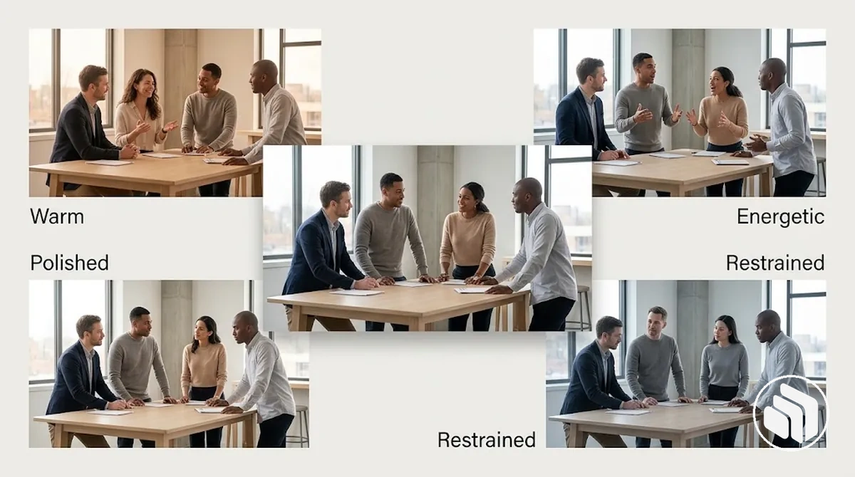
Each descriptor should map to observable image qualities so its implications can guide expressions, setting, movement, atmosphere, lighting, and colour temperature.
The following descriptors illustrate how emotional intent can become repeatable visual direction without prescribing one fixed treatment.
- Warm: natural expressions, inviting settings, softer lighting, and warmer colour temperature can support an approachable atmosphere.
- Energetic: active expressions, visible movement, lively settings, and dynamic visual choices can support a sense of activity without becoming chaotic.
- Polished: controlled expressions, deliberate settings, restrained movement, and considered lighting can support a refined atmosphere without making the brand imagery feel sterile.
- Restrained: quieter expressions, limited movement, simple settings, and subdued visual choices can keep the atmosphere measured rather than visually forceful.
These descriptors act as constraints for later visual decisions: individual images can vary while their visible qualities remain compatible with the intended mood and consistency of the brand imagery.
The defined emotional tone can then be consolidated visually in a brand mood board while remaining the constraint that guides later image choices.
Choose Subjects, People, and Settings
Subjects, people, and settings should support the defined brand character and the intended use of each image rather than being selected only for visual appeal.
Their activities, environments, and visible context should make the scene suitable for the message the brand imagery needs to carry.
Selection criteria should connect what appears in the image to its use context and explain why that choice affects authenticity or suitability.
Evaluate the people and activities first, then the objects, settings, locations, props, backgrounds, and recurring situations that establish the scene.

- People: choose people whose role, expression, and visible behaviour make sense for the situation being depicted, rather than relying on demographic stereotypes to signal brand character.
- Activities: select actions that support the intended use of the image; a natural task can strengthen authenticity when the activity is plausible for the person and setting.
- Objects or products: include items that help explain the activity or message, while excluding objects that introduce an unrelated context or change the perceived purpose of the scene.
- Settings and locations: use environments that provide an appropriate context for the subject and activity; changing from an informal everyday location to a controlled professional setting can materially change suitability.
- Props and backgrounds: keep supporting elements consistent with the scene and brand character so they reinforce context without competing with the main subject.
- Recurring situations: define repeatable scene types when consistency matters across multiple images, while allowing the individual subjects, people, and locations to vary within those criteria.
For example, an image direction intended to feel approachable in an everyday service situation might suit a person naturally engaged in the activity within a familiar environment, while the same person posed formally against an unrelated corporate background could conflict with that direction.
The deciding factor is not which scene looks more attractive, but whether its subject matter and setting satisfy the defined subject-fit criteria.
Define the Visual Attributes of the Imagery Style
Visual attributes make an imagery direction reproducible by translating subjective intent into observable image characteristics that can be specified and checked.
Composition, perspective, lighting, colour behaviour, texture, and image treatment provide the main decision dimensions, with each attribute defined clearly enough to guide consistent image choices.
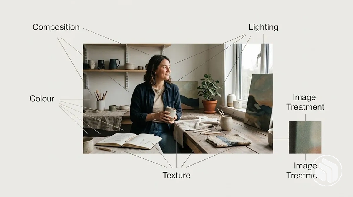
At a glance
- Composition, framing, and perspective
- Define subject placement, viewpoint, negative space, depth, cropping, and focal emphasis.
- Lighting, colour, and texture
- Define lighting quality and direction, tonal range, colour temperature and saturation, palette and background behaviour, and surface detail.
- Image treatment
- Define the acceptable post-production range for crop, exposure, contrast, colour correction, retouching, grain, and sharpening.
- Acceptable range
- For each attribute, record the preferred tendency, the variation that still fits, and the point at which a candidate needs revision or should be excluded.
These attributes work together rather than as isolated rules. Coordinating them creates consistency while still allowing individual images to vary within a defined, recognisably coherent range.
Composition, Framing, and Perspective
Composition, framing, and perspective control where subjects appear, what receives focal emphasis, and the point of view from which the scene is experienced.
Framing distance, camera angle, negative space, depth, and cropping can therefore be defined as adjustable attributes rather than fixed compositional rules.
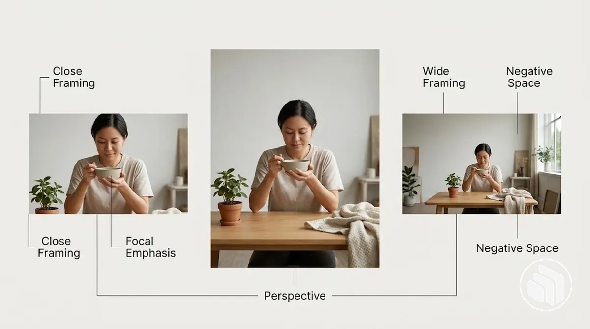
The main variables work together: framing distance and cropping determine how much of the subject and surroundings remain visible, while camera angle and perspective influence the apparent relationship between the viewer, subject, and environment.
Negative space can increase separation around the focal subject, while depth can establish spatial layers and context.
Focal emphasis determines which part of the composition attracts attention first, so its acceptable tendency should remain consistent with the intended imagery direction.
The table maps these controllable attributes to practical acceptable tendencies and their likely visual implications.
| Visual attribute | Acceptable tendency | Visual implication |
|---|---|---|
| Framing distance | Closer or wider framing within a defined range | Changes how strongly the subject dominates relative to its surroundings. |
| Camera angle and perspective | Consistent viewpoint tendencies suited to the imagery direction | Changes the apparent relationship between the viewer, subject, and scene. |
| Negative space | More or less open space around the focal subject within a consistent tendency | Changes subject separation and the amount of visual breathing room. |
| Depth | Shallow or layered spatial relationships according to the intended scene | Changes how strongly foreground, subject, and background establish spatial context. |
| Focal emphasis | Clear priority for the intended subject or detail | Directs attention toward the element that should be noticed first. |
| Cropping | Tighter or more generous crop boundaries within an established framing tendency | Changes how much contextual information remains visible around the subject. |
For example, the same subject framed closely with limited surrounding context can communicate greater intimacy, while a wider framing that includes more environment can create greater distance or formality.
These effects are controlled tendencies rather than universal rules, so composition, framing, and perspective should remain flexible within the acceptable range defined for the imagery style.
Lighting, Colour, and Texture
Lighting, colour behaviour, and texture shape the atmosphere of brand imagery while helping separate images feel related through repeatable visual characteristics.
Lighting quality, lighting direction, contrast, brightness, colour temperature, saturation, palette interaction, background tones, and texture can therefore be treated as adjustable attributes within the selected imagery direction.
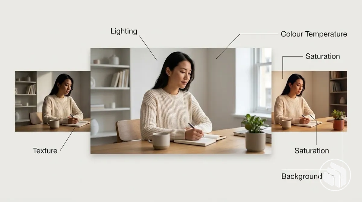
Lighting quality and lighting direction determine how light falls across the subject, while contrast and brightness control the separation and tonal balance between lighter and darker areas.
Colour temperature and saturation influence the overall colour treatment, while palette interaction and background tones determine how colours relate across the subject and surrounding scene.
Texture contributes visible surface quality and detail, which can support the intended atmosphere when treated consistently.
The table organises these controllable lighting, colour, and texture attributes by preferred state and intended visual implication.
| Visual attribute | Preferred state | Visual implication |
|---|---|---|
| Lighting quality | Soft or defined light within the selected direction | Changes the appearance of transitions, shadows, and surface detail. |
| Lighting direction | A repeatable directional tendency appropriate to the subject | Changes which forms and features receive visual emphasis. |
| Contrast and brightness | A controlled tonal range consistent with the intended imagery | Changes separation between light and dark areas and the overall tonal character. |
| Colour temperature and saturation | A defined warm-to-cool tendency and restrained or vivid saturation range | Changes the overall colour character without prescribing an exact emotional effect. |
| Palette interaction and background tones | Colours and background tones that remain compatible within the selected image treatment | Helps separate images share a related colour behaviour. |
| Texture | A consistent tendency toward smoother, cleaner, or more visibly tactile surface detail | Changes the prominence of material and surface qualities within the image. |
For example, the same subject may fit a defined style when its lighting quality, colour temperature, saturation, and background tones remain within the selected direction, yet move outside that style when those attributes shift substantially away from it.
The relevant standard is consistency within the chosen imagery direction rather than one lighting, colour, or texture treatment being suitable for every brand.
Editing and Image Treatment
Post-production should preserve the defined visual direction rather than create an image treatment that conflicts with it.
Editing choices should therefore stay within an acceptable range that maintains consistency across crop, exposure, contrast, saturation, white balance, retouching, grain, and sharpening.
The main treatment boundaries concern how far each adjustment can change the established visual character without producing a mismatch.
Each rule below defines an editable variable, its acceptable range, and the consequence of moving beyond that range.
- Crop: keep framing within the established composition and subject-emphasis rules; moving substantially outside that range can change the intended relationship between the subject and its surroundings.
- Exposure and contrast: keep brightness and tonal separation compatible with the defined lighting direction; excessive adjustment can make the image materially lighter, darker, flatter, or harsher than related imagery.
- Saturation and white balance: keep colour intensity and temperature within the established colour treatment; a pronounced shift can create a colour character that no longer fits the imagery direction.
- Retouching: correct distracting details while retaining the surface qualities and visible characteristics required by the direction; extensive smoothing or alteration can produce an over-processed result when a more natural treatment is intended.
- Grain: keep grain within the acceptable range established for the imagery style; a noticeably different grain character can make otherwise related images feel visually inconsistent.
- Sharpening: keep edge and detail emphasis compatible with the rest of the image set; excessive sharpening can make texture and fine detail more prominent than the defined treatment intends.
For example, the same image may remain consistent after restrained exposure, retouching, and colour adjustments that stay within the established treatment, while aggressive contrast, saturation, or smoothing can shift its character away from that direction.
Repeatable image treatment comes from applying consistent post-production boundaries rather than forcing every image through identical adjustments.
Set Image Selection and Exclusion Criteria
Image selection criteria should turn the defined imagery style into repeatable rules for deciding whether a candidate image should be accepted, rejected, or revised.
Apply the same selection criteria and exclusion criteria across sourced and produced images by evaluating observable fit in mood, subject matter, setting, composition, lighting, colour, treatment, authenticity, and practical suitability.
Not every mismatch carries the same implication for the decision.
A high-priority criterion should control acceptance when its failure materially changes the intended character, while an adjustable mismatch can lead to revision when the underlying subject and context still fit.
The table turns these distinctions into repeatable selection rules by connecting each criterion to an include condition, an exclude-or-revise condition, and its decision implication.
| Criterion | Include condition | Exclude or revise condition | Implication |
|---|---|---|---|
| Mood | The visible atmosphere supports the defined emotional direction. | Reject when the dominant mood conflicts with the intended direction; revise only when treatment can correct the mismatch without changing the scene. | A high-priority mood mismatch can outweigh otherwise suitable visual attributes. |
| Subject matter and setting | The subject, activity, and setting support the intended message and context. | Reject when the subject matter or setting creates a conflicting context that editing cannot resolve. | Controls whether the image is fundamentally suitable for its intended use. |
| Authenticity | People, activities, objects, and surroundings form a plausible scene for the intended context. | Reject when the scene depends on implausible behaviour or contextual relationships that conflict with the defined direction. | Affects whether the image remains credible within the intended imagery style. |
| Composition | Framing, perspective, negative space, cropping, and focal emphasis remain within the defined tendencies. | Revise when reframing can restore the intended emphasis; reject when the underlying composition cannot support it. | Determines whether visual emphasis and spatial relationships remain consistent. |
| Lighting and colour | Lighting quality, tonal behaviour, colour temperature, saturation, and background tones remain compatible with the defined direction. | Revise when controlled adjustments can restore consistency; reject when the captured lighting or colour character would require a substantial transformation. | Separates adjustable finishing differences from fundamental visual mismatches. |
| Treatment | Retouching, grain, sharpening, and other finishing choices remain within the established acceptable range. | Revise when the underlying image fits but its treatment exceeds the defined boundaries. | Allows a suitable image to be corrected without changing its core subject or context. |
| Practical suitability | The image can serve its intended use without undermining the required subject visibility or visual direction. | Reject or revise when its format, framing, or visible content prevents the intended use. | Confirms that stylistic fit also works in the actual application. |
For example, an image might match the defined composition, lighting, colour, and treatment but still be rejected when its subject matter or setting creates a mood or context that conflicts with a high-priority criterion.
Conversely, an image with suitable subject matter and authenticity may be revised when a correctable crop or treatment mismatch is the only issue, making the accept, reject, or revise decision repeatable rather than subjective.
Once these rules are stable, the same selection and exclusion logic can be documented in brand guidelines so later image choices can be evaluated against the same observable criteria.
Use Positive and Negative Examples to Clarify the Criteria
A positive example and a negative example are useful only when the same criterion is applied to both cases, so the observable reason for fit or mismatch remains clear.
Holding the surrounding imagery direction constant makes the relevant visual attribute and its implication easier to distinguish.
The paired examples below keep most conditions consistent while changing one or two attributes that affect the selection decision.
Each comparison identifies the shared criterion, the fitting state, the conflicting state, and the practical implication for the imagery direction.
| Criterion | Positive example | Negative example | Implication |
|---|---|---|---|
| Subject matter and setting | A person performs a plausible everyday activity in a setting that supports the intended context. | The same type of subject performs a similar activity in a setting unrelated to the intended context, creating a mismatch between the activity and environment. | The positive example fits because subject matter and setting reinforce the same context; the negative example should be excluded when that contextual mismatch cannot be corrected without changing the scene. |
| Lighting and colour | The subject, activity, and setting remain constant while lighting and colour stay within the defined visual treatment. | The same scene retains its subject matter and setting but uses lighting or colour behaviour outside the established treatment. | The positive example fits the imagery direction, while the negative example may be revised when the visual attribute causing the mismatch can be adjusted without changing the underlying scene. |
The comparison supports a repeatable selection decision because each fit or mismatch is tied to an observable criterion rather than a subjective judgement about which image looks better.
The deciding criterion is the demonstrated visual attribute and its implication for the imagery direction.
Apply the Style When Selecting and Producing Images
The same defined imagery criteria should guide both image selection and image production so every candidate is evaluated against the intended visual direction rather than its source.
Start with the intended use, then apply the relevant criteria consistently whether you source existing imagery or produce an original image.
The operating sequence moves from defining the intended use and imagery criteria through candidate images, review, adjustment, verification, and approval.
Applying the stages in the same order keeps the evaluation logic stable even when sourcing and production require different execution.
- Confirm the intended use and imagery criteria. Identify where the image will be used and which mood, subject matter, setting, composition, lighting, colour, and treatment requirements apply.
- Source or produce candidate images. Search existing imagery using the defined criteria, or produce original photography with a direction that communicates the same requirements before capture.
- Review each candidate against the visual direction. Compare the image with the relevant criteria and identify specific areas of fit or mismatch rather than approving it on general visual appeal.
- Adjust when the underlying image remains suitable. Revise correctable attributes such as crop or treatment when the adjustment can bring the candidate within the defined direction without changing a conflicting subject or setting.
- Verify and approve. Check the adjusted or unchanged candidate against the intended use and imagery criteria again, then approve it only when it satisfies the required visual direction.
For example, sourced imagery may require filtering candidate images that already satisfy the required subject and setting, while original photography can establish those conditions during production; both are reviewed against the same imagery criteria before approval.
Applying imagery rules is one implementation activity within the wider brand identity design process, not a replacement for that broader process.
In either case, verification before approval confirms that execution differences have not changed the intended visual direction.
Select Existing and Stock Images That Fit the Style
Existing images and stock images should first pass the highest-impact imagery criteria before minor editing is considered.
Screen subject relevance, setting, and mood before evaluating more correctable details such as composition, lighting, colour, and treatment compatibility.
Screening order
- Content fit first.Check subject relevance, setting, and mood. Reject a mismatch when editing cannot change the underlying scene without changing its meaning.
- Adjustable visual fit next.Review composition, lighting, colour, and treatment because some mismatches can be corrected without replacing the image.
- Implementation fit last.Confirm technical suitability and any applicable usage constraints before accepting the candidate.
- Subject relevance: accept the candidate when the subject and activity support the intended context; reject it when the underlying subject matter conflicts with the imagery direction and cannot be corrected through editing.
- Setting and mood: verify that the environment and visible atmosphere support the intended direction; reject a mismatch when changing it would require replacing or materially reconstructing the scene.
- Composition: check framing, perspective, cropping, and focal emphasis; adjust the candidate when a minor crop or reframing can restore the required composition without changing its essential context.
- Lighting and colour: verify that lighting character and colour behaviour fall within the intended range; adjust correctable tonal or colour differences, but reject the image when the underlying lighting creates a substantial conflict that treatment cannot reasonably resolve.
- Treatment compatibility: confirm that retouching, grain, sharpening, and other finishing characteristics can remain within the defined image treatment; revise finishing differences when the underlying image already fits.
- Technical suitability and usage constraints: verify that resolution, crop or aspect-ratio flexibility, and file quality are suitable for the intended placement, and confirm that the applicable licence or permissions allow the intended use and any required modification; reject the candidate when either condition prevents appropriate implementation.
For example, an attractive stock image may closely match the required composition, lighting, colour, and treatment compatibility but still fail because its subject relevance or setting conflicts with the intended imagery direction.
That high-priority mismatch makes the candidate unsuitable even when lower-level attributes fit, so the appropriate decision is to reject it rather than adjust it.
Direct Original Photography to Match the Style
Original photography should translate the defined imagery rules into clear pre-shoot and on-set direction so the photo shoot begins within the intended visual style.
Set expectations for the subject, setting, location, props, lighting, framing, perspective, movement, and image treatment before capture rather than relying on later correction.
The sequence should connect each production choice to the intended brand character and reduce downstream mismatch.
Define the required subject and setting first, including the location, wardrobe or props where relevant, then direct lighting, framing, perspective, movement, and expression within the established imagery criteria.
Use on-set review to identify mismatches while the subject, setting, or direction can still be adjusted, and carry the same criteria into post-shoot selection.
The following sequence turns those requirements into production instructions with verification during the photo shoot and final selection.
- Set the pre-shoot direction. Translate the imagery criteria into explicit expectations for the intended brand character, including the required mood, subject behaviour, setting, and image treatment.
- Direct the subject and setting. Choose the subject, location, wardrobe, products, and props where relevant so the visible scene supports the intended context and brand character.
- Specify lighting and composition. Direct lighting, framing, perspective, movement, and expression within the established visual ranges so the captured material starts within the intended style.
- Verify fit during the on-set review. Review representative captures against the imagery criteria and adjust correctable mismatches in expression, movement, framing, lighting, props, or setting before the photo shoot ends.
- Select captures for final treatment. Choose images that satisfy the defined style and confirm that the expected image treatment can be applied without compensating for a fundamental mismatch in the captured scene.
For example, when the intended brand character depends on candid authenticity, directing natural activity and expressions before capture can prevent overly posed images that later treatment cannot make genuinely candid.
Final selection should retain captures that meet the defined style rather than relying on post-production to correct a conflicting subject or scene.
Verify That New Images Match the Defined Style
Verify new images against the same observable criteria used to define and select the defined style rather than expecting exact duplication of previously approved imagery.
The review should confirm consistency while allowing controlled variation within the established imagery direction.
Start with mood, subject matter, and setting because a mismatch in these variables can change the meaning or character of the image even when its visual treatment is compatible.
Then review composition, lighting, colour behaviour, and treatment to identify the specific variable responsible for a mismatch and whether adjustment can bring it back within the defined range.
Compare the result with existing approved imagery to distinguish acceptable variation from a genuine break in the imagery direction.
The following checks support an adjustment-or-approval decision while allowing appropriate variation between images.
- Mood: verify that the overall atmosphere remains compatible with the intended emotional direction; adjust or reject an image when its dominant mood conflicts with that direction.
- Subject matter: confirm that the subject and activity support the intended message and context; treat a conflicting subject as a genuine mismatch when changing it would require replacing the underlying scene.
- Setting: check that the environment supports the subject and intended context; allow different locations when they preserve the established setting logic.
- Composition: review framing, perspective, cropping, negative space, and focal emphasis; adjust correctable compositional differences when the underlying subject and setting still fit.
- Lighting: confirm that lighting quality, direction, brightness, and contrast remain within the defined visual range; adjust correctable tonal differences when they do not require changing the captured scene.
- Colour behaviour: compare colour temperature, saturation, palette interaction, and background tones with the established direction; treat controlled differences as acceptable variation when they remain within that range.
- Treatment: verify that retouching, grain, sharpening, and other finishing choices remain compatible with the established image treatment; revise treatment mismatches when the underlying image already fits.
- Approved-imagery comparison: compare the candidate with existing approved imagery as a final consistency check; approve variation that preserves the same visual logic and adjust or reject differences that create a genuine style break.
For example, a new image may use a different location and framing from earlier images while still matching their mood, subject logic, lighting, colour behaviour, and treatment, making those differences acceptable variation.
If the same image instead introduces a conflicting mood or subject-setting relationship, the difference represents a genuine mismatch even when its colour and treatment are similar.
The decision should therefore identify the variable causing the break and either adjust it when correctable or withhold approval when it is not.
This imagery-level verification remains focused on whether individual images fit the defined style; maintaining brand consistency across channels is the broader task beyond this image-level review.