
How to Create a Brand Mood Board for Visual Direction
A brand mood board turns established brand intent into a curated visual direction before final identity decisions are made. Build it by translating the brief into observable visual criteria, selecting and arranging references that reinforce one coherent direction, then use that direction to evaluate later design choices rather than treating the board as a finished brand identity.
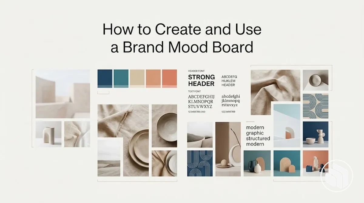
Brand mood board workflow: intent → criteria → references → decisions
Use the mood board as a planning bridge between brand strategy and identity design. Each stage should narrow interpretation without turning exploratory references into approved assets.
- Start with brand intentUse established goals, audience cues, positioning, and intended character as the source of the visual direction.
- Translate intent into visual criteriaDescribe observable qualities that suitable references should express, plus constraints that rule out conflicting interpretations.
- Collect, select, and arrange referencesExplore imagery, colour, typography, texture, pattern, and concise verbal cues, then retain only material that contributes a distinct, relevant signal.
- Review the board for coherenceKeep useful variation, but remove or reduce references that create unsupported side directions, redundancy, or mixed signals.
- Use the direction to guide designEvaluate later choices against the agreed qualities while allowing original solutions that preserve the underlying visual character.
Decision rule: keep a reference or design choice when its visible qualities support the intended direction; question, revise, or remove it when it introduces an unsupported contradiction.
Brand intent provides the basis for deciding which visual references belong together and what they should communicate. When compatible references make the intended mood and personality concrete, the board becomes a shared planning reference for designers, stakeholders, or clients.
The board guides later choices, but the final brand identity depends on how that direction is developed and implemented. Its practical role is to make abstract intent visible without turning inspiration into the finished identity.
Table of Contents
What a Brand Mood Board Is and What It Does in Brand Identity Planning
A brand mood board is a visual planning tool that communicates the intended mood, personality, aesthetic direction, and shared design intent for a brand.
It brings selected visual references and concise verbal cues together so brand intent can be interpreted as a coherent visual direction.
The brand mood board gives a team or client a common reference point for discussing what the intended direction should feel and look like before later design decisions are made.
Images, colour, typography, and text can represent that direction without functioning as final design specifications, helping support alignment when the references consistently reflect the same brand intent.
Within Brand Identity Design, the mood board therefore serves as an exploratory planning reference rather than the identity system itself.

Translate the Brand Brief into Mood Board Criteria
Mood board criteria should translate already-defined decisions in the brand brief into visual criteria that guide which visual references belong and which should be excluded.
Start with the brand goals and audience cues that matter to the intended direction, then express them as observable visual qualities rather than leaving them as broad strategic adjectives.
Extract the relevant goals, audience, positioning, and intent without recreating the brand identity brief.
Translate those inputs into visual qualities that describe the intended mood and personality, then identify constraints that limit unsuitable interpretations.
Because one strategic adjective can support several legitimate visual expressions, the selection criteria should state what visual evidence would support the intended meaning rather than prescribing a fixed mapping.
A practical planning sequence keeps each mood board criterion connected to its strategic input and gives visual references a clear basis for inclusion or exclusion:
- Extract the relevant inputs: identify the brand goals and audience cues that the mood board needs to express.
- Translate them into visual qualities: describe observable characteristics that could communicate the intended mood or personality.
- Define constraints: specify which visual characteristics would conflict with the established brand intent or positioning.
- Test for evidence of fit: include a visual reference when its observable qualities support the intended criterion, and exclude it when the connection depends mainly on personal appeal or contradicts a stated constraint.
For example, if an established strategic idea is “approachable expertise,” useful criteria might favour clear, orderly compositions alongside natural human imagery and restrained visual cues rather than interpreting “expertise” as one prescribed aesthetic.
A reference is a stronger fit when its visible qualities can be connected to the intended idea and defined constraints before visual curation proceeds.

Define the Visual Qualities the Brand Should Express
Visual qualities are observable expressions of the intended brand character, turning abstract attributes such as mood, personality, and tone into visual cues that can guide reference selection.
Each quality should be specific enough to indicate what a suitable reference needs to express without prescribing a finished colour, typography, or imagery system.
Each visual quality should connect an intended attribute to cues that a reference can visibly supply and to a clear selection implication.
The meaning of composition, colour relationships, or type character can vary with context, so these cues should be treated as evidence of fit rather than fixed meanings.
For instance, a restrained quality may suggest controlled composition and quieter visual relationships, while an energetic quality may support greater movement or contrast; references should be selected or rejected according to whether those cues support the intended quality.
The following criteria connect each intended quality with observable evidence that can guide whether a reference fits or conflicts with the desired direction:
- Restrained: controlled composition, measured contrast, and limited competing elements can support a restrained mood; select references where those cues reinforce the intended tone and reject visually busy references that conflict with it.
- Approachable: natural imagery, open composition, and less formal type character can suggest an approachable brand character; favour references where these cues support the intended attribute rather than relying on a single stylistic signal.
- Editorial: deliberate hierarchy, structured layouts, and considered image-to-type relationships can express an editorial quality; select references that demonstrate this visual discipline and reject those whose treatment conflicts with the intended tone.
The annotated example illustrates how intended visual qualities can connect to observable imagery, composition, restrained colour relationships, and type cues.
These connections provide selection guidance rather than fixed design rules.

Keep the visual qualities few and non-contradictory so they provide a coherent direction for reference selection.
Their purpose is to make brand character observable at the mood-board stage, not to define the finished visual system.
Set Clear Selection Criteria for Visual References
Visual reference selection should be based on brand fit rather than visual appeal alone.
Clear selection criteria test whether each visual reference supports the intended direction, so an attractive image can still warrant exclusion when its relevance to the brand is weak.
Evaluate each reference for relevance to the intended direction, consistency with the chosen visual qualities, and compatibility with the rest of the board.
Distinctiveness matters when a reference helps avoid an overly generic direction, while transferability considers whether its useful qualities can inform later design work rather than functioning only as isolated inspiration.
These criteria require judgment rather than an objective score because their importance can change with the brand context.
The criteria below connect each selection dimension to the condition that supports inclusion or warrants removal:
- Relevance: include a reference when its visible qualities support the intended brand character or direction; reject it when the connection relies mainly on personal taste.
- Consistency: include a reference when it reinforces the visual qualities already defined for the mood board; remove it when its mood or tone conflicts with those qualities.
- Distinctiveness: favour a reference when it contributes useful character to the intended direction rather than merely repeating generic visual conventions; its importance may vary with the identity context.
- Transferability: retain a reference when its useful composition, imagery, colour relationship, type character, or other visual principle can inform later design exploration; reconsider it when its appeal depends on details that do not translate meaningfully to the intended identity.
- Compatibility: include a reference when it can coexist coherently with the other selected material; remove it when it weakens the board by introducing a conflicting visual direction.
A side-by-side selection example can make the decision boundary clearer by showing how similar visual appeal can produce different outcomes when brand fit differs.
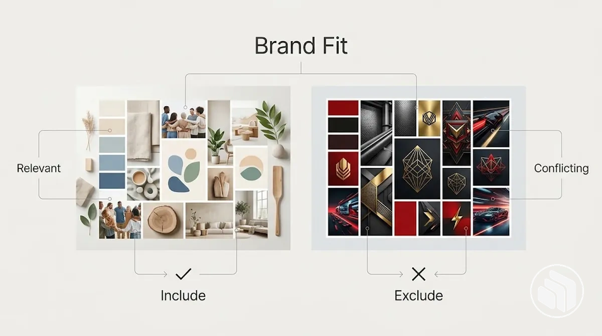
A visually attractive editorial photograph, for example, may have strong composition but still fail the selection test if its mood conflicts with the intended brand character.
In that borderline case, aesthetic appeal does not compensate for weak relevance or compatibility, so exclusion keeps the mood board focused on the intended direction.
What to Include in a Brand Mood Board
A brand mood board should include only the visual and verbal references needed to communicate one intended visual direction.
Common components include imagery, colour references, typography references, textures or patterns, and concise words or annotations, with the exact mix depending on what best expresses that direction.
These component classes contribute different signals while working together as one coherent reference.
Imagery can establish atmosphere and compositional character, while colour references and typography references suggest tone and visual character without becoming final specifications.
Textures and patterns can introduce materiality or surface qualities, and brief words or annotations can clarify the intent connecting the visual references.
The image labels the main component classes within one coordinated brand mood board, showing how different reference types contribute to the same visual direction.
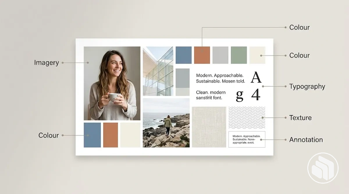
Together, these categories express one direction while each component contributes a different planning signal:
- Imagery: photos, illustrations, or other image references communicate atmosphere, subject treatment, composition, and the general visual character the brand may explore.
- Colour references: swatches or colour relationships suggest the intended tone and interaction of colours without defining finished colour specifications.
- Typography references: examples of type character, contrast, or hierarchy indicate how typography could contribute to the intended personality without establishing finished typography specifications.
- Textures and patterns: surface, material, or pattern references add cues about tactility, rhythm, detail, and mood when those qualities support the direction.
- Words and annotations: concise verbal cues clarify intent, explain why a visual reference belongs, or reinforce the qualities that the board is intended to communicate.
A balanced board uses enough variety to express the direction from several visual angles while keeping the components mutually supportive.
For example, imagery, colour, typography, a supporting texture or pattern, and concise annotations can form a coherent mix when each element reinforces the same intended character.
Colour and Typography References
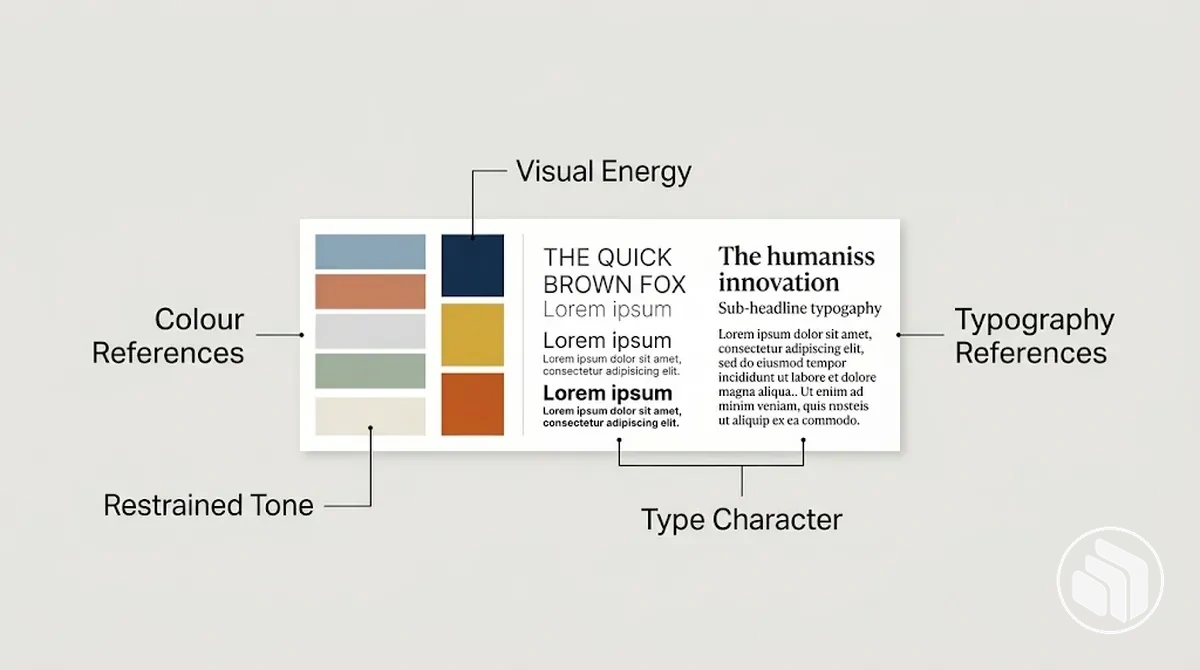
Colour references and typography references on a brand mood board indicate a family of visual qualities rather than finished design specifications.
They provide exploratory cues for the intended tone, contrast, energy, formality, type character, and visual rhythm without locking later design work to an exact colour or type specimen.
- Colour references
- Hue relationships and contrast can suggest directional qualities. More muted relationships can support a restrained direction, while stronger contrast can suggest greater visual energy when that interpretation fits the wider context.
- Typography references
- Type character, proportion, weight, spacing, and other visible forms can support a more formal, editorial, or approachable direction.
- Interpretation boundary
- These associations are contextual, not universal. Treat colour and typography as evidence for an intended direction rather than as deterministic signals.
- Planning value
- Together, the references help test whether the desired tone and character can be expressed coherently before later design decisions define the finished system.
The annotated example shows coordinated colour references and typography references as exploratory cues, with annotations identifying the tone or character they are intended to suggest rather than presenting them as approved specifications.
Imagery, Textures and Patterns
Imagery, textures, and patterns make a mood board's visual direction more tangible by signalling atmosphere, materiality, composition, and recurring stylistic cues.
Imagery can establish subject matter and compositional character, while textures and patterns contribute surface qualities, repetition, and visual motifs that support the intended mood.
These references should reinforce the same atmosphere rather than compete through unrelated aesthetics.
For example, softly lit architectural imagery with spacious composition, a tactile paper texture, and a restrained geometric pattern can support the same considered mood without becoming visually identical.
Their role remains exploratory: mood-board image references indicate qualities worth developing, while defining a consistent brand imagery direction is a later task with its own implementation decisions.
- Imagery: subject matter, photographic treatment, and composition can signal the atmosphere and visual character that later design exploration should investigate.
- Textures: tactile or surface cues can suggest materiality and reinforce the intended mood when they relate coherently to the imagery.
- Patterns: repetition, motifs, and recurring forms can contribute stylistic cues and visual character without establishing a permanent pattern system.
Brand Words and Notes That Clarify the Intended Mood
Brand words and short notes clarify why a visual reference belongs on the mood board and what quality it is intended to signal.
Annotations connect a visible visual cue to its intended mood or meaning, helping distinguish an interpretive reason for inclusion from a simple description of what the reference depicts.
Concise verbal cues can reduce ambiguity when the same image could support different interpretations in different contexts.
For example, the annotation “precise — controlled spacing and orderly composition” explains why a reference supports a precise direction, whereas a note such as “office building” merely names the subject shown.
Useful annotations stay tied to visible evidence and guide interpretation without claiming that one visual cue fixes meaning.
Keeping brand words and notes brief also prevents the verbal layer from overpowering the visual references.
- Precise: controlled spacing and orderly composition can clarify a deliberate, disciplined interpretation.
- Approachable: natural human moments and open composition can support a warmer, less formal reading.
- Restrained: limited competing elements and quieter visual relationships can reinforce a more measured intended mood.
Build the Mood Board Around One Coherent Direction
A coherent mood board direction comes from narrowing and refining references around one intended visual direction rather than continually accumulating material.
The curation process moves from broad exploration toward selection, arrangement, and refinement based on how well the references reinforce the previously defined visual qualities.
Begin with enough breadth to reveal recurring themes, then use those patterns to decide which references deserve greater emphasis.
Selection reduces competing cues, while arrangement shows how the chosen references work together as a unified direction.
Review the assembled board for contradictions and iterate when important references do not reinforce the intended visual qualities.
The sequence therefore moves from exploration to progressively stronger visual coherence.
- Gather: collect a broad pool of relevant references to explore possible expressions of the intended direction; before narrowing, check that the pool offers enough variation to reveal meaningful similarities rather than repeating one isolated idea.
- Identify patterns: look for recurring themes, visual qualities, and repeated cues that fit the intended direction; move forward when the strongest patterns provide a clear basis for selection rather than several unrelated themes competing equally.
- Select and arrange: retain references that best reinforce the chosen themes, then arrange them so primary ideas and supporting cues work together; check that the arrangement strengthens the intended direction instead of giving contradictory references equal emphasis.
- Review and refine: assess the board as a whole and remove, replace, or reposition references that weaken its visual coherence; refine again when necessary until the board communicates one recognisable direction rather than several competing ones.
Collect a Broad Range of Relevant References
Collect relevant visual references broadly enough to create useful variation for later pattern recognition, while keeping every reference connected to the predefined visual qualities.
The appropriate breadth depends on the project scope and how clearly the intended direction is already defined, so the aim is a varied inspiration pool rather than a fixed number of references.
- Reference breadth
- Explore different classes and perspectives, including imagery, typography, colour, and texture, instead of relying on near-duplicates from one medium or source.
- Variation with fit
- An intended quality such as restraint might be explored through spacious photography, measured typography, subdued colour relationships, and subtle texture rather than repeated versions of the same image.
- Inclusion rule
- Capture a reference because it expresses a relevant visual quality, not because it is currently popular.
- Traceability
- Retain source context or a short note where it may help later interpretation, keeping the collection varied and traceable without letting breadth become unrelated accumulation.
Identify Recurring Visual Themes and Remove Weak References
Recurring themes become useful when repeated visual signals also fit the previously defined brand criteria.
Repetition can suggest a shared direction across the reference pool, but frequency alone does not establish relevance; the repeated cues should also align with the intended visual qualities.
Look for shared patterns in colour relationships, composition, image treatment, typography character, texture, form, and emotional tone, then judge each pattern against the brand criteria.
A recurring restrained image treatment and spacious composition, for example, can be retained when both reinforce the intended direction, while related references can be combined around that theme.
An isolated reference with a contrasting emotional tone should be removed when it introduces an attractive but unsupported side direction.
This recurrence-plus-fit judgment keeps meaningful patterns and removes weak references that pull the board away from its shared direction.
- Colour relationships: keep or combine recurring relationships when they align with the intended visual qualities; remove isolated colour cues when they introduce a conflicting direction.
- Composition: retain repeated approaches to spacing, hierarchy, or visual balance when they reinforce the brand criteria; remove outliers that weaken the shared pattern.
- Image treatment: combine references with recurring photographic or illustrative treatment when that treatment fits the intended direction; remove visually appealing treatments that remain off-brief.
- Typography character: keep repeated type characteristics when they support the intended qualities; remove isolated type references when their character conflicts with the emerging direction.
- Texture and form: retain recurring surface qualities, shapes, or forms when they reinforce the same visual language; remove unsupported motifs that create a competing theme.
- Emotional tone: keep references whose recurring tone aligns with the brand criteria and remove outliers whose mood contradicts the intended character.
Select and Arrange the Strongest References
Select the strongest references by keeping representative material and removing redundancy, then arrange the remaining references so their relationships are easy to interpret.
Fewer well-chosen references can communicate the visual direction more clearly when each one contributes a distinct and relevant cue.
Dominant cues should carry the primary mood or character, while supporting cues add nuance without competing for equal attention.
Grouping related references can make those relationships easier to read and create a clearer visual hierarchy, but prominence should reflect semantic importance rather than arbitrary size or decoration.
For example, a board with several near-duplicate photographs may become clearer when one representative image is retained and the remaining space is used for complementary typography, colour, or texture cues.
Layout polish cannot compensate for weak relevance, so arrangement should clarify the meaning already present in the selected material.
- Select representative references: choose the references that express the intended visual direction most clearly and retain those that contribute distinct information; check that each selected item has a clear role rather than simply adding visual volume.
- Remove redundancy: eliminate near-duplicates and repeated cues that do not add new meaning; check that simplification improves focus without removing a necessary aspect of the direction.
- Balance dominant and supporting cues: give the strongest references enough prominence to communicate the primary mood while supporting cues add context or nuance; check that supporting material reinforces rather than competes with the dominant cues.
- Group and arrange for interpretation: organise related references so their connections are easy to recognise and the visual hierarchy reflects their intended semantic weight; check that the board reads as one coherent direction rather than a collection of equally competing elements.
Review and Refine the Board for Coherence
Review the mood board as a combined whole to verify that it communicates one recognisable direction aligned with the intended qualities.
Refine references that create mixed signals, but retain purposeful variation when it adds nuance without weakening coherence.
The coherence check should consider consistency of mood, contradictory cues, variety without fragmentation, relevance to the established criteria, and clarity of decision guidance for later design work.
References can differ when those differences reinforce compatible aspects of the same direction.
If one reference group introduces a conflicting mood, treatment, or visual character, reconsider that group and determine whether it should be removed, replaced, or reduced in emphasis.
This review verifies readiness to guide later decisions rather than serving as formal approval of a finished identity.
- Check mood consistency: verify that the combined references reinforce the intended qualities; refine references whose overall mood pulls the board toward a different direction.
- Identify contradictory cues: look for imagery, colour, typography, texture, or other signals that communicate incompatible ideas; reconsider the reference group responsible when the contradiction creates mixed signals.
- Assess variety without fragmentation: retain differences that add useful nuance, but refine the board when variation becomes so disconnected that several competing directions appear.
- Verify relevance: confirm that the remaining references still relate to the established brand criteria; remove or replace material whose appeal is no longer supported by those criteria.
- Check decision guidance: verify that the board makes the primary direction clear enough to guide later design decisions; refine dominant or supporting references when their combined effect leaves the intended direction ambiguous.
Use the Mood Board to Guide Brand Identity Decisions
The mood board should act as a reference point for evaluating later brand identity decisions rather than as a rigid specification.
Each design choice can be judged against the agreed visual direction by asking which mood-board attribute it supports, departs from, or contradicts.
A design choice that aligns with the relevant mood-board attribute can usually be kept because it reinforces the intended direction.
A choice can also differ from the references while remaining directionally compatible when it preserves the underlying tone, character, or visual quality in an original way.
If the choice introduces a clear contradiction, it should prompt revision or reconsideration rather than being accepted simply because it is visually polished.
For example, a new layout does not need to copy a reference composition if its spacing, rhythm, and overall character still support the qualities established by the board.
- Aligned: keep the design choice when it clearly supports the relevant mood-board attribute and strengthens the agreed visual direction.
- Intentionally different but compatible: keep or develop the choice when it introduces an original solution while preserving the underlying qualities that the mood board is meant to guide.
- Contradictory: question or revise the choice when it conflicts with the intended mood, character, or other relevant attribute without a clear reason for that departure.
The mood board therefore guides interpretation and decision consistency without requiring every design element to literally match a reference.
Its role is to support choices within the broader brand identity creation process, while detailed implementation remains part of later identity development.
Share the Board and Gather Feedback on the Visual Direction
Feedback on the mood board should test whether the visual direction communicates the intended qualities and supports the intended audience response and brand intent, rather than asking for personal preference alone.
Focused questions make each response easier to interpret because they connect feedback to a defined quality or observable visual cue.
An actionable observation identifies what in the board supports, weakens, or obscures an intended quality, while a personal preference mainly reports what someone likes or dislikes without explaining its relevance to the agreed direction.
For example, instead of asking whether someone likes the board, ask, “Which references make the direction feel approachable, and what visible qualities create that impression?” Conflicting feedback may indicate an unclear visual direction, different assumptions about the intended qualities, or differences in preference, so disagreement does not automatically mean every response must be accommodated.
When several interpretations expose mixed signals in the references, refine the relevant part of the board rather than trying to satisfy every opinion.
- Test an intended quality: ask which references communicate a defined quality and what observable cues support that interpretation; feedback is actionable when it identifies evidence rather than preference alone.
- Check audience response: ask how the direction is likely to be interpreted by the intended audience and which visual cues contribute to that reading; use the response to identify alignment or ambiguity rather than treating it as proof.
- Check consistency with brand intent: ask which references reinforce the agreed brand intent and which appear to send a conflicting signal; reconsider references when the observation identifies a specific contradiction.
- Separate observation from preference: distinguish comments tied to visible evidence from statements based only on personal taste; give greater practical weight to feedback that explains how a cue supports or conflicts with the intended direction.
Evaluate Design Choices Against the Agreed Direction
Each design choice should be evaluated against the relevant visual criterion established by the mood board and the agreed direction.
The comparison should identify whether the choice aligns with that criterion, intentionally departs while preserving its underlying quality, or creates a contradiction that warrants revision or reconsideration.
No single matching attribute is sufficient to establish overall alignment because colour mood, typographic character, imagery treatment, composition, texture, and tone can reinforce or undermine one another.
A difference can remain compatible when it is intentional and preserves the underlying visual quality, while a contradiction becomes significant when it weakens the combined direction.
For example, a design may use a different composition from the mood-board reference yet preserve the same restrained quality through controlled spacing and a clear hierarchy.
Evaluate the most salient attributes first, then consider their combined effect on the overall direction.
- Colour mood: compare the choice with the intended colour character; retain an intentional variation when it supports the same mood, and revise or reconsider it when the colour relationship introduces a conflicting tone.
- Typographic character: assess whether the type treatment preserves the intended character even when the exact type differs; reconsider it when its formality, energy, or visual presence contradicts the criterion.
- Imagery treatment: evaluate subject treatment, atmosphere, and visual character against the intended direction; revise imagery when its treatment introduces an unsupported mood or interpretation.
- Composition: compare spacing, hierarchy, balance, and arrangement with the relevant visual criterion; accept a different composition when it preserves the underlying quality and reconsider it when the arrangement weakens that quality.
- Texture: assess whether surface or material cues reinforce the intended character; revise or remove texture when it creates a competing visual signal.
- Overall tone: interpret the attributes together and keep the design choice when their combined effect remains coherent with the agreed direction; reconsider it when one apparent alignment is outweighed by broader contradiction.
Common Brand Mood Board Mistakes
Common brand mood board mistakes weaken brand relevance, reduce visual coherence, create a conflicting direction, limit originality, or lead to misuse of the board as something more rigid than an exploratory reference.
Their impact depends on how strongly each error affects the board's ability to communicate and support the intended visual direction.
Choosing Attractive References Without Brand Relevance
An attractive reference can still be the wrong choice when its visual appeal is stronger than its brand relevance.
If the reference does not express the intended qualities or align with the established selection criteria, it can pull the mood board toward a mismatch even when the image itself is visually compelling.
Evaluate the reference by comparing its visible qualities with the intended direction and identifying the specific attribute that supports or conflicts with the brand criteria.
A polished reference that feels dramatic, high-energy, and luxurious may warrant removal if the intended qualities are restrained and approachable, while a less flashy reference with calmer composition, softer contrast, and more compatible visual cues may support the direction more clearly.
When the mismatch is substantial, remove or replace the reference rather than keeping it for isolated appeal.
The corrective principle is to prefer contextual fit and coherence over visual appeal alone.
Combining Conflicting Visual Directions on One Board
Conflicting references create ambiguity when they signal materially different moods, levels of formality, audiences, or approaches to the visual system at the same time.
The problem is not variation itself, but directional conflict that makes the mood board harder to interpret as one coherent concept.
Productive variation can use different imagery, typography, or textures when their underlying cues reinforce a shared mood and audience; for example, formal editorial photography and restrained typography can differ visually while supporting the same considered direction.
A genuine conflict appears when another reference introduces an informal, playful mood aimed at a different audience or suggests a visual system that competes with that direction.
In that case, choose the dominant direction and remove or refine the outlier rather than forcing incompatible cues to coexist.
Coherent variation should add nuance to the shared concept, while conflicting references that change its interpretation warrant correction.
Copying Inspiration Too Literally Instead of Defining a Distinct Direction
Inspiration becomes imitation when a source reference is treated as a finished form to reproduce rather than material from which to learn.
A mood board should identify the underlying principle or visual quality worth carrying forward, then use that insight to support an original design direction.
For example, copying a reference's restrained composition, muted treatment, and specific arrangement would reproduce much of its visible form, whereas extracting restraint as the underlying principle allows that quality to be reinterpreted through different spacing, composition, imagery, or texture.
The same approach can be used to learn from contrast or other visual qualities without treating the source inspiration as a template.
Reinterpret the useful principle through original design decisions that fit the brand's intended direction rather than duplicating the reference.
This keeps inspiration connected to a distinct design outcome instead of allowing the source to define it.
Treating the Mood Board as a Finished Brand Identity
A mood board is a directional planning artefact that communicates visual direction, not a finished brand identity containing approved brand assets and design decisions.
Its references support exploration and guide later choices rather than functioning as completed assets, rules, or approved design choices.
A reference can influence the final identity without being carried into it unchanged.
For example, a mood-board image with restrained composition and muted colour relationships may guide later decisions about spacing, imagery, and colour while the resulting brand assets use original forms developed for the identity.
The final identity therefore formalizes approved design choices at a later stage instead of treating mood-board references as finished outputs.
Keeping that boundary clear preserves the mood board's role as a planning artefact.
What Strong Brand Mood Board Examples Have in Common
Strong brand mood board examples communicate clear visual intent through selective variety, internal coherence, and a visible connection to the intended brand qualities.
Their reference mix gives enough specificity to establish a visual direction and support decision usefulness without turning the board into a finished identity.
- Spacious imagery
- Subdued colour relationships
- Measured typography
- Subtle texture
Different reference types reinforce a controlled mood, so the board remains coherent and useful for later decisions.
- Dynamic imagery
- Stronger colour contrast
- Expressive typography
- More active forms
Selective variety supports a different mood while remaining coherent because the references reinforce the same intended qualities.
- Restrained photography
- Playful type
- Unrelated luxury textures
- Colours chosen mainly for individual appeal
The mix is varied but internally weak, making the visual intent harder to interpret and reducing decision usefulness.
These examples show that strength does not depend on one preferred aesthetic or a particular collection of components.
Examples are useful when their references work together to make the intended brand qualities interpretable and provide coherent guidance for later decisions.