
Principles for a Coherent Brand Identity Design System
A coherent brand identity system uses shared visual logic to keep colour, typography, logo form, imagery, and layout recognisably related without making every application identical. Coherence comes from balancing alignment, consistency, visual hierarchy, distinctiveness, and flexibility according to the brand direction, audience, medium, and application context.
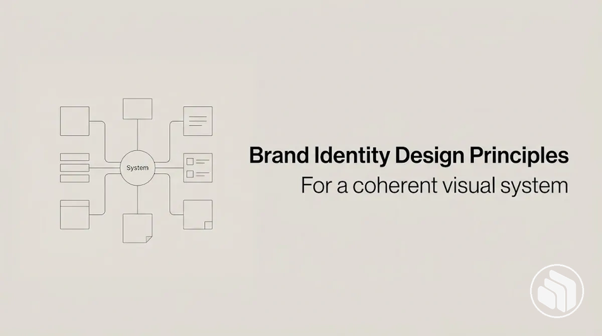
Brand identity coherence at a glance
A coherent identity is not a collection of isolated rules. Each principle protects a different system property, and the principles work together through shared visual logic.
Separate visual choices remain recognisably related when their rules are compatible and they reinforce the intended brand meaning.
- Alignment
- Connects visual choices to purpose, personality, positioning, audience expectations, and the wider identity system.
- Consistency
- Keeps important visual roles and recurring cues stable enough to support recognition across applications.
- Visual hierarchy
- Organises attention and information priority through scale, contrast, spacing, placement, and typographic emphasis.
- Distinctiveness
- Creates recognisable character through differentiating cues that remain relevant to the brand direction.
- Flexibility
- Allows controlled adaptation across formats, scales, content needs, and contexts while identity-bearing cues remain recognisable.
Decision rule: keep the cues that carry recognition stable, allow only the variation the application needs, and do not maximise any one principle in isolation.
Table of Contents
What Coherence Means in a Brand Identity System
Brand identity coherence is the degree to which visual elements and their governing rules relate consistently enough to be perceived as parts of the same identity system.
Coherence means that different brand elements work together as parts of the same recognisable system through shared visual logic.
Within an identity system, coherence concerns the relationships among visual elements, not merely the repetition of individual elements.
Colour, typography, imagery, logo forms, and layout can vary while retaining recognisable relationships when their visual choices remain compatible with the intended brand meaning.
The diagram shows how separate visual elements can remain related through shared logic while allowing controlled variation.

Coherence differs from uniformity: uniformity emphasises sameness or repetition, whereas coherence allows variation when the elements remain meaningfully related.
Consistency supports coherence through recurring rules and cues, but it is not identical to coherence; within Brand Identity Design, coherence describes how those choices function together as a unified visual system.
This distinction provides the conceptual basis for discussing shared visual logic.
Coherence Comes From Shared Visual Logic, Not Identical Repetition
Shared visual logic can preserve coherence even when applications within an identity system are not identical.
Repetition is one device for creating similarity, while shared logic governs relationships and identical repetition duplicates surface form.
The comparison image shows how recurring visual cues can connect varied applications without requiring the same composition.
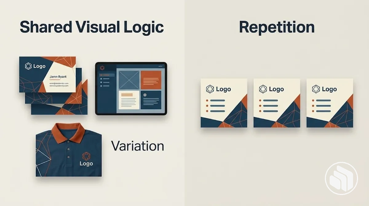
A common rule set can govern visual cues such as proportion, typography, colour relationships, or placement while allowing variation in how they appear in each application.
That variation can retain recognisability when enough recurring cues remain clear for the applications to relate as one identity system.
For example, two layouts can use different compositions while following the same typographic and colour relationships.
The distinction is between consistent logic that connects visual choices and repetition that duplicates their form.
Consistency Is One Part of Brand Identity Coherence
Consistency supports coherence by keeping important identity cues stable enough to contribute to recognisability, but it does not fully define coherence.
Consistency asks whether cues are applied stably, while coherence also concerns whether those cues work together as one system.
Colour, typography, and imagery can each be used consistently while their overall fit remains disconnected.
The comparison image isolates this distinction by showing stable cues in one composition where they relate well and another where they remain individually consistent but poorly integrated.
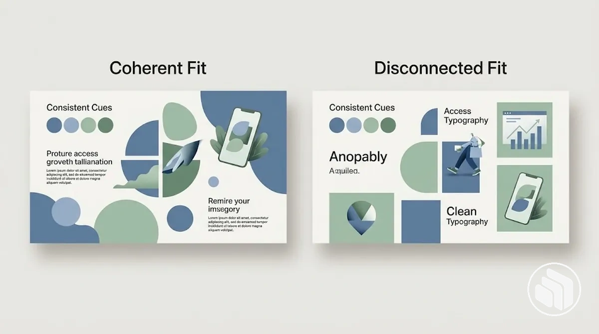 For example, recurring colour and typography may provide system stability, yet an imagery style that conflicts with those cues can weaken their visual relationship.
Consistent application therefore contributes to coherence through stable cues, while coherence remains the broader system property defined by the overall fit among those cues.
Core Principles That Create Brand Identity Coherence
Core brand identity principles work as interdependent design criteria that protect different properties of one identity system.
Their contribution to coherence comes from how the principles interact, rather than from treating each one as an isolated rule.
Strategic fit connects visual choices to brand direction, while recurring cues can support recognisability and system stability.
Visual hierarchy structures attention and emphasis, distinctiveness helps differentiate the identity, and flexibility permits appropriate variation across applications.
The diagram groups these system properties around one identity system to show their interdependence rather than a ranked or linear sequence.
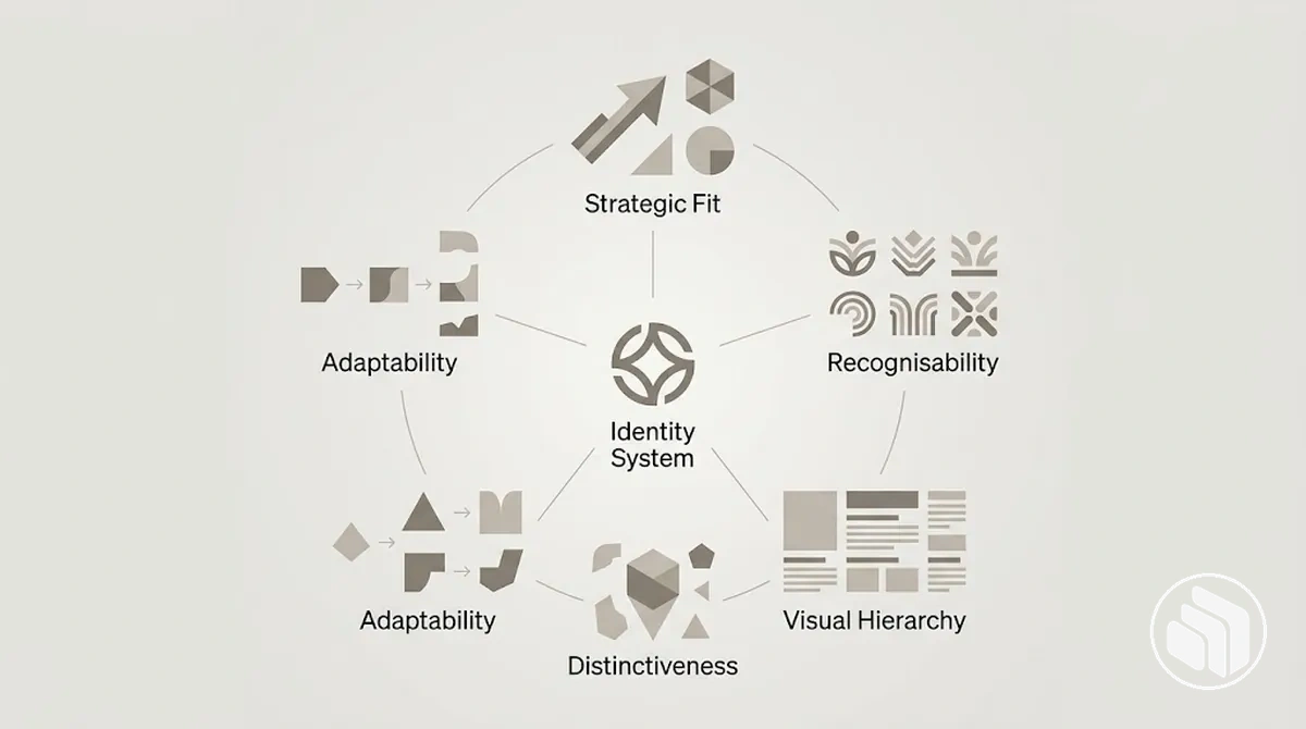
No principle should be maximised in isolation, and each may carry more weight when brand direction, audience, medium, or application context requires it.
Some principles primarily stabilise the system while others permit meaningful differentiation and adaptation, but these functions overlap and together provide a framework for evaluating individual design choices.
Alignment Connects Visual Choices to a Shared Brand Direction
Alignment evaluates whether a visual choice supports the intended brand direction and fits the wider identity system.
A choice has strategic fit when it serves the relevant purpose, personality, positioning, audience expectation, and system compatibility rather than reflecting stylistic preference alone.
The criteria test contextual fit rather than prescribe a single style; category conventions may inform that context without automatically determining the appropriate choice.
- Purpose: the visual choice supports alignment when it serves what the identity needs to communicate or accomplish in its intended context.
- Personality: its visual character fits when it supports the personality the brand direction is intended to express.
- Positioning: the choice aligns when it supports the intended positioning without requiring conformity to category conventions.
- Audience expectation: the choice may fit when it accounts for relevant audience expectations without assuming or guaranteeing a particular response.
- System compatibility: the choice supports coherence when it relates appropriately to the identity system's other visual cues rather than functioning as an isolated stylistic decision.
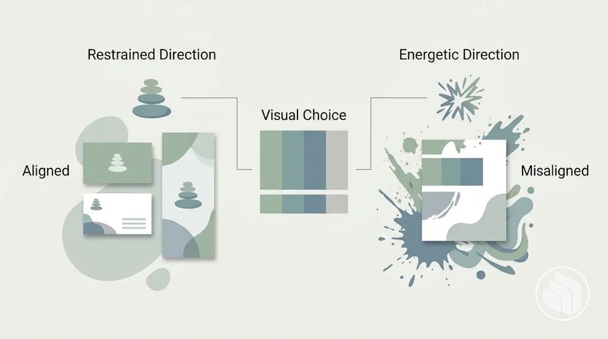
For example, a restrained colour choice may align with a brand direction centred on restraint and clarity, while the same choice may conflict with a direction that calls for a more energetic personality.
The annotated example demonstrates this alignment condition by comparing the same type of visual choice against different brand-direction cues.
Consistency Establishes Recognisable Visual Patterns
Brand identity consistency is the stable application of recognisable visual rules and recurring cues across varied applications, rather than the duplication of identical layouts.
Colour roles, typography roles, logo treatment, spacing conventions, and imagery behaviour can remain stable while individual compositions vary.
These recurring rules support recognisability when their roles remain sufficiently stable for different applications to relate coherently as one identity system.
The annotated example shows how repeated colour and typography roles and consistent logo treatment can remain recognisable even when the layout changes.
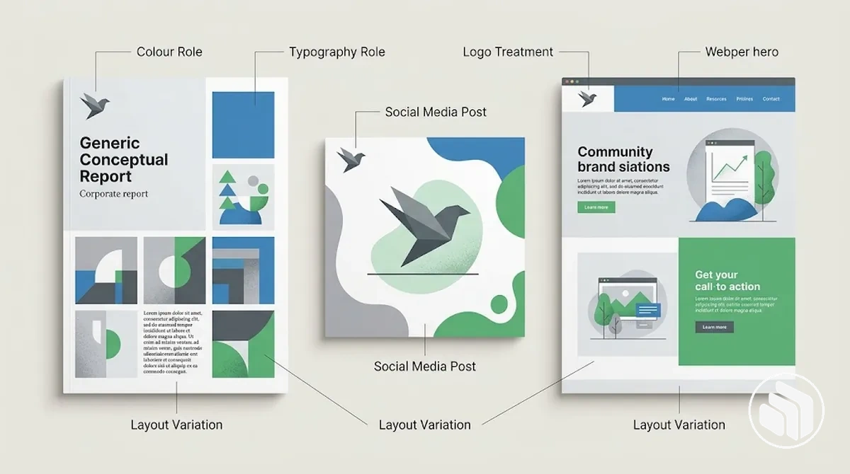
- Colour roles: key colours retain consistent functions or relationships, creating recurring cues across different applications.
- Typography roles: type choices and their functional roles recur with enough stability to support recognisability while allowing layout variation.
- Logo treatment: the logo follows stable rules for its form and presentation so it remains a consistent identity cue.
- Spacing conventions: recurring spacing relationships provide structural continuity without requiring identical compositions.
- Imagery behaviour: imagery follows a recognisable visual approach that can vary in subject while remaining compatible with the wider system and its coherence.
When recurring visual rules become inconsistent enough to disrupt these patterns, the specific failures belong to the adjacent context of common brand identity mistakes rather than to the definition of consistency itself.
Visual Hierarchy Organises Attention Within the Identity System
Visual hierarchy is the ordering of attention and importance within a brand application so information can be interpreted in a deliberate sequence.
It establishes a priority structure through visual emphasis, although the strength of each cue depends on how it interacts with the surrounding composition.
Scale, contrast, spacing, placement, and typographic emphasis can organise attention by signalling different levels of priority and supporting clarity within the identity system.
These cues organise visual attention rather than define organisational relationships among brands or product lines.
- Scale: differences in size can signal greater or lesser importance relative to surrounding elements.
- Contrast: differences in tone, colour, weight, or form can increase separation and emphasise particular information.
- Spacing: separation and grouping can clarify relationships between elements and influence which information is perceived together.
- Placement: position within a composition can give an element greater or lesser visual priority depending on the surrounding structure.
- Typographic emphasis: differences in type size, weight, or treatment can distinguish information levels and support clarity.
Visual hierarchy concerns attention and priority within visual compositions; it is distinct from brand hierarchy or brand architecture, which can describe organisational relationships among brands, sub-brands, or product lines.
Distinctiveness Gives the Identity a Recognisable Character
Brand identity distinctiveness is the presence of recognisable visual cues that give an identity its own recognisable character rather than making it appear as an interchangeable category treatment.
Meaningful differentiation comes from characteristics that are identifiable and relevant to the intended brand direction.
- Use recognisable cues Colour relationships, typography, imagery, forms, and other recurring choices can give the identity an identifiable character.
- Repeat them clearly enough to be associated Recognisability can aid memory when cues recur clearly enough to be linked with the identity.
- Keep them relevant to the brand direction Category conventions can inform the context, but an unusual treatment contributes to differentiation only when it reinforces shared character rather than competing with the wider system.
Novelty alone does not establish meaningful distinctiveness. Distinctiveness depends on relevant visual cues forming a recognisable character; when recognisable differentiation is insufficient, the adjacent diagnostic context is a generic-looking brand identity.
Flexibility Preserves Coherence Across Different Uses
Flexibility in the identity system is the capacity for controlled adaptation across different formats, scale, content needs, and application contexts while core visual cues remain recognisable.
The appropriate degree of controlled variation depends on what each application requires, but flexibility preserves coherence by keeping some rules stable while allowing other properties to adapt.
Flexibility depends on distinguishing invariant rules from variable properties so adaptation does not remove the cues that support recognisability.
The appropriate balance depends on the format, scale, content needs, and application context.
What stays stable and what can change
Invariant rules
- Core colour relationships and established typographic roles remain stable when they function as recognisable cues.
- Defining visual relationships remain sufficiently stable across changes in format or scale to preserve coherence.
Variable properties
- Layout, composition, and spacing may vary within controlled limits when different formats or content needs require a different arrangement.
- Imagery selection and the scale of supporting elements may adapt when their treatment remains compatible with the system's recognisable visual cues.
How Brand Identity Principles Work Together as a System
Brand identity principles work as a system because principle interaction means strengthening one property can affect the conditions needed to support another.
Consistency, flexibility, distinctiveness, alignment, and hierarchy therefore operate through dependencies and trade-offs that collectively influence coherence.
The relationships below show how each principle pair can support a particular system property while also creating a risk of imbalance.
The table focuses on dependencies and design tensions rather than treating the principles as independent measures.
| Principle Relationship | System Property | What Must Stay Balanced | Risk of Imbalance |
|---|---|---|---|
| Consistency and flexibility | Recognisability across varied applications | Recurring visual rules with controlled variation for different formats, scales, and content needs | Too much rigidity can constrain adaptation, while too much variation can weaken recurring cues. |
| Distinctiveness and alignment | Recognisable character that fits the brand direction | Differentiating visual cues with relevance to purpose, personality, positioning, and context | Differentiation without alignment can feel disconnected, while alignment without sufficient differentiation can produce an interchangeable treatment. |
| Hierarchy and recurring visual rules | Attention structure and clarity | Context-sensitive emphasis with recurring rules that keep information relationships recognisable | Rigid recurrence can limit necessary emphasis, while inconsistent hierarchy can make attention patterns less clear. |
The importance of each trade-off depends on the identity context and the requirements of a particular application.
One principle can support or constrain another, so increasing a property in isolation does not establish stronger coherence by itself.
The relationships should therefore be evaluated according to how well they protect the required system properties under the relevant conditions.
System quality comes from compatible relationships among principles rather than from treating them independently.
Shared Rules Create Consistency Without Visual Sameness
Shared rules can create consistency without requiring visual sameness across every composition.
Shared rule pattern
- Keep stable
- Colour roles, typographic roles, and recurring visual relationships can remain stable enough to support recognition and coherence.
- Allow to vary
- Composition, spacing, imagery, and emphasis may change within limits that preserve those recognisable relationships.
- Example
- Two applications can use different compositions while retaining the same colour and typography roles.
The acceptable degree of variation depends on the application context, but consistent logic can support varied compositions when the shared rules remain recognisable.
Controlled Variation Preserves Flexibility Without Losing Recognition
Controlled variation preserves flexibility only when recognisable cues remain sufficiently stable as other properties change.
Conditions for controlled variation
Composition or emphasis may adapt to the format, medium, context, and role of each cue, provided the change does not obscure recognisable identity cues. For example, a composition can change for a different format while identity-bearing cues remain stable.
The visual relationships needed for recognition and coherence can remain intact even as variable properties change.
The application can become less recognisably connected to the wider identity system and coherence can weaken.
Controlled variation therefore permits adaptation within conditions defined by the cues the identity needs to keep recognisable.
Distinctive Choices Stay Connected Through Common Visual Logic
Distinctive choices support coherence when they connect through common visual logic and reinforce the same brand meaning rather than functioning as isolated novelty.
Key distinction
Integrated distinctiveness
A distinctive choice can differ from surrounding elements while still relating through shared proportions, colour relationships, or other established cues. For example, a distinctive type treatment can remain compatible with the identity's broader visual relationships and brand meaning; that connection can support recognisability.
Arbitrary novelty
A choice can separate from the identity character it is meant to support. It may draw attention as an isolated element without strengthening coherence.
Several distinctive choices therefore work together most coherently when each reinforces the same identity character rather than competing as an independent expression.
Criteria for Applying Brand Identity Principles to Design Decisions
A brand identity design decision should be evaluated by whether it strengthens the identity system under the relevant context, rather than by isolated visual preference.
The evaluation criteria test each design choice against conditions that affect strategic fit, recognisability, information priority, differentiation, adaptation, and coherence.
The criteria below connect each condition to a coherent state and its implication for the design decision.
They cover strategic alignment, consistency, visual hierarchy, distinctiveness, flexibility, and system compatibility without assigning universal weights.
| Criterion | Condition to Check | Coherent State | Implication for the Decision |
|---|---|---|---|
| Strategic alignment | The choice relates to the intended brand direction, purpose, personality, positioning, and relevant audience context. | The visual expression supports the intended brand direction rather than conflicting with it. | The choice can be retained when strategic fit is important to the application; a conflict indicates that the choice needs reconsideration. |
| Consistency | The choice follows the recurring visual roles and rules that provide recognisable cues across the identity system. | Important cues remain recognisable while the application retains appropriate room for variation. | The choice supports recognition when it preserves the recurring relationships needed in that context. |
| Visual hierarchy | The choice gives information an appropriate level of attention and importance within the composition. | Scale, contrast, spacing, placement, or typographic emphasis supports the intended information priority. | The choice supports clarity when its emphasis matches the role of the information in the application. |
| Distinctiveness | The choice contributes recognisable character while remaining connected to the identity's common visual logic and brand meaning. | Differentiating cues reinforce the identity character instead of functioning as isolated novelty. | The choice can support differentiation when its distinctive qualities remain integrated with the wider system. |
| Flexibility | The choice can accommodate relevant changes in format, scale, content, or application context without removing essential recognisable cues. | Variable properties can change under the required condition while invariant cues remain sufficiently stable. | The choice supports flexibility when necessary variation preserves recognition and coherence. |
| System compatibility | The choice relates appropriately to the identity system's other visual elements, rules, and relationships. | The choice works with the wider system rather than operating as a disconnected visual decision. | The choice supports coherence when its relationships remain compatible with the system as a whole. |
The relative weight of these criteria may change with the context, so a design decision can satisfy some conditions while conflicting with others.
For example, an expressive type treatment may provide distinctiveness and clear visual hierarchy but conflict with strategic alignment if its character does not fit the intended brand direction.
In that case, the implication is not an automatic rejection: the decision depends on whether the relevant context makes that conflict more important than the properties the choice supports.
Trade-offs should therefore be interpreted according to the conditions the application needs to satisfy.
These evaluation criteria assess an individual design choice; they do not prescribe the sequence for developing the identity.
Selecting, developing, testing, and refining choices across the broader brand identity creation process is a separate implementation task.