
Logo Usage Guidelines for Consistent Brand Application
Use a logo only in an approved version and lockup, preserve its geometry, and then apply the brand’s documented clear-space, minimum-size, placement, and background rules. If no approved asset works for a condition, change the layout or background—or obtain an approved variant—rather than altering the logo.
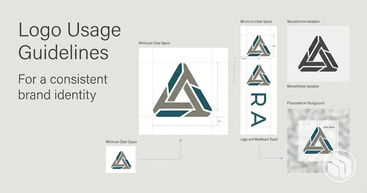
Logo application check: use this order
Treat the supplied logo asset as the fixed reference, then verify each application condition before release.
- Choose the approved asset.Select the supplied logo version or lockup intended for the application; do not invent an alternate arrangement.
- Preserve the geometry.Keep proportions, orientation, visible boundaries, and fixed element relationships unchanged.
- Apply space and scale rules.Use the documented clear-space rule and the minimum size for that logo version and medium; if no minimum is specified, test the actual asset under the intended reproduction condition.
- Match placement and background.Follow the approved anchor or alignment and use the full-colour, monochrome, reversed, or other supplied version intended for the actual background.
- Run the misuse check.Reject distortion, arbitrary rotation, cropping, rearrangement, manual recolouring, or unapproved outlines, shadows, glows, textures, and transparency changes.
If no approved version works: change the background or layout, or obtain an approved asset for that condition. Do not create a workaround by modifying the logo.
Table of Contents
Define Approved Logo Versions and Lockups
Implementation starts by identifying the exact approved logo versions and logo lockups before any placement or sizing rule is applied.
Use only a supplied approved asset, selecting among available configurations according to its documented usage condition.
A primary logo, secondary logo, or other logo variant is an approved alternative only when the existing logo system explicitly establishes it as one.
- Approved asset
- Defines the permitted composition, orientation, relative arrangement, and approved colour treatment of the logo.
- Usage condition
- Defines where that approved configuration may be used, such as a particular background, medium, orientation, or available-space condition.
The diagram identifies the primary configuration and any supplied alternate lockup as parts of one controlled logo system.
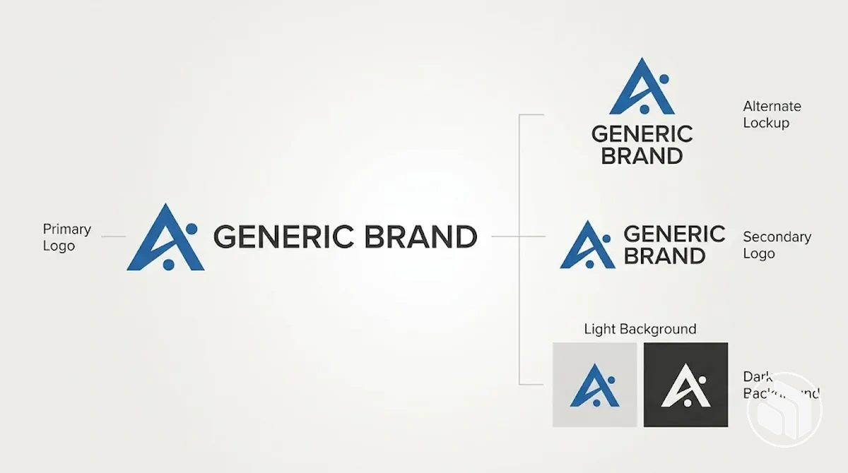
Approved alternatives provide a defined option when the primary logo does not fit an allowed context, rather than requiring users to improvise a new arrangement.
If no secondary logo, alternate orientation, or other variant is supplied for that condition, the absence of an approved alternative does not authorise modification of the existing asset.
Approved logo assets should already be established through the brand identity creation process before logo usage rules are applied.
Approved Lockups and Fixed Element Relationships
A logo lockup is an approved fixed arrangement of elements such as a logomark, wordmark, and, when included, a tagline.
These elements function as one approved configuration because their spatial relationships are controlled rather than assembled independently for each application.
- Relative size
- Each component keeps its approved proportion to the other elements.
- Spacing
- The intended separation between the logomark, wordmark, and any tagline stays fixed.
- Alignment
- Components retain the supplied positional relationship rather than being realigned independently.
- Orientation
- The lockup remains in its approved arrangement unless another orientation is supplied as an approved variant.
The annotated example labels these component relationships so the fixed relationship between the parts and the whole remains visible.
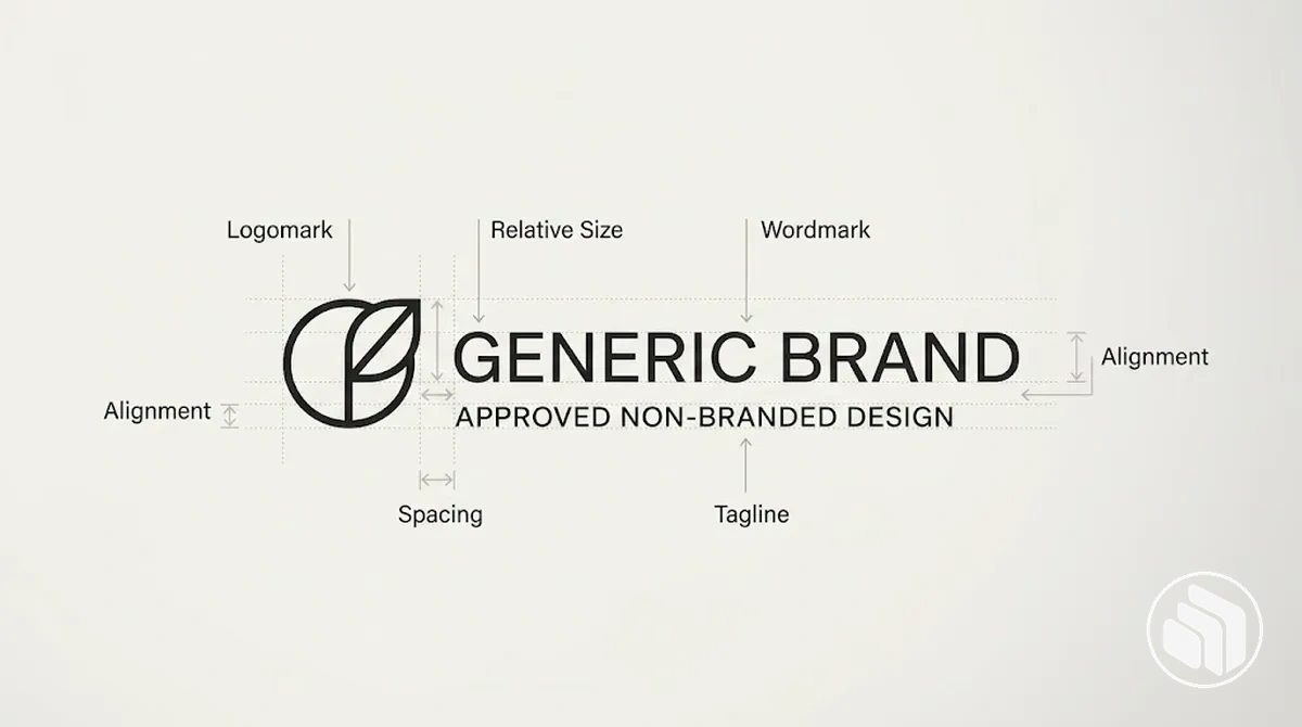
For example, using a supplied horizontal logo lockup preserves its approved arrangement; moving the wordmark beneath the logomark would be an improvised configuration unless that arrangement is also supplied as an approved lockup.
The same principle applies to a tagline: its position remains part of the fixed arrangement when the approved configuration includes one.
Approved Full-Colour, Monochrome, and Reversed Logo Versions
Approved logo colour versions serve different background and reproduction conditions rather than acting as interchangeable styling choices.
A full-colour logo uses its approved brand colours, a monochrome logo uses an approved single-colour treatment for limited-colour reproduction, and a reversed logo uses an approved light treatment when a dark background requires sufficient contrast.
The comparison maps each approved version to the background or production condition it is intended to handle and the resulting usage implication.
The appropriate colour treatment depends on the background, reproduction method, and approved assets available for print or digital use.
| Version | Suitable background or production condition | Usage implication |
|---|---|---|
| Full-colour | Background and reproduction conditions that reproduce the approved brand colours clearly | Use the supplied full-colour logo without manually changing its colour treatment |
| Monochrome | Single-colour or limited-colour reproduction conditions where the full-colour treatment cannot be reproduced as intended | Use the supplied monochrome logo as the approved single-colour version |
| Reversed | Dark backgrounds where the approved light or reversed treatment preserves sufficient contrast | Use the supplied reversed logo rather than manually recolouring the full-colour asset |
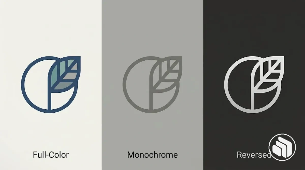
The image compares the same logo geometry across the three approved colour states, showing that the colour treatment changes while the underlying configuration stays consistent.
Set Clear Space and Minimum Size Rules
Clear space and minimum size are complementary but distinct logo usage criteria.
Clear space protects visual separation by defining a protected area around the logo, while minimum size protects recognition and legibility by limiting how small an approved logo version should appear.
The diagram separates these spacing and scale controls without assigning a universal numeric threshold.
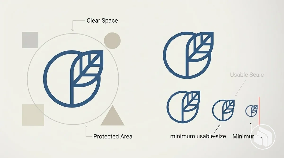
Each criterion needs its own measurement basis, applicable logo version or medium, and threshold or condition so the rule can be applied consistently.
- Clear space: defines protected spacing between the logo and surrounding elements, using the brand's specified measurement basis to maintain the required visual separation.
- Minimum size: defines the smallest approved displayed dimensions for a logo version in a given medium before limiting detail can compromise recognition or legibility.
The final spacing and size values should come from the approved logo system or verified testing rather than a universal pixel, millimetre, or inch value; displayed dimensions are separate from image file size.
Specifications should be testable and repeatable for each approved application, then documented when teams build brand guidelines.
Define Clear Space with a Proportional Reference
Logo clear space should use a repeatable proportional reference from the approved logo system when such a rule exists, so the protected area scales with the logo rather than relying on an arbitrary fixed amount.
A documented logo feature supplies the reference unit, and that unit defines the protected boundary around the artwork.
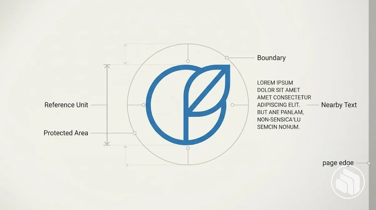
The proportional reference maps the selected logo feature to a minimum distance on the relevant boundary or boundaries.
That protected area functions as an exclusion zone, keeping nearby text, imagery, or a page edge outside the specified minimum clear area.
When the logo scales, the reference unit and the resulting clear space scale with it, maintaining the same proportional measurement logic across approved applications.
The logo feature used as the reference unit, its multiplier if one is specified, and the boundaries to which it applies are brand-specific and should come from the approved specification rather than an assumed universal ratio.
Set Minimum Size by Legibility, Logo Version, and Medium
Minimum logo size should be set for each approved logo version according to its limiting detail, the reproduction medium, and the point at which the artwork remains recognisable and legible.
There is no single reliable minimum dimension for every logo; when an approved specification does not provide one, the width, height, or other measurement basis needs to be established through testing of the actual artwork under its intended reproduction condition.
Print and digital applications can require different measurement units and minimum dimensions, while different logo versions can reach their legibility threshold at different sizes.
The applicable minimum therefore needs to be evaluated for the specific logo version and reproduction condition rather than transferred from an unrelated logo system.
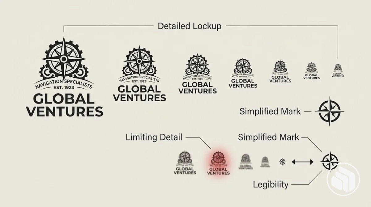
The comparison image shows how reducing the same logo version can make a limiting detail progressively harder to distinguish, while an approved simplified mark may remain recognisable at a smaller displayed size.
| Logo version | Medium | Limiting detail or legibility condition | Minimum dimension |
|---|---|---|---|
| Approved detailed lockup | Digital | Small lettering or fine elements remain distinguishable under the intended screen reproduction condition | Use the approved digital threshold; if none is specified, establish the applicable width or height by testing the actual asset |
| Approved detailed lockup | Small lettering or fine elements remain distinguishable under the intended print process and reproduction condition | Use the approved print threshold; if none is specified, establish the applicable width or height by testing the actual asset | |
| Approved simplified mark | Digital or print | Essential identifying features remain recognisable under the intended reproduction condition | Use the version-specific approved or tested threshold rather than assuming the detailed lockup's minimum dimension applies |
A detailed lockup can require a larger minimum size than an approved simplified mark when its smaller lettering or finer elements become difficult to distinguish first.
The applicable minimum dimension therefore belongs to the specific logo version and medium being reproduced, not to the logo system as one universal value.
Set Logo Placement Rules for Layouts and Backgrounds
Logo placement should follow the approved relationship between the logo and its layout rather than a universally correct corner.
The permitted position can change with the layout role and background while the approved logo itself remains unchanged.
Each placement condition should therefore map to a repeatable approved rule for that application.
- Layout relationship
- The layout role and approved anchor or grid determine where the logo sits and how it aligns.
- Protected spacing
- Clear space and any specified edge distance keep surrounding content and layout boundaries outside the required protection zone.
- Background condition
- The surface behind the logo determines which supplied colour treatment can remain distinct and legible.
- Format variation
- The physical position may change between formats when each format follows its own approved anchor, alignment, edge relationship, and background rule.
Documenting these repeatable placement conditions also helps teams maintain brand consistency when the logo moves into broader cross-channel applications.
Position and Align the Logo Consistently Within Layouts
Logo position and alignment should follow an approved anchor point, grid, or other defined relationship within the layout area rather than arbitrary placement.
The actual position may vary by format, but the approved alignment relationship should remain identifiable and repeatable.
Apply the position rule in three checks
- Align: place the logo on the approved anchor point, grid, or other defined layout relationship.
- Protect: maintain the specified edge distance and keep surrounding elements outside the logo’s clear-space zone.
- Adapt only by rule: allow the physical position to change for another format only when its approved alignment and spacing relationships remain intact.
For example, one approved layout may anchor the logo to a header grid while another positions it relative to a different layout area.
The physical position changes, but the alignment logic remains consistent when each format follows its defined anchor point, edge relationship, and clear-space condition.
Maintain Logo Contrast on Colour and Image Backgrounds
Logo contrast on backgrounds should keep the approved logo version visually distinct enough from its background for the mark to remain recognisable and legible.
The appropriate treatment depends on the background condition and the approved assets available, such as full-colour, monochrome, or reversed versions, rather than a single numeric threshold.
For a solid background, evaluate whether the approved logo treatment remains visually separated from the background colour before selecting the applicable version.
An image background also requires checking the specific placement area because changes in colour, brightness, and visual detail can affect background contrast across the image.
A busy image may therefore require repositioning the logo to a clearer area or selecting another approved logo version instead of altering the artwork.
The table maps these background conditions to approved treatments and practical checks without inventing new styling.
| Background condition | Approved logo treatment | Check | Usage implication |
|---|---|---|---|
| Light solid background | Approved full-colour or monochrome version intended for the light background | Confirm the logo remains visually distinct and its essential features remain legible | Use the approved treatment without recolouring or adding decorative effects |
| Dark solid background | Approved reversed or other light version intended for the dark background | Confirm sufficient visual separation between the logo and background | Use the supplied approved version rather than creating an outline, shadow, or new colour treatment |
| Image background with a clear placement area | Approved version compatible with the colour and value of that image area | Check the logo against the actual area where it will appear | Place the approved version only where the image provides adequate visual separation |
| Busy image or image area with poor visual separation | Approved alternate version where suitable, combined with repositioning when needed | Check whether another permitted area provides clearer separation without modifying the logo | Reposition the logo or use an approved alternate rather than adding an unapproved outline, shadow, box, or recolouring |
When a busy image prevents the available approved logo versions from remaining distinct, repositioning the logo to a clearer area is preferable to inventing an effect that is not part of the approved system.
If no suitable placement or approved alternate exists, the application requires a different background or layout condition rather than an unauthorised logo modification.
Prevent Incorrect Logo Usage
Incorrect logo usage is an application that alters an approved configuration or violates the visual conditions defined for that logo asset.
The rule violation may affect the logo's geometry, appearance, or permitted treatment and can undermine consistency, recognition, or legibility depending on the alteration and context.
Here, incorrect logo usage refers to violations of visual application rules, not a legal determination about permission to use a trademark.
Structural alterations change the geometry or fixed relationships within the approved configuration, while appearance alterations change how that configuration is visually treated.
These two error classes provide recognition cues for identifying logo misuse without treating every variation as the same problem.
The corrective direction is to restore the applicable approved asset and its documented treatment rather than modifying the altered version further.
- Structural or geometric alterations: distortion, rotation, cropping, or rearrangement indicates that the approved configuration or its fixed relationships have changed; correction means returning to the supplied configuration.
- Appearance or treatment alterations: recolouring or unapproved effects such as an outline or shadow indicate that the approved appearance has changed; correction means using the approved treatment intended for the application condition.
A practical recognition cue is whether the applied logo still matches an approved asset in both configuration and treatment under the relevant usage condition.
When it does not, the likely consequence is reduced consistency, recognition, or legibility depending on the violation, and correction means using the corresponding approved asset or correcting the application condition.
Do Not Distort, Rotate, Crop, or Rearrange the Logo
Preserve the proportions, orientation, visible boundaries, and fixed component relationships of the approved logo or lockup.
Stretching or squashing creates distortion by changing the aspect ratio, while arbitrary rotation, cropping, or rearrangement changes other parts of the approved geometry or arrangement.
Proportional scaling preserves the aspect ratio and is therefore distinct from distortion.
The four geometric error classes can be recognised by the specific change made to the approved form and corrected by returning to the applicable approved asset or configuration.
- Distort: stretching or squashing changes the proportions and aspect ratio; correct it by scaling the approved form proportionally instead.
- Rotate: arbitrary rotation changes the approved orientation; return the logo to its approved angle unless a rotated version is explicitly supplied as an approved variant.
- Crop: cropping removes part of the approved artwork at a visible boundary; restore the complete approved form rather than displaying an incomplete mark.
- Rearrange: repositioning elements within a lockup changes their fixed alignment or relationship; use the supplied lockup with its approved component arrangement.
Do Not Recolour, Restyle, or Add Unapproved Effects
Approved logo colours and rendering treatments are controlled states, so select the appropriate supplied asset rather than manually recolouring or restyling the logo.
An approved monochrome or reversed logo is a defined alternate asset; applying a manual colour change or decorative effect creates a different visual treatment.
The following appearance errors can be recognised by changes to the approved colours or rendering of the asset and corrected by returning to an approved version.
- Recolouring: replacing the approved colours with an unapproved colour changes the logo's controlled colour state; use the supplied full-colour, monochrome, reversed logo, or other approved colour version applicable to the condition.
- Gradients or textures: applying a gradient or texture where the approved asset does not contain one alters its rendering treatment; replace it with the appropriate approved asset without the added treatment.
- Outlines or strokes: adding an outline or stroke changes the visible treatment around the logo's forms; remove the unapproved effect and use the supplied version as provided.
- Shadows or glows: adding a shadow or glow introduces a decorative effect that is not part of the approved rendering; return to the approved logo treatment rather than using the effect to separate the logo from its surroundings.
- Transparency changes: manually reducing or otherwise changing transparency alters the approved appearance; restore the opacity defined by the approved asset instead of creating a new translucent treatment.
For example, if a background makes the current logo treatment difficult to distinguish, select a compatible approved monochrome or reversed logo when one is provided, or make a placement adjustment when the layout permits.
Do not solve the condition by manually recolouring the logo or adding an outline, shadow, glow, or other unapproved effect.